Quantcast
Channel: Syncfusion Blogs
Viewing all 473 articles
Browse latest View live

6 Easy Ways to Export Data to Excel in C#

$
0
0

Syncfusion Excel (XlsIO) library is a .NET Excel library that allows the user to export data to Excel in C# and VB.NET from various data sources like data tables, arrays, collections of objects, databases, CSV/TSV, and Microsoft Grid controls in a very simple and easy way. Exporting data to Excel helps in visualizing the data in a more understandable fashion. This feature helps to generate financial reports, banking statements, and invoices, while also allowing for filtering large data, validating data, formatting data, and more.

Essential XlsIO provides the following ways to export data to Excel:

In this blog we will look at each of these methods and how to execute them.

1. Export from DataTable to Excel

Data from ADO.NET objects such as datatable, datacolumn, and dataview can be exported to Excel worksheets. The exporting can be done as column headers, by recognizing column types or cell value types, as hyperlinks, and as large dataset, all in a few seconds.

Exporting DataTable to Excel worksheets can be achieved through the ImportDataTable method. The following code sample shows how to export a datatable of employee details to an Excel worksheet.

using (ExcelEngine excelEngine = new ExcelEngine())
{
    IApplication application = excelEngine.Excel;
    application.DefaultVersion = ExcelVersion.Excel2016;

    //Create a new workbook
    IWorkbook workbook = application.Workbooks.Create(1);
    IWorksheet sheet = workbook.Worksheets[0];

    //Create a dataset from XML file
    DataSet customersDataSet = new DataSet();
    customersDataSet.ReadXml(Path.GetFullPath(@"../../Data/Employees.xml"));

    //Create datatable from the dataset
    DataTable dataTable = new DataTable();
    dataTable = customersDataSet.Tables[0];

    //Import data from the data table with column header, at first row and first column, 
    //and by its column type.
    sheet.ImportDataTable(dataTable, true, 1, 1, true);

    //Creating Excel table or list object and apply style to the table
    IListObject table = sheet.ListObjects.Create("Employee_PersonalDetails", sheet.UsedRange);

    table.BuiltInTableStyle = TableBuiltInStyles.TableStyleMedium14;

    //Autofit the columns
    sheet.UsedRange.AutofitColumns();

    //Save the file in the given path
    Stream excelStream = File.Create(Path.GetFullPath(@"Output.xlsx"));
    workbook.SaveAs(excelStream);
    excelStream.Dispose();
}

Export DataTable to Excel in C#

Output of DataTable to Excel

When exporting large data to Excel, and if there is no need to apply number formats and styles, you can make use of the ImportDataTable overload with the TRUE value for importOnSave parameter. Here, the export happens while saving the Excel file.

Use this option to export large data with high performance.

value = instance.ImportDataTable(dataTable, firstRow, firstColumn, importOnSave);

If you have a named range and like to export data to a named range from a specific row and column of the named range, you can make use of the below API, where rowOffset and columnOffset are the parameters to import from a particular cell in a named range.

value = instance.ImportDataTable(dataTable, namedRange, showColumnName, rowOffset, colOffset);

2. Export from collection of objects to Excel

Exporting data from a collection of objects to an Excel worksheet is a common scenario. However, this option will be helpful if you need to export data from a model to an Excel worksheet.

The Syncfusion Excel (XlsIO) library provides support to export data from a collection of objects to an Excel worksheet.

Exporting data from a collection of objects to an Excel worksheet can be achieved through the ImportData method. The following code example shows how to export data from a collection to an Excel worksheet.

using (ExcelEngine excelEngine = new ExcelEngine())
{
    IApplication application = excelEngine.Excel;
    application.DefaultVersion = ExcelVersion.Excel2016;

    //Read the data from XML file
    StreamReader reader = new StreamReader(Path.GetFullPath(@"../../Data/Customers.xml"));

    //Assign the data to the customerObjects collection
    IEnumerable customerObjects = GetData (reader.ReadToEnd());   

    //Create a new workbook
    IWorkbook workbook = application.Workbooks.Create(1);
    IWorksheet sheet = workbook.Worksheets[0];

    //Import data from customerObjects collection
    sheet.ImportData(customerObjects, 5, 1, false);

    #region Define Styles
    IStyle pageHeader = workbook.Styles.Add("PageHeaderStyle");
    IStyle tableHeader = workbook.Styles.Add("TableHeaderStyle");

    pageHeader.Font.RGBColor = Color.FromArgb(0, 83, 141, 213);
    pageHeader.Font.FontName = "Calibri";
    pageHeader.Font.Size = 18;
    pageHeader.Font.Bold = true;
    pageHeader.HorizontalAlignment = ExcelHAlign.HAlignCenter;
    pageHeader.VerticalAlignment = ExcelVAlign.VAlignCenter;

    tableHeader.Font.Color = ExcelKnownColors.White;
    tableHeader.Font.Bold = true;
    tableHeader.Font.Size = 11;
    tableHeader.Font.FontName = "Calibri";
    tableHeader.HorizontalAlignment = ExcelHAlign.HAlignCenter;
    tableHeader.VerticalAlignment = ExcelVAlign.VAlignCenter;
    tableHeader.Color = Color.FromArgb(0, 118, 147, 60);
    tableHeader.Borders[ExcelBordersIndex.EdgeLeft].LineStyle = ExcelLineStyle.Thin;
    tableHeader.Borders[ExcelBordersIndex.EdgeRight].LineStyle = ExcelLineStyle.Thin;
    tableHeader.Borders[ExcelBordersIndex.EdgeTop].LineStyle = ExcelLineStyle.Thin;
    tableHeader.Borders[ExcelBordersIndex.EdgeBottom].LineStyle = ExcelLineStyle.Thin;
    #endregion

    #region Apply Styles
    //Apply style to the header
    sheet["A1"].Text = "Yearly Sales Report";
    sheet["A1"].CellStyle = pageHeader;

    sheet["A2"].Text = "Namewise Sales Comparison Report";
    sheet["A2"].CellStyle = pageHeader;
    sheet["A2"].CellStyle.Font.Bold = false;
    sheet["A2"].CellStyle.Font.Size = 16;

    sheet["A1:D1"].Merge();
    sheet["A2:D2"].Merge();
    sheet["A3:A4"].Merge();
    sheet["D3:D4"].Merge();
    sheet["B3:C3"].Merge();

    sheet["B3"].Text = "Sales";
    sheet["A3"].Text = "Sales Person";
    sheet["B4"].Text = "January - June";
    sheet["C4"].Text = "July - December";
    sheet["D3"].Text = "Change(%)";
    sheet["A3:D4"].CellStyle = tableHeader;
    sheet.UsedRange.AutofitColumns();
    sheet.Columns[0].ColumnWidth = 24;
    sheet.Columns[1].ColumnWidth = 21;
    sheet.Columns[2].ColumnWidth = 21;
    sheet.Columns[3].ColumnWidth = 16;
    #endregion

    sheet.UsedRange.AutofitColumns();

    //Save the file in the given path
    Stream excelStream = File.Create(Path.GetFullPath(@"Output.xlsx"));
    workbook.SaveAs(excelStream);
    excelStream.Dispose();
}
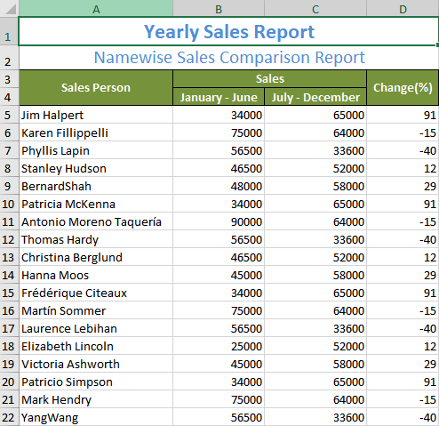
Export collection of objects to Excel in c#

Output of collection of objects to Excel

3. Export from Database to Excel

Excel supports creating Excel tables from different databases. If you have a scenario in which you need to create one or more Excel tables from a database using Excel, you need to establish every single connection to create those tables. This can be time consuming, so if you find an alternate way to generate Excel tables from database very quickly and easily, wouldn’t that be your first choice?

The Syncfusion Excel (XlsIO) library helps you to export data to Excel worksheets from databases like MS SQL, MS Access, Oracle, and more. By establishing a connection between the databases and Excel application, you can export data from a database to an Excel table.

You can use the Refresh() option to update the modified data in the Excel table that is mapped to the database.

Above all, you can refer to the documentation to create a table from an external connection to learn more about how to export databases to Excel tables. The following code sample shows how to export data from a database to an Excel table.

using (ExcelEngine excelEngine = new ExcelEngine())
{
    IApplication application = excelEngine.Excel;
    application.DefaultVersion = ExcelVersion.Excel2016;

    //Create a new workbook
    IWorkbook workbook = application.Workbooks.Create(1);
    IWorksheet sheet = workbook.Worksheets[0];
                    
    if(sheet.ListObjects.Count == 0)
    {
        //Estabilishing the connection in the worksheet
        string dBPath = Path.GetFullPath(@"../../Data/EmployeeData.mdb");
        string ConnectionString = "OLEDB;Provider=Microsoft.JET.OLEDB.4.0;Password=\"\";User ID=Admin;Data Source="+ dBPath;
        string query = "SELECT EmployeeID,FirstName,LastName,Title,HireDate,Extension,ReportsTo FROM [Employees]";
        IConnection Connection = workbook.Connections.Add("Connection1", "Sample connection with MsAccess", ConnectionString, query, ExcelCommandType.Sql);
        sheet.ListObjects.AddEx(ExcelListObjectSourceType.SrcQuery, Connection, sheet.Range["A1"]);
    }

    //Refresh Excel table to get updated values from database
    sheet.ListObjects[0].Refresh();

    sheet.UsedRange.AutofitColumns();
                    
    //Save the file in the given path
    Stream excelStream = File.Create(Path.GetFullPath(@"Output.xlsx"));
    workbook.SaveAs(excelStream);
    excelStream.Dispose();
}
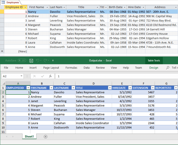
Export Database to Excel in c#

Output of Database to Excel table

4. Export data from DataGrid, GridView, DatGridView to Excel

Exporting data from Microsoft grid controls to Excel worksheets helps to visualize data in different ways. You may work for hours to iterate data and its styles from grid cells to export them into Excel worksheets. It should be good news for those who export data from Microsoft grid controls to Excel worksheets, because exporting with Syncfusion Excel library is much faster.

Syncfusion Excel (XlsIO) library supports to exporting data from Microsoft Grid controls, such as DataGrid, GridView, and DataGridView to Excel worksheets in a single API call. Also, you can export data with header and styles.

The following code example shows how to export data from DataGridView to an Excel worksheet.

#region Loading the data to DataGridView
DataSet customersDataSet = new DataSet();

//Read the XML file with data
string inputXmlPath = Path.GetFullPath(@"../../Data/Employees.xml");
customersDataSet.ReadXml(inputXmlPath);
DataTable dataTable = new DataTable();
            
//Copy the structure and data of the table
dataTable = customersDataSet.Tables[1].Copy();
            
//Removing unwanted columns
dataTable.Columns.RemoveAt(0);
dataTable.Columns.RemoveAt(10);
this.dataGridView1.DataSource = dataTable;

dataGridView1.AlternatingRowsDefaultCellStyle.BackColor = Color.White;
dataGridView1.RowsDefaultCellStyle.BackColor = Color.LightBlue;
dataGridView1.ColumnHeadersDefaultCellStyle.Font = new System.Drawing.Font("Tahoma", 9F, ((System.Drawing.FontStyle)(System.Drawing.FontStyle.Bold)));
dataGridView1.ForeColor = Color.Black;
dataGridView1.BorderStyle = BorderStyle.None;
#endregion

using (ExcelEngine excelEngine = new ExcelEngine())
{
    IApplication application = excelEngine.Excel;

    //Create a workbook with single worksheet
    IWorkbook workbook = application.Workbooks.Create(1);

    IWorksheet worksheet = workbook.Worksheets[0];

    //Import from DataGridView to worksheet
    worksheet.ImportDataGridView(dataGridView1, 1, 1, isImportHeader: true, isImportStyle: true);

    worksheet.UsedRange.AutofitColumns();
    workbook.SaveAs("Output.xlsx");
}
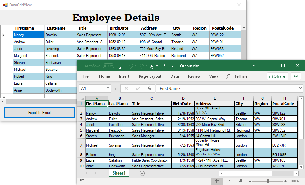
Export Microsoft DataGridView to Excel in c#

Microsoft DataGridView to Excel

5. Export from array to Excel

Sometimes, there may be a need where an array of data may need to be inserted or modified into existing data in Excel worksheet. In this case, the number of rows and columns are known in advance. Arrays are useful when you have a fixed size.

The Syncfusion Excel (XlsIO) library provides support to export an array of data into an Excel worksheet, both horizontally and vertically. In addition, two-dimensional arrays can also be exported.

Let us consider a scenario, “Expenses per Person.” The expenses of a person for the whole year is tabulated in the Excel worksheet. In this scenario, you need to add expenses for a new person, Paul Pogba, in a new row and modify the expenses of all tracked people for the month Dec.

Excel data before exporting from array to Excel in c#

Excel data before exporting from array

Exporting an array of data to Excel worksheet can be achieved through the ImportArray method. The following code sample shows how to export an array of data to an Excel worksheet, both horizontally and vertically.

using (ExcelEngine excelEngine = new ExcelEngine())
{
    IApplication application = excelEngine.Excel;
    application.DefaultVersion = ExcelVersion.Excel2016;

    //Reads input Excel stream as a workbook
    IWorkbook workbook = application.Workbooks.Open(File.OpenRead(Path.GetFullPath(@"../../../Expenses.xlsx")));
    IWorksheet sheet = workbook.Worksheets[0];

    //Preparing first array with different data types
    object[] expenseArray = new object[14]
    {"Paul Pogba", 469.00d, 263.00d, 131.00d, 139.00d, 474.00d, 253.00d, 467.00d, 142.00d, 417.00d, 324.00d, 328.00d, 497.00d, "=SUM(B11:M11)"};

    //Inserting a new row by formatting as a previous row.
    sheet.InsertRow(11, 1, ExcelInsertOptions.FormatAsBefore);

    //Import Peter's expenses and fill it horizontally
    sheet.ImportArray(expenseArray, 11, 1, false);

    //Preparing second array with double data type
    double[] expensesOnDec = new double[6]
    {179.00d, 298.00d, 484.00d, 145.00d, 20.00d, 497.00d};

    //Modify the December month's expenses and import it vertically
    sheet.ImportArray(expensesOnDec, 6, 13, true);

    //Save the file in the given path
    Stream excelStream = File.Create(Path.GetFullPath(@"Output.xlsx"));
    workbook.SaveAs(excelStream);
    excelStream.Dispose();
}

Export array of data to Excel in c#

Output of array of data to Excel

6. Export from CSV to Excel

Comma-separated value (CSV) files are helpful in generating tabular data or lightweight reports with few columns and a high number of rows. Excel opens such files to make the data easier to read.

The Syncfusion Excel (XlsIO) library supports opening and saving CSV files in seconds. The below code example shows how to open a CSV file, also save it as XLSX file. Above all, the data is shown in a table with number formats applied.

using (ExcelEngine excelEngine = new ExcelEngine())
{
    IApplication application = excelEngine.Excel;
    application.DefaultVersion = ExcelVersion.Excel2016;

    //Preserve data types as per the value
    application.PreserveCSVDataTypes = true;

    //Read the CSV file
    Stream csvStream = File.OpenRead(Path.GetFullPath(@"../../../TemplateSales.csv")); ;

    //Reads CSV stream as a workbook
    IWorkbook workbook = application.Workbooks.Open(csvStream);
    IWorksheet sheet = workbook.Worksheets[0];

    //Formatting the CSV data as a Table 
    IListObject table = sheet.ListObjects.Create("SalesTable", sheet.UsedRange);
    table.BuiltInTableStyle =  TableBuiltInStyles.TableStyleMedium6;
    IRange location = table.Location;
    location.AutofitColumns();

    //Apply the proper latitude & longitude numerformat in the table
    TryAndUpdateGeoLocation(table,"Latitude");
    TryAndUpdateGeoLocation(table,"Longitude");

    //Apply currency numberformat in the table column 'Price'
    IRange columnRange = GetListObjectColumnRange(table,"Price");
    if(columnRange != null)
        columnRange.CellStyle.NumberFormat = "$#,##0.00";

    //Apply Date time numberformat in the table column 'Transaction_date'
    columnRange = GetListObjectColumnRange(table,"Transaction_date");
    if(columnRange != null)
        columnRange.CellStyle.NumberFormat = "m/d/yy h:mm AM/PM;@";

    //Sort the data based on 'Products'
    IDataSort sorter = table.AutoFilters.DataSorter;
    ISortField sortField = sorter. SortFields. Add(0, SortOn. Values, OrderBy. Ascending);
    sorter. Sort();

    //Save the file in the given path
    Stream excelStream;
    excelStream = File.Create(Path.GetFullPath(@"../../../Output.xlsx"));
    workbook.SaveAs(excelStream);
    excelStream.Dispose();
}

Input CSV File

Input CSV file

Export CSV to Excel in c#

Output of CSV converted to Excel

Wrapping up

As you can see, Syncfusion Excel (XlsIO) library provides various  easy ways to export data to Excel in C#. Use them effectively to generate Excel reports with high performance and to process large data. Take a moment to peruse the documentation, where you’ll find other options and features, all with accompanying code samples. Using the library, you can also Export Excel data to PDF, image, data table, CSV, TSV, HTML, collections of objects, ODS file format, and more.

If you are new to our Excel library, it is highly recommended that you follow our Getting Started guide.

Are you already a Syncfusion user? You can download the product setup here. If you’re not yet a Syncfusion user, you can download a free, 30-day trial here.

If you have any questions or require clarification about these features, please let us know in the comments below. You can also contact us through our support forum or Direct-Trac or Feedback Portal. We are happy to assist you!

The post 6 Easy Ways to Export Data to Excel in C# appeared first on Syncfusion Blogs.

7 Tips to Optimize Xamarin Charts Performance

$
0
0

Visualizing raw data is important in any application, so that you can quickly and clearly understand large quantities of data and compare different kinds of data sets. One of the most commonly used chart types is the line chart. It is represented by a series of data points on a straight line. It should be capable of visualizing a large amount of data points, as would be the typical requirement in most applications.

We built this chart with plotting a lot of data points in mind and included several optimizations to handle high numbers of data points while still providing a smooth experience to users. Still, more optimizations can be done at the application level to get the best possible performance when loading more than 100K data points, and those techniques are explained in this blog post.

#1: Use fast line series instead of line series

The line series was built for providing rich customization of individual lines, so it will not be good for loading a high number of data points and performing real-time data updates. However, we also have a FastLineSeries. It is commonly used to load a huge number of data points as it renders the line with a single points collection. The configuration of FastLineSeries, such as setting the items source and binding paths, is the same as any other series. The following code snippet shows how to configure the fast line series in XAML code.

<chart:SfChart.Series>
      <chart:FastLineSeries XBindingPath="XValue" YBindingPath="YValue" ItemsSource="{Binding Data}"/>
</chart:SfChart.Series>

#2: Do not use data markers, use trackball or tooltips

Plotting data markers and labels for each data point will be look messy when you plot many data points. Nevertheless, it is important to track the data points at required indexes. That is where tooltips and a trackball come into play. A tooltip will display data when you touch any data point. Similarly, the trackball will display the information of the nearest data point along with a vertical line when you touch and hold it on the chart area. Customize the appearance of both trackball and tooltip labels using built-in APIs and data templates. The following code snippet shows how to enable tooltips and the trackball and customize their labels using a data template.

Enable and customize tooltips using a data template.

<chart:FastLineSeries  EnableTooltip="true"> 
 
     <chart:FastLineSeries.TooltipTemplate> 
           <DataTemplate> 
                <Label Text="{Binding TooltipString}" /> 
           </DataTemplate> 
     </chart:FastLineSeries.TooltipTemplate> 
 
</chart:FastLineSeries>

Enable the trackball.

<chart:SfChart.ChartBehaviors>
      <chart:ChartTrackballBehavior/>
</chart:SfChart.ChartBehaviors>

Customize the trackball labels with a data template

<chart:FastLineSeries>
 
    <chart:FastLineSeries.TrackballLabelTemplate>
                  <DataTemplate>
                        <Label Text="{Binding TooltipString}" />
                  </DataTemplate>
    </chart:FastLineSeries.TrackballLabelTemplate > 
 
</chart:FastLineSeries>

#3: Reduce the stroke width of the fast line series to 1

By default, the stroke width of a fast line series is 2. It causes a delay if you render the line with two pixels rather than a single pixel. So, set the StrokeWidth of FastLineSeries to 1 if you don’t have any specific requirement to render the line with the thickness of two. The thickness of the line can be increased at runtime. You can render the line with a thickness of one at load time and, after zooming to a certain level, you can increase the thickness to two or more to see the line clearly. The following code snippet demonstrates how to configure the thickness of the line.

<chart:SfChart.Series> 
       <chart:FastLineSeries StrokeWidth="1" /> 
</chart:SfChart.Series> 

#4: Make use of SuspendSeriesNotification and ResumeSeriesNotification

After binding your data to the ItemsSource property of ChartSeries, the chart will always listen to the changes that happen in your data if it implements the INotifyCollectionChanged interface. But in some cases, you may add bulk objects to your data collection. If you think those updates in the chart do not make any sense, you are able to stop the chart from being updated for each modification in the items source collection. It is possible with the Charts control using the SuspendSeriesNotification and ResumeSeriesNotification methods. The chart will not respond to any change in the items source collection after the SuspendSeriesNotification method is invoked. It will be updated with latest data after the ResumeSeriesNotification method is invoked. Refer to the following code snippet.

Chart.SuspendSeriesNotification();
 
//Make the required changes in the items source that don’t need to be updated in UI immediately.
 
Chart.ResumeSeriesNotification(); 

#5: Disable the anti-aliasing

The anti-aliasing support renders the line with smooth edges. But, this is not very important when you plot a huge number of data points. Disable the anti-aliasing of the line using EnableAntiAliasing property of FastLineSeries. Enable the anti-aliasing at runtime, though, whenever you want the line to be anti-aliased. The following code snippet shows how to disable the anti-aliasing feature.

<chart:SfChart.Series>
       <chart:FastLineSeries EnableAntiAliasing="false"  />
</chart:SfChart.Series>

#6: Avoid CategoryAxis, use NumericalAxis and DateTimeAxis

Do not use the CategoryAxis when you do not have any specific need to show the string values in the x-axis. Whereas CategoryAxis populates the labels based on the individual data points, the NumericalAxis and DateTimeAxis populate the labels based on the points’ ranges and intervals. These axes always give good performance when loading a high number of data points. The following code snippet shows how to configure the NumericalAxis as the primary axis.

<chart:SfChart.PrimaryAxis>
       <chart:NumericalAxis/>
</chart:SfChart.PrimaryAxis>

#7: Replace the FastLineSeries with FastLineBitmapSeries in UWP

Because the quality of the default rendering is better with FastLineSeries, the Xamarin.Forms FastLineSeries has been mapped with it instead of FastLineBitmapSeries in the UWP platform. The FastLineSeries plots the data using polylines, but FastLineBitmapSeries plots the data using bitmap, which is faster than polyline rendering. To replace FastLineSeries with FastLineBitmapSeries, you need to write a custom renderer, as shown in the following code snippet.

public class ChartRendererExt : SfChartRenderer
    {
        protected override void OnElementChanged(ElementChangedEventArgs e)
        {
            base.OnElementChanged(e);
 
            Native.SfChart chart = this.Control as Native.SfChart;
            chart.Series.Clear();
 
            //Replace the fast line series with fast line bitmap series
            foreach (var formsSeries in e.NewElement.Series)
            {
                if (formsSeries is FastLineSeries)
                {
                    Native.FastLineBitmapSeries fastLine = new Native.FastLineBitmapSeries();
 
                    formsSeries.PropertyChanged += (sender, a) =>
                    {
                        if(a.PropertyName.Contains("ItemsSource"))
                        {
                            fastLine.ItemsSource = formsSeries.ItemsSource;
                        }
                    };
                    
                    var properties = SfChartRenderer.GetPropertiesChanged(typeof(ChartSeries), formsSeries);
 
                    foreach (var name in properties)
                    {
                        ChartSeriesMapping.OnXyDataSeriesPropertiesChanged(name, formsSeries as FastLineSeries,
                            fastLine);
                    }
                    chart.Series.Add(fastLine);
                }
            }
        }
    } 

All the above techniques help to improve the loading time and provide smooth, real-time updates in a complex application. However, the performance is still dependent on the device and its configuration. We have applied these optimizations and tested the control with 500K data points. It loads within a second in all the Xamarin.Forms platforms. We have used an iPhone 7 to test iOS, Google Pixel for Android, and a device with 16GB RAM and an Intel Core i5 7th Gen 7200U to perform this test on the Windows platform.

The following GitHub repository contains the example project with all the proposed optimizations. You can download or clone it to perform this test in your environment.

https://github.com/SyncfusionExamples/xamarin.forms-sfchart-performance

Please share your valuable feedback about this article in the comments section below. If you have any specific requirement related to chart performance, you can also contact us through our support forum or Direct-Trac. We are happy to assist you!

If you enjoyed this post, we think you will also like:

The post 7 Tips to Optimize Xamarin Charts Performance appeared first on Syncfusion Blogs.
Creating the Story Estimator application with Syncfusion ASP.Net Core Controls

$
0
0

Overview

In this blog, I have created the Story Estimator application as an example of an application you can make with a combination of Syncfusion ASP.Net Core controls. Here, I will first explain how this application works, and then how I used Syncfusion ASP.Net Core controls to build it.

The Story Estimator

The Story Estimator is an effective Agile-based tool for estimating story points for stories using Planning Poker techniques. Planning Poker is an Agile estimating and planning technique that is consensus-based.

Agile teams around the world use this kind of tool to estimate how long a certain amount of work will take to complete. The purpose of this tool is to make sure that each person on the development team is actively participating in the estimation process and contributing their opinion.

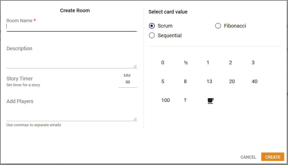
The Room Creation

As a first step, organizer creates a room (session) and imports all the stories to be estimated. Normally, the product owner or team lead who organizes the session will be the organizer, and their team members are players or estimators. So, the organizer will invite their team members for this session.

The Story Estimation

After starting the session, the organizer reads the description of the user story for which the estimation is to be made. If the estimators raise any questions, then the organizer will answer them.

Each estimator has a separate play screen with cards that hold values like 0, 1, 2, 3, 5, 8, 13, 20, 40, and 100. The values represent the number of story points, ideal days, or other units the team follows.

The estimators discuss the story or feature by asking the organizer questions, if needed.  When the story or feature has been fully discussed, each estimator privately selects one card to represent his or her estimate. After all the estimators select their estimates, the organizer will reveal everyone’s selection.

If everyone has selected the same value, it becomes the estimate. If not, all the estimators will discuss their estimates. The high and low estimators will share their reasoning. According to the discussion, the organizer will finalize the estimate of the selected story. If required, repeat the process until the estimate is finalized.

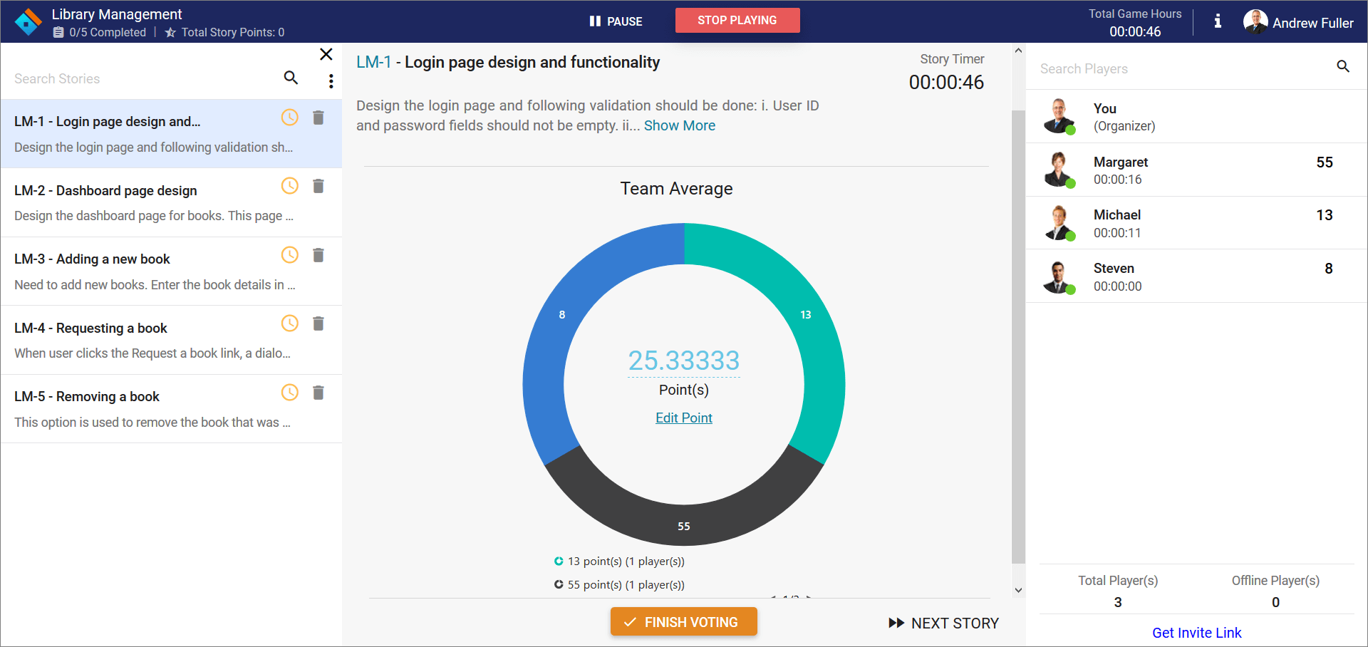
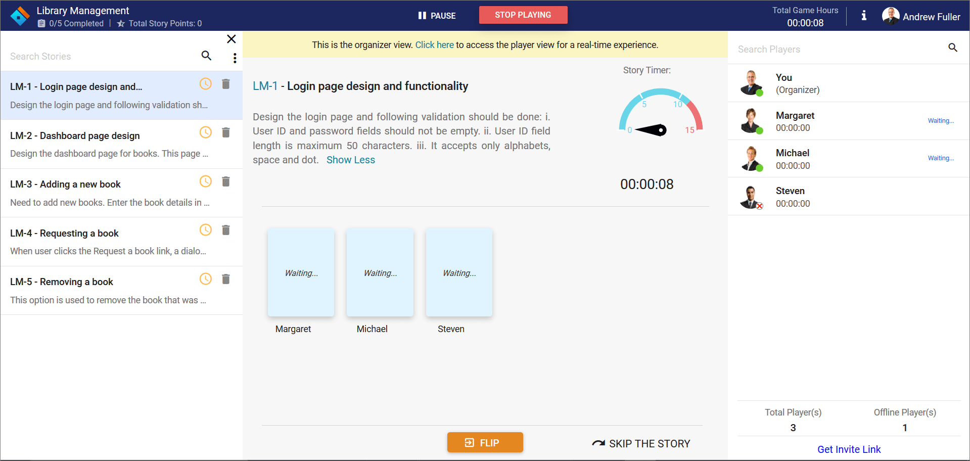
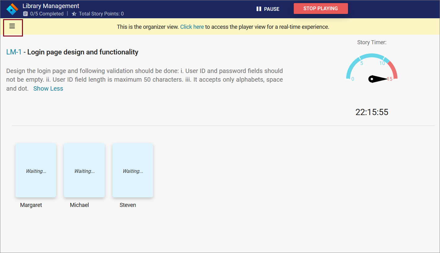
Story estimator - Admin play area Story estimator – Admin play area

Average story point estimatedAverage story point estimated

Demo: https://aspdotnetcore.syncfusion.com/showcase/aspnetcore/story-estimator/

This Story Estimator was developed using Syncfusion components. Let’s see how Syncfusion components are part of Story Estimator and where they are used.

Accumulation Chart

The Accumulation chart control is a circular graphic, that can be divided into multiple segments to illustrate numerical proportions. All the elements are rendered as Scalable Vector Graphics (SVG).

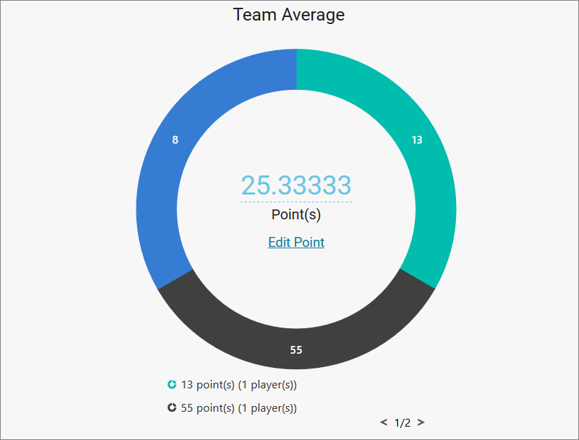
We use this chart to represent the team average for votes. It will display after flipping all the cards. This chart groups similar data and the legend shows the values.

Chart to represent average story pointsChart to represent average story points

This chart has some key features, that supports:

  • Local binding and remote data sources.
  • Arranging the labels smartly without overlapping.
  • Interactive features such as tooltip, explode, and selection.
  • Club points to group the values of category.

Button

The Button control is a graphical user interface element that triggers an event when clicked. It can contain text, an image, or both. We used Syncfusion buttons in many places in this application.

Syncfusion Button key features:

  • Different button types.
  • Predefined button styles.
  • Easy button customization.
  • Buttons can use texts and icons.

Checkbox

The Checkbox control is a graphical user interface element that allows you to select one or more options from a group of choices. It contains checked, unchecked, and indeterminate states.

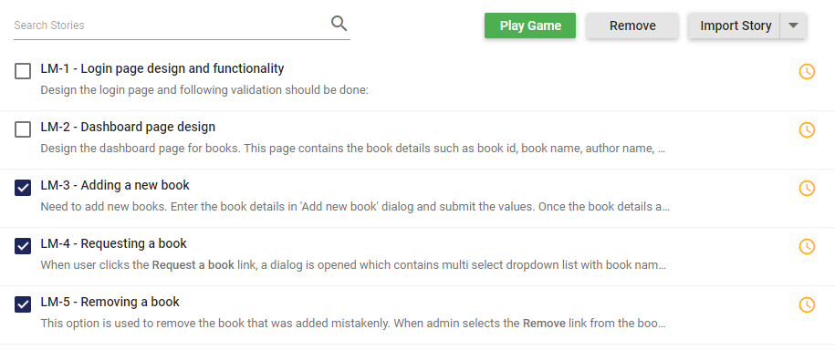
We used check boxes in this application to remove multiple stories at a time from the discussion phase.

Checkbox to select the storiesCheckbox to select the stories

Circular Gauge

The Circular Gauge control is ideal to visualize numeric values over a circular scale. Scalable Vector Graphics (SVG) is used to render all element of circular gauge.

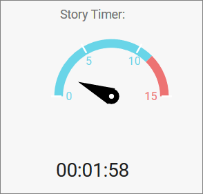
We used the Circular Gauge control to represent the story timer. The story timer reminds the organizer to estimate a story within a specified time range. The optimal time range is set as 15 minutes, and you can change it during room creation.

Circular Gauge as timerCircular Gauge as timer

Syncfusion Circular Gauge key features:

  • Add custom elements to the gauge using annotations.
  • Use interactive features like tooltip and pointer drag and drop.
  • Add multiple pointers to the gauge.
  • Add multiple axes and ranges.
  • Use animation for pointers.

Dialog

The Dialog control is a window that displays information to a user, requests and accepts user input.

We used dialog for several purposes; creating the room, confirmation, warning messages, and some alerts.

Dialog used as formDialog used as form

Syncfusion Dialog key features:

  • Model and modeless dialogs.
  • Button: Render buttons in the Dialog footer.
  • Templates: Customize Dialog header and footer through a template.
  • Draggable: Drag the Dialog within the page or container.
  • Animation: Use customized animation support when opening and closing a dialog.
  • Localization: Localize the default close icon title text to different cultures.

DataGrid

The DataGrid control is used to display and manipulate tabular data with configuration options to control the way the data is presented. It can pull data from data sources such as an array of JavaScript objects, OData web services, or the DataManager and bind data fields to columns. It also displays the column header to identify the field with support for grouped records.

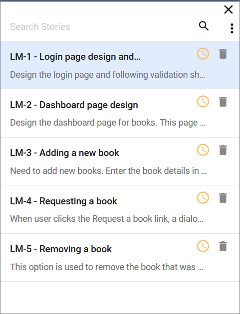
We used the DataGrid to represent user stories and the players list. We have done some simple customization and changed the grid view to a more elegant look. The DataGrid is very lightweight, so it does not increase the process time of the application.

DataGrid used to list the storiesDataGrid used to list the stories

Syncfusion DataGrid key features:

  • Data sources: Binds the DataGrid component with an array of JavaScript objects or DataManager.
  • Sorting and grouping: Supports n level of sorting and grouping.
  • Filtering: Offers filter bar in each column to filter data.
  • Paging: Allows easy switching between pages using the pager bar.
  • Reordering: Allows the drag and drop of any column anywhere in a grid’s column header row, thus allowing repositioning of columns.
  • RTL support: Provides right-to-left mode that aligns the grid content from right to left.
  • Localization: Provides inherent support to localize the UI.

Input Mask

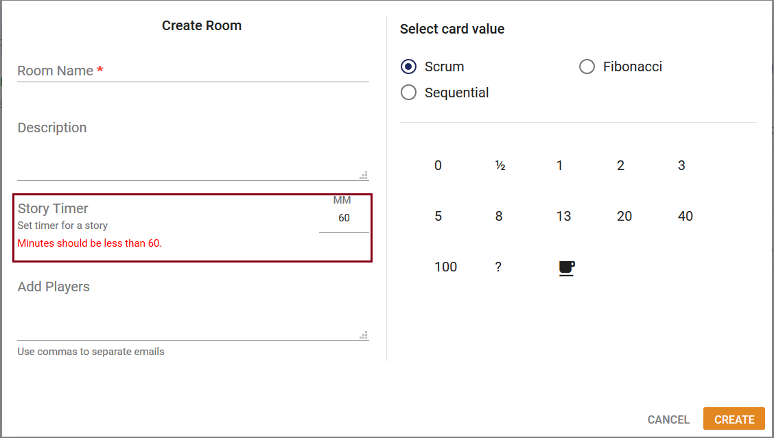
The Input Mask control allows users to enter valid input based on the provided mask.

We used the Input Mask to set the story timer value when creating the room. Input mask used to create rooms

Input mask used to create rooms

Syncfusion Input Mask key features:

  • Custom characters: Use your own characters as the mask elements.
  • Regular expression: Use as a mask element for each character of the Input Mask.
  • Accessibility: Access all the Input Mask component features through the keyboard, on-screen readers, or other assistive technology devices.

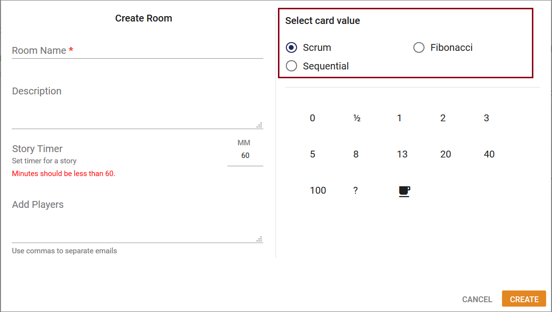
Radio Button

The Radio Button control is a graphical user interface element that allows you to select only one option from a set of choices. It contains checked and unchecked states.

We used the Radio Button to select card value when creating the room.

Radio button used to select card valuesRadio button used to select card values

The Sidebar control is an expandable and collapsible component that typically acts as a side container to place primary or secondary content alongside the main content.

We used Sidebar to represent user stories in the play area. It has mobile-friendly support, so when opening the site in mobile, the user stories area will be closed automatically.

Sidebar collapsed viewSidebar collapsed view

Sidebar expanded viewSidebar expanded view

Syncfusion Sidebar key features:

  • Context: Initialize Sidebar in any HTML element except the body element.
  • Several types and positions.
  • Auto close: The Sidebar can be in an expanded or collapsed state only in certain resolutions.
  • Dock: By default, it supports the display of short notifications about the content in docked mode.

Split Button

The Split Button control triggers a default action when its primary button is clicked, and toggles contextual overlays to display a list of action items when its drop-down button is clicked. The control can contain both text and images.

We used Split Button in the Import Story options. We have multiple import story options simply represented in a split button.

Split button to import storiesSplit button to import stories

Syncfusion Split Button key features:

  • Icons
  • Pop-up items
  • Accessibility

Uploader

The Uploader control is useful to upload images, documents, and other files to a server. This component is an extended version of HTML5 upload. It has multiple-file selection, auto upload, drag and drop, progress bar, preloading files, and validation.

We used the Uploader in the Import Stories option in Excel and CSV file formats. Also, you can drag and drop the files to upload.

Uploaded to upload files containing story detailsUploaded to upload files containing story details

Syncfusion Uploader key features:

  • Asynchronous upload: The Uploader component allows you to upload files in an asynchronous way.
  • Drag and drop: The files can be dragged from the file explorer into the drop area. By default, the Uploader control itself acts as a drop-area element.
  • Form supports: The selected or dropped files are received as a collection in a when the form is submitted.
  • Template: You can customize the default appearance of the Uploader using a template property along with a button property.

Conclusion

Syncfusion has powerful controls you can use to develop any kind of application on various platforms. They are designed to make developers’ lives easier. If you’re already a Syncfusion user, you can download the product setup here, or, you can download a free, 30-day trial here to evaluate our products.

Want to learn more about creating real time application using Syncfusion Essential JS 2? Don’t forget to check out the Showcase Applications here. You can find this project in this Github repository. If you have any questions on these features, please let us know in the comments below. You can also contact us through our support forum or Direct-Trac or Feedback portal. We are more than happy to assist you!

The post Creating the Story Estimator application with Syncfusion ASP.Net Core Controls appeared first on Syncfusion Blogs.
Microsoft Doubles Down on PWAs with PWA Builder 2.0

$
0
0

Microsoft recently announced the 2.0 release of its free PWA Builder for easily converting an existing webpage into a fully functional progressive web app (PWA). This release comes just a few weeks before the Build 2019 conference. It may be a taste of what’s to come from Microsoft and its growing PWA arsenal.

Put simply, a PWA is a website or web app that delivers the functionality and experience of a native app regardless of the target device or internet availability. PWAs are installed locally, occupy their own window—no address bars here!—and are responsive to any screen size or orientation. Think of them as the next step in the evolution of hybrid apps.

PWAs made easy

PWA Builder is designed to jumpstart developers on their PWA journey. It is a PWA itself that can be used inside a browser or downloaded and installed locally. To use it, all developers have to do is provide the URL of the website they want to build as a PWA and then click Start. PWA Builder then builds a Manifest and a Service Worker, and evaluates them for how well they support PWA features. It also evaluates some basic security items like HTTPS and SSL certificate usage. Version 2.0 features a new design to streamline the presentation of this information in a centralized Hub.

PWA Builder 2.0 Hub

From the Hub, developers can view the generated Manifest and choose one of five types of Service Worker to use. Clicking Build My PWA provides a download link for the PWA package. It also provides links for an Xcode package, a side-loadable version for Windows 10, and packages ready for submission to Google Play and App Store.

Enhancing your PWA

Developers can add additional features to their PWA in the form of “snippits” from the PWA Builder website. These snippits provide the markup and code necessary to add APIs like geolocation, copy to clipboard, Microsoft Graph integration, and more. As development on PWA Builder continues, developers can expect more snippits, Workbox integration, and a way to package a PWA as a Trusted Web Activity to make Google Play submission even easier. For a thorough overview of what’s new in PWA Builder 2.0, check out this blog from Microsoft Program Manager Justin Willis.

Features Available from PWA Builder

Since the concept of PWAs emerged in 2015, the maturation rate has been slow but steady. Microsoft put its skin in the game when it announced plans to support PWAs on Windows 10 back in 2016, and has been releasing a steady steam of updates to accommodate PWAs with support in Edge and Windows 10. With PWA Builder 2.0, Microsoft reaffirms its commitment to making PWAs a viable option for delivering first-class apps throughout the Windows ecosystem and beyond.

If you enjoyed this post, we think you’ll also like:

The post Microsoft Doubles Down on PWAs with PWA Builder 2.0 appeared first on Syncfusion Blogs.
Syncfusion WinForms and WPF controls support in .NET Core 3.0

$
0
0

Overview

.NET Core 3.0 has been released, supporting Windows desktop applications on platforms such as Windows Forms (WinForms), Windows Presentation Foundation (WPF), and Entity Framework 6. It also provides cross development among Windows Forms, WPF, and UWP, providing developers an opportunity to use the modern interfaces of UWP in Windows Forms and WPF. Overall, .NET Core 3.0 gives WinForms and WPF an easy access to benefit all its technology. To learn more about .NET Core 3.0, refer to these posts:

https://docs.microsoft.com/en-us/dotnet/core/whats-new/dotnet-core-3-0

https://devblogs.microsoft.com/dotnet/net-core-3-and-support-for-windows-desktop-applications/

In this blog, I am going to walk through creating a WinForms .NET Core app that includes the Syncfusion DataGrid control. You can follow similar procedure to create WPF .NET Core app.

Prerequisites

The prerequisites for creating a .NET Core application are:

Creating a Windows Forms App (.NET Core)

Once the installation is done, we create a .NET Core WinForms application. In Visual Studio 2019, you can create a Windows Forms App (.NET Core) directly from the File > New Project > Create a new project dialog.

Creating a new Windows Forms App (.NET Core) project in Visual Studio 2019

Creating a new Windows Forms .NET Core App project in Visual Studio 2019

Open the project, remove the default template and then, include Syncfusion WinForms controls either using the NuGet package or by adding assembly references from the precompiled assemblies location. To learn more about Syncfusion WinForms controls’ NuGet packages and assembly references, refer to this documentation.

Precompiled Assembly Location: <system drive>:\Program Files (x86)\Syncfusion\Essential Studio\Windows\<Essential Studio: Installed Version>\precompiledassemblies\netcoreapp3.0

If you choose to install the required assemblies as a NuGet package, search for the Syncfusion.SfDataGrid.WinForms package and install it.

If you choose to add assemblies from the precompiled assemblies location, please add this list of assemblies:

  • Core.WinForms
  • Data.WinForms
  • DataSource.WinForms
  • GridCommon.WinForms
  • Licensing
  • SfDataGrid.WinForms
  • SfInput.WinForms
  • SfListView.WinForms
  • Shared.Base

Here, I have chosen the former way.

SfDataGrid NuGet package installed in the project

SfDataGrid NuGet package installed in the project

After installing the NuGet package, we initialize the WinForms DataGrid control and assign a data source in “Form1.cs”.

using System.Data;
using Syncfusion.WinForms.DataGrid;

namespace NETCoreWFDemo
{
    public partial class Form1 : Form
    {
        public Form1()
        {
            InitializeComponent();
            SfDataGrid sfDataGrid1 = new SfDataGrid();
            sfDataGrid1.Location = new System.Drawing.Point(5, 5);
            sfDataGrid1.Size = new System.Drawing.Size(1240, 1150);
            sfDataGrid1.DataSource = GetDataTable();
            this.Controls.Add(sfDataGrid1);
        }

        public DataTable GetDataTable()
        {
            DataTable employeeCollection = new DataTable();
            var dt = DateTime.Now;

            employeeCollection.Columns.Add("EmployeeID", typeof(int));
            employeeCollection.Columns[0].ColumnName = "Employee ID";
            employeeCollection.Columns.Add("EmployeeName", typeof(string));
            employeeCollection.Columns["EmployeeName"].ColumnName = "Employee Name";
            employeeCollection.Columns.Add("CustomerID", typeof(string));
            employeeCollection.Columns["CustomerID"].ColumnName = "Customer ID";
            employeeCollection.Columns.Add("Country", typeof(string));
            employeeCollection.Columns.Add("Date", typeof(DateTime));

            employeeCollection.Rows.Add(1001, "Belgim", "YHGTR", "US", new DateTime(dt.Year, dt.Month, dt.Day));
            employeeCollection.Rows.Add(1002, "Oliver", "LDON", "UK", new DateTime(dt.Year, dt.Month, dt.AddDays(-1).Day));
            employeeCollection.Rows.Add(1003, "Bernald", "ALFKI", "US", new DateTime(dt.Year, dt.Month, dt.AddDays(-5).Day));
            employeeCollection.Rows.Add(1004, "James", "YHGTR", "US", new DateTime(dt.Year, dt.Month, dt.AddDays(-1).Day));
            employeeCollection.Rows.Add(1005, "Beverton", "BERGS", "Europe", new DateTime(dt.Year, dt.Month, dt.Day));

            return employeeCollection;
        }
    }
}

On executing this project, we will get an output like this screenshot.

WinForms DataGrid bound to a DataTable

WinForms DataGrid bound to a DataTable

NOTE: Like WinForms applications, WPF .NET Core applications can also be created by choosing WPF App (.NET Core) in the Create a new project dialog. Once the project is created, you can add Syncfusion WPF controls following a similar procedure. Online help links are provided later to help you out in adding Syncfusion WPF controls.

Conclusion

In this blog, we have gone through the steps to create a Windows Forms App (.NET Core) and include the Syncfusion DataGrid control in it. You can try creating projects with other supported Syncfusion WinForms controls and WPF controls available and share your feedback with us through our support forumDirect-Trac, or our Feedback Portal.

If you are an existing customer, please download the new version of Essential Studio from the download page and try the .NET Core 3.0-supporting WinForms controls and their features for yourself. If you are a new customer, you can try our 30-day free trial to evaluate our controls.

Windows Forms Sample Link: https://github.com/SyncfusionExamples/.net-core-3.0-winforms-demo

WPF Sample Link: https://github.com/SyncfusionExamples/.net-core-3.0-wpf-demo

Online Help Links:

WinForms

https://help.syncfusion.com/windowsforms/nuget-packages

https://help.syncfusion.com/windowsforms/control-dependencies

https://help.syncfusion.com/windowsforms/add-syncfusion-controls

https://help.syncfusion.com/windowsforms/sfdatagrid/gettingstarted

WPF

https://help.syncfusion.com/wpf/nuget-packages

https://help.syncfusion.com/wpf/control-dependencies

https://help.syncfusion.com/wpf/add-syncfusion-controls

https://help.syncfusion.com/wpf/sfdatagrid/getting-started

The post Syncfusion WinForms and WPF controls support in .NET Core 3.0 appeared first on Syncfusion Blogs.
Introducing Syncfusion’s JavaScript PDF Viewer for Web

$
0
0

Syncfusion is happy to let you know that the production version of the JavaScript PDF Viewer component for web frameworks is available from 2019 Volume 1 release (version 17.1.0.38).

In this current release, we have made various improvements in terms of viewing experience and new features such as right-to-left support, accessibility, and text mark-up annotations. The PDF Viewer component is interoperable with other third-party frameworks such as Angular, React, and Vue.js.

The PDF Viewer is designed to provide high performance in every aspect, but it is especially powerful in the following ways:

  • Instant Loading – Load PDF files with thousands of pages instantly.
  • Accurate Rendering – Render PDF pages without errors.
  • Virtualized pages – Render pages on demand to help reduce initial load time when working with large PDF files.

In this blog, you will learn how to get started with the PDF Viewer and its feature set, uses, and different modules, as well as learn the details of the roadmap.

Key Features

  • Both normal and PDF files protected with AES and RC4 encryption can be opened and displayed.
  • JavaScript PDF Viewer supports core interactions such as scrolling, zooming, panning, and page navigation.
  • Built-in toolbar.
  • Select and copy text from PDF files.
  • Text can be easily searched across the PDF document.
  • Easy navigation with the help of bookmarks, thumbnails, hyperlinks, and a table of contents.
  • Availability of two view modes: fit-to-page and fit-to-width.
  • The entire document or a specific page or a customized range of pages can be printed directly from the browser.
  • Text can be highlighted with the help of text mark-up annotations such as Highlight, Underline, and Strikethrough.

Where to use the PDF Viewer?

Here are some common uses for the JavaScript PDF Viewer component:

  • Preview PDF files on Cloud/File Storage.
  • Display PDF invoices or reports in your web applications.
  • Perform review of PDF files.

Creating a PDF Viewer

For configuring PDF Viewer, we have to perform changes on both the server-side and client-side.

Web API Service Creation

The JavaScript PDF Viewer has server-side dependency to get details from PDF documents. First of all, let’s see the steps to create an ASP.NET Core Web API service for server-side processing.

  1. Choose File > New > Project in the Visual Studio menu bar.
    Create New VS Project

    Create New VS Project

  2. Select ASP.NET Core Web Application, change the application name, and then click OK.
    Choose ASP.NET Core Web Application

    Select ASP.NET Core Web Application

  3. Select API and then click OK. The web application project has been created with the default ASP.NET Core template
    Select Web API Template

    Select Web API Template

  4. After creating the project, add the Syncfusion.EJ2.PdfViewer.AspNet.Core.Windows dependency to your project by using NuGet Package Manager
    Install Syncfusion.EJ2.PdfViewer.AspNet.Core.Windows nuget package

    Install Syncfusion.EJ2.PdfViewer.AspNet.Core.Windows

    Note: For Linux and macOS operating systems, use the following respective NuGet package:

    • Syncfusion.EJ2.PdfViewer.AspNet.Core.Linux
    • Syncfusion.EJ2.PdfViewer.AspNet.Core.OSX
  5. Place a PDF file inside the App_Data folder.
  6. Rename the ValuesController.cs to PdfViewerController.cs inside the Controllers folder and add the following code.
    using Microsoft.AspNetCore.Hosting;
    using Microsoft.AspNetCore.Mvc;
    using Newtonsoft.Json;
    using Syncfusion.EJ2.PdfViewer;
    using System;
    using System.Collections.Generic;
    using System.IO;
    
    namespace ej2_pdfviewer_service.Controllers
    {
        public class PdfViewerController : Controller
        {
            private IHostingEnvironment _hostingEnvironment;
            public PdfViewerController(IHostingEnvironment hostingEnvironment)
            {
                _hostingEnvironment = hostingEnvironment;
            }
            [AcceptVerbs("Post")]
            [HttpPost]
            [Microsoft.AspNetCore.Cors.EnableCors("MyPolicy")]
            //Post action for Loading the PDF documents   
            public IActionResult Load([FromBody] Dictionary jsonObject)
            {
                PdfRenderer pdfviewer = new PdfRenderer();
                MemoryStream stream = new MemoryStream();
                object jsonResult = new object();
                if (jsonObject != null && jsonObject.ContainsKey("document"))
                {
                    if (bool.Parse(jsonObject["isFileName"]))
                    {
                        string documentPath = GetDocumentPath(jsonObject["document"]);
                        if (!string.IsNullOrEmpty(documentPath))
                        {
                            byte[] bytes = System.IO.File.ReadAllBytes(documentPath);
                            stream = new MemoryStream(bytes);
                        }
                        else
                        {
                            return this.Content(jsonObject["document"] + " is not found");
                        }
                    }
                    else
                    {
                        byte[] bytes = Convert.FromBase64String(jsonObject["document"]);
                        stream = new MemoryStream(bytes);
                    }
                }
                jsonResult = pdfviewer.Load(stream, jsonObject);
                return Content(JsonConvert.SerializeObject(jsonResult));
            }
    
            [AcceptVerbs("Post")]
            [HttpPost]
            [Microsoft.AspNetCore.Cors.EnableCors("MyPolicy")]
            //Post action for processing the bookmarks from the PDF documents   
            public IActionResult Bookmarks([FromBody] Dictionary jsonObject)
            {
                PdfRenderer pdfviewer = new PdfRenderer();
                var jsonResult = pdfviewer.GetBookmarks(jsonObject);
                return Content(JsonConvert.SerializeObject(jsonResult));
            }
            [AcceptVerbs("Post")]
            [HttpPost]
            [Microsoft.AspNetCore.Cors.EnableCors("MyPolicy")]
            //Post action for processing the PDF documents.  
            public IActionResult RenderPdfPages([FromBody] Dictionary jsonObject)
            {
                PdfRenderer pdfviewer = new PdfRenderer();
                object jsonResult = pdfviewer.GetPage(jsonObject);
                return Content(JsonConvert.SerializeObject(jsonResult));
            }
            [AcceptVerbs("Post")]
            [HttpPost]
            [Microsoft.AspNetCore.Cors.EnableCors("MyPolicy")]
            //Post action for rendering the ThumbnailImages
            public IActionResult RenderThumbnailImages([FromBody] Dictionary jsonObject)
            {
                PdfRenderer pdfviewer = new PdfRenderer();
                object result = pdfviewer.GetThumbnailImages(jsonObject);
                return Content(JsonConvert.SerializeObject(result));
            }
            [AcceptVerbs("Post")]
            [HttpPost]
            [Microsoft.AspNetCore.Cors.EnableCors("MyPolicy")]
            //Post action for unloading and disposing the PDF document resources  
            public IActionResult Unload([FromBody] Dictionary jsonObject)
            {
                PdfRenderer pdfviewer = new PdfRenderer();
                pdfviewer.ClearCache(jsonObject);
                return this.Content("Document cache is cleared");
            }
            [HttpPost]
            [Microsoft.AspNetCore.Cors.EnableCors("MyPolicy")]
            //Post action for downloading the PDF documents
            public IActionResult Download([FromBody] Dictionary jsonObject)
            {
                PdfRenderer pdfviewer = new PdfRenderer();
                string documentBase = pdfviewer.GetDocumentAsBase64(jsonObject);
                return Content(documentBase);
            }
            [HttpPost]
            [Microsoft.AspNetCore.Cors.EnableCors("MyPolicy")]
            //Post action for printing the PDF documents
            public IActionResult PrintImages([FromBody] Dictionary jsonObject)
            {
                PdfRenderer pdfviewer = new PdfRenderer();
                object pageImage = pdfviewer.GetPrintImage(jsonObject);
                return Content(JsonConvert.SerializeObject(pageImage));
            }
            //Gets the path of the PDF document
            private string GetDocumentPath(string document)
            {
                string documentPath = string.Empty;
                if (!System.IO.File.Exists(document))
                {
                    var path = _hostingEnvironment.ContentRootPath;
                    if (System.IO.File.Exists(path + "\\Data\\" + document))
                        documentPath = path + "\\Data\\" + document;
                }
                else
                {
                    documentPath = document;
                }
                return documentPath;
            }
        }
    }
  7. Change the launchUrl to pdfviewer (name of the control) in the launchSettings.json file as follows.
    {
      "iisSettings": {
        "windowsAuthentication": false,
        "anonymousAuthentication": true,
        "iisExpress": {
          "applicationUrl": "http://localhost:58767/",
          "sslPort": 0
        }
      },
      "profiles": {
        "IIS Express": {
          "commandName": "IISExpress",
          "launchBrowser": true,
          "launchUrl": "pdfviewer",
          "environmentVariables": {
            "ASPNETCORE_ENVIRONMENT": "Development"
          }
        },
        "ej2_pdfviewer_service": {
          "commandName": "Project",
          "launchBrowser": true,
          "launchUrl": "pdfviewer",
          "environmentVariables": {
            "ASPNETCORE_ENVIRONMENT": "Development"
          },
          "applicationUrl": "http://localhost:62978/"
        }
      }
    }
    
    
  8. Configure a CORS policy at application Startup.cs in the ConfigureService method using the following code.
    public void ConfigureServices(IServiceCollection services)
            {
                services.AddMemoryCache();
                services.AddMvc();
                services.AddCors(o => o.AddPolicy("MyPolicy", builder =>
                {
                    builder.AllowAnyOrigin()
                    .AllowAnyMethod()
                    .AllowAnyHeader();
                }));
                services.Configure(options => options.Level = System.IO.Compression.CompressionLevel.Optimal);
                services.AddResponseCompression();
            }
    
  9. The CoresPolicyBuilder in builder allows you to configure the policy as needed. You can now use this policy name to apply to controllers and actions as shown in the following code sample.
[Microsoft.AspNetCore.Cors.EnableCors("MyPolicy")]

You can download the same ASP.NET Core Web API service application from the following location.
ASP.NET Core Web API service application
Note: Similarly, you can create the ASP.NET MVC Web API service for PDF Viewer  by using the steps provided in the following link,                                                                     
https://ej2.syncfusion.com/documentation/pdfviewer/how-to/create-pdfviewer-service

        And also you can download the ASP.NET MVC Web API service application from the following location.

        ASP.NET MVC Web API service application

Configure PDF Viewer on Client-side

Now let’s look at the steps for configuring PDF Viewer on client-side.

  1. You can clone the Essential JS 2 QuickStart project and install necessary packages by using the following commands.
    git clone https://github.com/syncfusion/ej2-quickstart.git quickstart
    cd quickstart
    npm install
  2. Dependent packages must be mapped in the config.js configuration file exist in the directory “quickstart/src” using the following code sample.
    System.config({
        paths: {
            'npm:': '../node_modules/',
            'syncfusion:': 'npm:@syncfusion/'
            
        },
        map: {
            app: 'app',
    
             //Syncfusion packages mapping
            "@syncfusion/ej2-base": "syncfusion:ej2-base/dist/ej2-base.umd.min.js",
            "@syncfusion/ej2-buttons": "syncfusion:ej2-buttons/dist/ej2-buttons.umd.min.js",
            "@syncfusion/ej2-popups": "syncfusion:ej2-popups/dist/ej2-popups.umd.min.js",
            "@syncfusion/ej2-navigations": "syncfusion:ej2-navigations/dist/ej2-navigations.umd.min.js",
            "@syncfusion/ej2-inputs": "syncfusion:ej2-inputs/dist/ej2-inputs.umd.min.js",
            "@syncfusion/ej2-splitbuttons": "syncfusion:ej2-splitbuttons/dist/ej2-splitbuttons.umd.min.js",
            "@syncfusion/ej2-dropdowns": "syncfusion:ej2-dropdowns/dist/ej2-dropdowns.umd.min.js",
            "@syncfusion/ej2-lists": "syncfusion:ej2-lists/dist/ej2-lists.umd.min.js",
            "@syncfusion/ej2-data": "syncfusion:ej2-data/dist/ej2-data.umd.min.js",
            "@syncfusion/ej2-notifications": "syncfusion:ej2-notifications/dist/ej2-notifications.umd.min.js",
            "@syncfusion/ej2-pdfviewer": "syncfusion:ej2-pdfviewer/dist/ej2-pdfviewer.umd.min.js"
    
        },
        packages: {
            'app': { main: 'app', defaultExtension: 'js' }
        }
    });
    
    System.import('app');
    
    
  3.  Add an HTML div element to act as the PDF Viewer in “index.html” using the following code
    <!--Element which will be rendered as PDF Viewer --></pre>
    <div id="PdfViewer" style="height: 600px;"></div>
    
  4. Essential JS 2 components support a set of built-in themes, and here we will use the material theme for the PDF Viewer. To add the material theme in your application, you need to import an applicable CSS in  “quickstart/src/styles/style.css”.
    @import '../../node_modules/@syncfusion/ej2/material.css';
    
  5. Place the following code in “app.ts” to start the PDF Viewer.
    // Import the required modules 
    import { PdfViewer, Toolbar, Magnification, Navigation, LinkAnnotation, BookmarkView,
    ThumbnailView, Print, TextSelection, TextSearch, Annotation} from '@syncfusion/ej2-pdfviewer';
    
    // Inject the required modules
    PdfViewer.Inject(Toolbar, Magnification, Navigation, LinkAnnotation, BookmarkView, ThumbnailView, Print, TextSelection, TextSearch, Annotation);
    
    // Create the PDF Viewer instance
    let pdfviewer: PdfViewer = new PdfViewer();
    // Map the service URL
    // Please use your own service URL of ASP.NET (Core or MVC) Web API  
    pdfviewer.serviceUrl = "http://localhost:62978/api/pdfviewer";
    pdfviewer.appendTo("#PdfViewer");
    pdfviewer.load('inputfile.pdf', null);


     Note: Here you have to use the service URL from ASP.NET Core or ASP.NET MVC Web API service application URL as provided in earlier steps.

  6. Run the following command to start the application
    npm start
  7. Your browser window will appear like this:
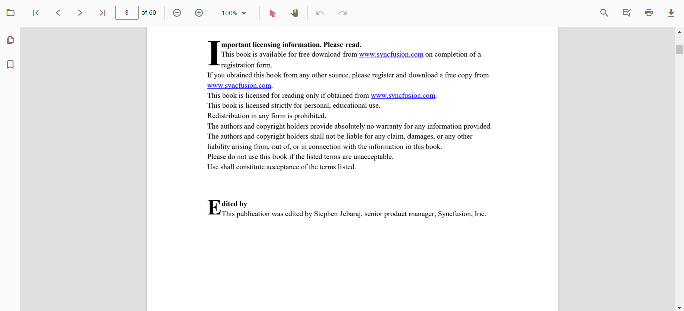
    JavaScript PDF Viewer default view

          PDF Viewer default view

  8. PDF Viewer – Modules

    All the features we’ve explored are broken into individual modules, so as to enable selective referencing; only the features you need have to be included in your application. Here are the available modules:

    • Toolbar: Built-in toolbar for better user interaction.
    • Magnification: Perform zooming operations for a better viewing experience.
    • Navigation: Easy navigation across PDF pages.
    • LinkAnnotation: Easy navigation both in and out of the PDF document through hyperlink.
    • ThumbnailView: Allows users to navigate easily with a thumbnail view.
    • BookmarkView: Allows users to navigate easily with a bookmark view.
    • TextSelection: Select and copy text from a PDF file.
    • TextSearch: Search text easily across the PDF document.
    • Print: Print the entire document or a specific page directly from the browser.
    • Annotation: Allows the user to add or edit annotations.

    Supported Frameworks

    This PDF Viewer supports the following Web Frameworks:

    Roadmap

    In the future release of Syncfusion’s JavaScript PDF Viewer, the following features can be expected:

    • Shape annotations such as rectangle, circle, line, polyline, and polygon
    • Stamp annotations
    • Measuring tools such as length, area, volume, radius, and perimeter.
    • Sticky notes and comments

    Summary

    We hope that you now understand the features of the JavaScript PDF Viewer, real use cases for it, and how to integrate it into a web application. If you would like to try the PDF Viewer component, you can download our free trial. You can visit the PDF Viewer source in GitHub and can check our sample browser and documentation for detailed explanations if you want to explore further applications.

    If you have any questions or need any information, please let us know in the comments section below. You can also contact us through our support forum or Direct-Trac or feedback portal. We are always happy to assist you.

The post Introducing Syncfusion’s JavaScript PDF Viewer for Web appeared first on Syncfusion Blogs.
A Tour of Syncfusion’s Volume 1, 2019 Updates

$
0
0

With the release of Volume 1, 2019, Syncfusion’s Essential Studio expands once again with new and improved features. New controls, improved functionality, and expanded platform support are highlights of Syncfusion’s quarterly update. To showcase the best features of this release, we held two webinars: “A Tour of Volume 1, 2019’s Updates to EJ2” and “A Tour of Volume 1, 2019: Updates to the Xamarin and Desktop Platforms.” In this blog post, we will provide the questions and answers from both of these webinars so that everyone interested in the highlights of Volume 1, 2019 can learn about its most compelling updates. If you want to see the full list of changes in this volume release, be sure to check out our What’s New page, and for a hands-on look, be sure to download a free, 30-day trial.


Do  you have tutorials to show how to use your new EJ2 controls?

Yes, we are working on a tutorial and plan to have it available within the next 20 days.


Since these are wrappers, what is the performance like with server-side Blazor?

You will have amazing performance on the server side. We address the most complex scenarios on our side to make sure we deliver high performance even in wrappers.


Are these controls included in the Community License?

Yes, they are included in our Community License as well.


When will your Blazor controls be released?

Right now, Razor Components are in early preview by Microsoft. Once they release a stable version, we will release our own stable version.


How stable are your Blazor components?

Our controls are derived from our EJ2 suite and have been thoroughly tested and are stable. Microsoft’s offerings are still in early preview, however, and there may be some issues on that side until the final build is available.


Are the Schedule and Grid controls included in Blazor?

Yes, they are included. In fact, all of our standard controls are available for a total of over 60 in the suite.


Is there a sample app demonstrating your Blazor controls?

Yes, we do have samples for our Blazor suite. You can check them out at https://ej2.syncfusion.com/home/aspnet-core-blazor.html.


Will you be at Microsoft Build to showcase your Xamarin controls?

Yes, we will be available for the MS Build conference in Seattle, so don’t forget to come and visit us at booth 600. We are excited about the event and meeting you all!


Do you plan to add an end-to-end application generator to your control suites?

We don’t have immediate plans for this, but you can go to our feedback portal at https://www.syncfusion.com/feedback/xamarin-forms and put in a request.


How can I try out your Xamarin controls?

You can learn more about our Xamarin offerings, including browsing samples and downloading a trial license, by visiting https://help.syncfusion.com/xamarin/introduction/overview.


If you liked this post, we think you’ll also enjoy:

The post A Tour of Syncfusion’s Volume 1, 2019 Updates appeared first on Syncfusion Blogs.
How to Create Custom Controls in Xamarin.Forms

$
0
0

Xamarin.Forms allows end users to create native user interfaces on Android, iOS, and UWP platforms using a single, shared C# codebase. It provides a multitude of customization options on each native platform, since the UI is rendered using different native control Renderer classes.

With over 40 pages, layouts, and controls built into the Xamarin.Forms library, you can do almost anything while building your native mobile apps on Android, iOS, and UWP. The best thing about Xamarin.Forms is the ability to completely customize each built in-control. In addition to that, you can use platform-specific APIs and custom controls. You can reuse your custom native control in Xamarin.Forms applications using the custom renderer concept.

There are two ways of creating a custom control:

  • Using the built-in layouts and controls.
  • Using a dummy wrapper class in the PCL/.NET standard project with bindable properties or in the renderer of each platform.

Simple ListView

In this blog post, we are going to create custom controls using the first approach. There are numerous custom controls in Xamarin. However, my favorite is the ListView, which is required in a majority of the applications we use.

What if you could create your own ListView that could render any data with just few lines of code? What if you could provide options to customize the view loaded in it without too much coding? That is exactly what we are going to see in this blog post: a simple ListView that displays contact information like in a mobile phone.

To create a ListView, first we need to write a class that contains the properties of the control. The best part about any ListView is that it reuses items when we scroll. In other words, it creates only the child and rearranges the items that go out of the viewport when we scroll. This logic is adopted in here, as well, and thus we need a scroll container to control this logic flow.

Displaying contact information in ListView

A ListView is a data-bound control. Therefore, you must create a data model to bind to the control.

We’ll create a simple data source and bind it to our ListView. In this case, simple “contact details of some random users” have been modeled that generate random contact details containing a user name, user image, call time, and the contact number. In a real-world scenario, you can also bind the data from the services and database to render in the ListView control.

public class ContactInfo
{
    public string ContactName { get; set; }
    public string CallTime { get; set; }
    public string ContactImage { get; set; }
    public long ContactNumber { get; set; }
    public Color ContactImageColor { get; set; }
}

Model class with properties

public class ContactsViewModel
{
    public ObservableCollection Contacts { get; set; }

    public ContactsViewModel()
    {
        GenerateContactDetails();
        Contacts = new ObservableCollection();

        foreach (var cusName in CustomerNames)
        {
            ContactInfo contact = new ContactInfo();
            ...
            Contacts.Add(contact);
        }
    }

    private void GenerateContactDetails()
    {
        ContactNumbers.Add("Kyle", 23564582);
        ContactNumbers.Add("Gina", 77656453);
        ...
        ContactNumbers.Add("Liam", 28726937);
        ContactNumbers.Add("Jacob", 39283738);
    }
}

Populating the model collection

Implementation logic

The ListView class contains the required properties to customize the appearance of the custom ListView and a subscription to the Scrolled event. The properties in the custom ListView are:

  • DataSource—To bind any collection to be rendered.
  • ItemTemplate—To customize the views that need to be loaded inside.
  • ItemHeight—To customize the height of the items, based on the views loaded in the ItemTemplate.

The following code illustrates the exact implementation of our SimpleListView that holds a custom view ScrollController as its content.

public class SimpleListView : ScrollView, IDisposable 
{
    private ScrollController controller;
    public int ItemHeight { get; set; }
    public DataTemplate ItemTemplate { get; set; }

    public static readonly BindableProperty DataSourceProperty =
        BindableProperty.Create("DataSource", typeof(IList), typeof(SimpleListView), null, BindingMode.TwoWay);

    public IList DataSource
    {
        get { return (IList)GetValue(DataSourceProperty); }
        set { this.SetValue(DataSourceProperty, value); }
    }

    public SimpleListView()
    {
        this.Orientation = ScrollOrientation.Vertical;
        this.ItemHeight = 60;
        this.controller = new ScrollController() { ListView = this };
        this.Scrolled += this.controller.ListView_Scrolled;
        this.Content = this.controller;
    }

    public void Dispose()
    {
        this.Scrolled -= this.controller.ListView_Scrolled;
    }
}

Loading initial views in the ListView

First, we need to create the views that fit within the view area. This can be done in the OnMeasure override of the ScrollController class. Obtain the number of items that fits within the view by diving the height of ListView by the item height. Maintain the created views in a list along with their index and the BindingContext information.

protected override SizeRequest OnMeasure(double widthConstraint, double heightConstraint)
{
    if (isFirstTime)
        CreateView((int)Math.Ceiling(ListView.Height / this.ListView.ItemHeight));

    var totalheight = this.ListView.DataSource.Count * this.ListView.ItemHeight;
    return (new SizeRequest(new Size(widthConstraint, totalheight)));
}

public void CreateView(int count)
{
    for (int i = 0; i < count; i++)
    {
        ItemView template = new ItemView
        {
            Content = (View)this.ListView.ItemTemplate.CreateContent(),
            BindingContext = this.ListView.DataSource[i],
            IsEnsured = false,
            ItemIndex = -1,
        };
        viewItems.Add(template);
        this.Children.Add(template);
    }
    isFirstTime = false;
}

The created views maintained in a list can be arranged sequentially based on the index in the LayoutChildren override.

protected override void LayoutChildren(double x, double y, double width, double height)
{
    double yPosition;
    foreach (var item in viewItems)
    {
        yPosition = item.ItemIndex * this.ListView.ItemHeight;
        item.Layout(new Rectangle(x, yPosition, width, this.ListView.ItemHeight));
    }
}

Reusing the items in the ListView when scrolling

In simple words, pick the item, whenever it goes out of the view. Then the index and the data of the item are modified and rearranged either at the top or bottom of the list based on the scroll direction.

We need to maintain a property to store the offset value and call the OnSizeAllocated method whenever the scroll offset changes to refresh the view.

The following illustrates the code logic to reuse items in the ListView control.

internal void ListView_Scrolled(object sender, ScrolledEventArgs e)
{
    this.ScrollY = e.ScrollY;
}

internal double ScrollY
{
    get { return this.scrollY; }
    set
    {
        if (this.scrollY != value)
        {
            this.scrollY = value;
            this.OnSizeAllocated(this.Width, this.Height);
        }
    }
}

protected override void OnSizeAllocated(double width, double height)
{
    var start = (int)Math.Floor(ScrollY / this.ListView.ItemHeight);
    int noOfItems = (int)Math.Ceiling(ListView.Height / this.ListView.ItemHeight);

    foreach (var item in viewItems)
        item.IsEnsured = false;

    for (int i = start; i < start + noOfItems; i++) { var row = this.viewItems.FirstOrDefault(x => x.ItemIndex == i);
        if (row == null)
        {
            row = this.viewItems.FirstOrDefault(x => ((x.ItemIndex < start || x.ItemIndex > (start + noOfItems - 1)) && !x.IsEnsured));
            if (row == null)
            {
                CreateView(1);
                row = this.viewItems.FirstOrDefault(x => ((x.ItemIndex < start || x.ItemIndex > (start + noOfItems - 1)) && !x.IsEnsured));
            }
            if (row != null)
            {
                row.ItemIndex = i;
                row.BindingContext = this.ListView.DataSource[i];
                row.IsEnsured = true;
            }
        }
        else
            row.IsEnsured = true;
    }
    base.OnSizeAllocated(width, height);
}

Binding contact information to the custom ListView

Design your template and define a suitable item height for your template. Then render the custom ListView in the view.

The following code illustrates a simple template for rendering the contact information that we generated earlier.

<ContentPage xmlns="http://xamarin.com/schemas/2014/forms"
             xmlns:x="http://schemas.microsoft.com/winfx/2009/xaml"
             xmlns:local="clr-namespace:CustomControl"
             x:Class="CustomControl.MainPage"
             Padding="5,5,10,5>

    <ContentPage.BindingContext>
        <local:ContactsViewModel x:Name="viewModel" />
    </ContentPage.BindingContext>

    <local:SimpleListView ItemHeight="60"
                          DataSource="{Binding Contacts}">
        <local:SimpleListView.ItemTemplate>
            <DataTemplate>
                <StackLayout>
                    <Grid>
                        <Grid.ColumnDefinitions>
                            <ColumnDefinition Width="60" />
                            <ColumnDefinition Width="*" />
                            <ColumnDefinition Width="Auto" />
                        </Grid.ColumnDefinitions>
                        <ContentView Padding="5, 0, 5, 0">
                            <Label Text="{Binding ContactImage}" BackgroundColor="{Binding ContactImageColor}" TextColor="White" FontSize="32"  HorizontalOptions="FillAndExpand" VerticalOptions="FillAndExpand" HorizontalTextAlignment="Center" VerticalTextAlignment="Center" />
                        </ContentView>
                        <StackLayout Grid.Column="1">
                            <Label LineBreakMode="NoWrap" TextColor="#474747" Text="{Binding ContactName}" FontSize="16" FontAttributes="Bold" VerticalTextAlignment="Center" />
                            <Label TextColor="#474747" LineBreakMode="NoWrap" Text="{Binding ContactNumber}" FontSize="12" VerticalTextAlignment="Center" HorizontalTextAlignment="Start" />
                        </StackLayout>
                        <Label Grid.Column="2" TextColor="#474747" LineBreakMode="NoWrap" Text="{Binding CallTime}" FontSize="12" VerticalTextAlignment="Center" HorizontalTextAlignment="Start" />
                    </Grid>
                    <BoxView BackgroundColor="Gray" HeightRequest="1" />
                </StackLayout>
            </DataTemplate>
        </local:SimpleListView.ItemTemplate>
    </local:SimpleListView>
</ContentPage>

Note: The custom ListView creation in the previous code example is entirely explained with XAML logics. However, you can also do this with the code behind.

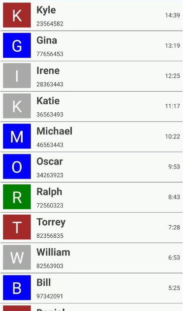
Congratulations on configuring a simple, custom ListView in your application. Just running the sample with these steps will render a beautiful ListView in your view.
Xamarin Forms Custom List View

Xamarin Forms Custom List View

The previous screenshot shows the outcome of the custom ListView. However, you might want to add some more customization options and advanced features. To see these, you can refer to the Syncfusion ListView and DataGrid components pages.

Conclusion

In this blog post, we looked at creating and configuring a simple custom control, custom ListView with customizable item heights and templates in Xamarin.Forms. Be sure to download the sample application to deploy a readily runnable sample and experience how easy it is to create a custom control in Xamarin.Forms!

If you are a current customer, we invite you to check out the Syncfusion ListView and DataGrid components for Xamarin. If you are not a current customer, you can always download our free evaluation to see them in action. You can also explore the ListView and DataGrid samples available on Google Play and the App Store, and learn about advanced features in our documentation (ListView, DataGrid).

If you have any questions or require clarification, please let us know in the comments section below. You can also contact us through our support forum or Direct-Trac or Feedback Portal. We are happy to assist you!

The post How to Create Custom Controls in Xamarin.Forms appeared first on Syncfusion Blogs.

How to Implement Xamarin Forms Validation

$
0
0

When a user interface enterprise application receives input, a common requirement will be to validate the provided information (such as email address, password, phone number). This is to ensure that, it satisfies the desired format and range for further processing. You can validate data in a user interface control by using built-in validations such as INotifyDataErrorInfo and data annotation while following the MVVM pattern.

In this blog, I will provide a walk-through on how to implement Xamarin Forms validation over data in the Syncfusion Xamarin.Forms DataForm control. Please go through the DataForm getting started documentation before proceeding with this blog if you are new to the DataForm control.

A data form validates data and displays an error message in case of failure. This error message is shown at the bottom of the editor.

Built-in validations

We can validate fields in MVVM in the DataForm control using:

  • INotifyDataErrorInfo
  • Data annotation

INotifyDataErrorInfo

You can validate data by implementing the INotifyDataErrorInfo interface in the data object class. The below code example illustrates the same.

public class EmployeeInfo: INotifyDataErrorInfo, INotifyPropertyChanged
{
    private int _EmployeeID;
    private string _Name;
    private string _Title;

    public event PropertyChangedEventHandler PropertyChanged;
    public event EventHandler ErrorsChanged;

    public EmployeeInfo()
    {

    }
    public int EmployeeID
    {
        get { return this._EmployeeID; }
        set
        {
            this._EmployeeID = value;
            this.RaisePropertyChanged("EmployeeID");
        }
    }
    public string Name
    {
        get { return this._Name; }
        set
        {
            this._Name = value;
            this.RaisePropertyChanged("Name");
        }
    }
    public string Title
    {
        get { return this._Title; }
        set
        {
            this._Title = value;
            this.RaisePropertyChanged("Title");
        }
    }

    [Display(AutoGenerateField = false)]
    public bool HasErrors
    {
        get
        {
            return false;
        }
    }
    private void RaisePropertyChanged(string propertyName)
    {
        if (PropertyChanged != null)
            PropertyChanged(this, new PropertyChangedEventArgs(propertyName));
    }
    public IEnumerable GetErrors(string propertyName)
    {
        var list = new List();
        if (!propertyName.Equals("Title"))
            return list;

        if (this.Title.Contains("Marketing"))
            list.Add("Marketing is not allowed");
        return list;
    }
}

Data annotations

The validation of the data fields using data annotation attributes is explained in the below topics.

Number validation

You can validate numeric types like int, double, and decimal properties using the Range attribute in numeric and numeric up-down editors.

private int employeeID;
[Range(1000, 1500, ErrorMessage = "EmployeeID should be between 1000 and 1500")]
public int EmployeeID
{
    get { return this.employeeID; }
    set
    {
        this.employeeID = value;
        this.RaisePropertyChanged("EmployeeID");
    }
}

Phone number validation

You can validate the length of a phone number using the StringLength attribute.

[StringLength(10, ErrorMessage = "Phone number should have 10 digits.")]
public string ContactNumber
{
    get { return this.contactNumber; }
    set
    {
        this.contactNumber = value;
        this.RaisePropertyChanged("ContactNumber");
        this.GetErrors("ContactNumber");
    }
}

As phone number format varies based on country, you can also use a regular expression and INotifyDataErrorInfo for validating it.

Mandatory fields validation

If any field in your application is mandatory, use the Required attribute to validate the data.

private string name;

[Required(AllowEmptyStrings = false, ErrorMessage = "Name should not be empty")]
public string Name
{
    get { return this.name; }
    set
    {
        this.name = value;
        this.RaisePropertyChanged("Name");
    }
}

Email validation

You can validate an email ID using the EmailAddress attribute.

private string email;

[EmailAddress(ErrorMessage = "Please enter a valid e-mail id.")]
public string Email
{
    get { return this.email; }
    set
    {
        this.email = value;
        this.RaisePropertyChanged("Email");
        this.GetErrors("Email");
    }
}

Password validation

To validate a new password entered in a form, you can use a regular expression and INotifyDataErrorInfo.

private Regex passwordRegExp = new Regex("((?=.*\\d)(?=.*[a-z])(?=.*[A-Z])(?=.*[@#$%]).{6,20})");

private string password;
[DataType(DataType.Password)]
public string Password
{
    get { return this.password; }
    set
    {
        this.password = value;
        this.RaisePropertyChanged("Password");
    }
}

public IEnumerable GetErrors(string propertyName)
{
    var list = new List();
    if (!propertyName.Equals("Password"))
        return list;

    if (!this.passwordRegExp.IsMatch(this.Password))
    {
        list.Add("Password must contain at least one digit, one uppercase character and one special symbol");
    }
    return list;
}

String length validation

You can validate the length of any property value in the text editor using the StringLength attribute.

private string name;

[Required(AllowEmptyStrings = false, ErrorMessage = "Name should not be empty")]
[StringLength(10, ErrorMessage = "Name should not exceed 10 characters")]
public string Name
{
    get { return this.name; }
    set
    {
        this.name = value;
        this.RaisePropertyChanged("Name");
    }
}

You can also specify, the minimum and maximum character length for the string property.

private string title;
[MinLength(5, ErrorMessage = "Title should be at least 5 characters.")]
[MaxLength(15, ErrorMessage = "Title should not exceed 15 characters.")]
public string Title
{
    get { return this.title; }
    set
    {
        this.title = value;
        this.RaisePropertyChanged("Title");
    }
}

Date range validation

To check a date range in the date editor, you need to specify the minimum and maximum date range by using the DateRange attribute.

private DateTime joinedDate;
[DateRange(MinYear = 2010, MaxYear = 2017, ErrorMessage = "Joined date is invalid")]
public DateTime JoinedDate
{
    get
    {
        return joinedDate;
    }
    set
    {
        joinedDate = value;
    }
}

Date Range Xamarin Forms Validation

Date Range Xamarin Forms Validation

The following attributes are also available in data forms to validate fields.

EmailAddressAttribute

MaxLengthAttribute

MinLengthAttribute

Validation mode

The ValidationMode determines when the value should be validated. The supported validation modes are:

  • LostFocus—Value validation occurs when the editor is out of focus.
  • PropertyChanged—Value validation occurs immediately whenever it is changed.
  • Explicit—Value is validated manually by calling the Validate or SfDataForm.Validate (propertyName) methods.

Explicit mode

The Explicit mode of validation refers to performing validation process irrespective of the state of the element, ie., it is performed at any time, as per the requirement. You can validate the values of all properties in a data object by using the following code.

bool isValid = dataForm.Validate();

To validate the value of a specific property, pass the property name as argument.

bool isPropertyValid = dataForm.Validate("PropertyName");

Custom validation through events

You can also validate the data entered in the form using the Validating event of DataForm.

dataForm.Validating += DataForm_Validating;
private void DataForm_Validating(object sender, ValidatingEventArgs e)
{
    if (e.PropertyName == "Name")
    {
        if (e.Value != null && e.Value.ToString().Length > 8)
        {
            e.IsValid = false;
            e.ErrorMessage = "Name should not exceed 8 characters";
        }
    }
}

You can validate the data using fluent validation with this event.

You can receive a notification after completing a validation using the Validated event of the data form.

dataForm.Validated += DataForm_Validated;
private void DataForm_Validated(object sender, ValidatedEventArgs e)
{
    var isValid = e.IsValid;
    var propertyName = e.PropertyName;
}

Valid or positive message

If the value meets the desired criteria, you can show a valid or positive message. Like an error message, the valid message will also be displayed at the bottom of the editor.

private string name;
[DisplayOptions(ValidMessage = "Name length is enough")]
[StringLength(10, ErrorMessage = "Name should not exceed 10 characters")]
public string Name
{
    get { return this.name; }
    set
    {
        this.name = value;
        this.RaisePropertyChanged("Name");
    }
}

Valid message - Xamarin Forms Validation

Valid message – Xamarin Forms Validation

You can validate the values of all editors, such as entry, numeric, check box, picker, date, or time.

Validation label customization

You can customize the default view of the validation label by using the ValidationTemplate property of the DataForm control. It lets you choose a different data template for each validation message, customizing the appearance of a validation message based on certain conditions.

<ContentPage.Resources>
    <ResourceDictionary>
        <local:TemplateSelector x:Key="validationDataTemplateSelector" />
    </ResourceDictionary>
</ContentPage.Resources>

<dataForm:SfDataForm Grid.Row="1" x:Name="dataForm" ValidationTemplate="{StaticResource validationDataTemplateSelector}" />

Creating different templates for validation messages

The following code shows different templates for each field.

<Grid xmlns="http://xamarin.com/schemas/2014/forms"
             xmlns:x="http://schemas.microsoft.com/winfx/2009/xaml"
             x:Class="DataForm_Validation.ValidMessageTemplate"  
    VerticalOptions="FillAndExpand" HorizontalOptions="FillAndExpand">
    <Grid BackgroundColor="Transparent">
        <Button x:Name="maingrid"  CornerRadius="8"  Text="Name length is enough" FontSize="9" TextColor="Green" VerticalOptions="FillAndExpand" HorizontalOptions="FillAndExpand"/>
   </Grid>
</Grid>
<Grid xmlns="http://xamarin.com/schemas/2014/forms"
             xmlns:x="http://schemas.microsoft.com/winfx/2009/xaml"
             x:Class="DataForm_Validation.InValidMessageTemplate"
    VerticalOptions="FillAndExpand" HorizontalOptions="FillAndExpand">
    <Grid BackgroundColor="Transparent">
        <Button x:Name="maingrid"  CornerRadius="8" Text="Please enter your first name" FontSize="9" TextColor="White" VerticalOptions="FillAndExpand" HorizontalOptions="FillAndExpand"/>
  </Grid>
</Grid>

Choose different templates based on conditions

In the DataTemplateSelector, you can return the desired template conditionally based on the DataFormItem.

public class TemplateSelector : DataTemplateSelector
{
    public DataTemplate ValidMessageTemplate { get; set; }
    public DataTemplate InvalidMessageTemplate { get; set; }     
    public DataTemplate LastNameTemplate { get; set; }
    public DataTemplate EmailTemplate { get; set; }
    public DataTemplate ContactNumberTemplate { get; set; }

    public TemplateSelector()
    {
        ValidMessageTemplate = new DataTemplate(typeof(ValidMessageTemplate));
        InvalidMessageTemplate = new DataTemplate(typeof(InValidMessageTemplate));
        EmailTemplate = new DataTemplate(typeof(EmailTemplate));
        ContactNumberTemplate = new DataTemplate(typeof(ContactNumberTemplate));
    }

    protected override DataTemplate OnSelectTemplate(object item, BindableObject container)
    {
        var dataform = (container as SfDataForm);
        if (dataform == null) return null;
        if (dataform != null)
        {
            if ((item as DataFormItem).LabelText == "First Name")
            {
                if (!(item as DataFormItem).IsValid)
                {
                    return InvalidMessageTemplate;
                }
                else
                {
                    return ValidMessageTemplate;
                }
            }
            else if ((item as DataFormItem).LabelText == "Email")
            {
                if (!(item as DataFormItem).IsValid)
                {
                    return EmailTemplate;
                }
            }
            else if ((item as DataFormItem).LabelText == "Contact Number")
            {
                if (!(item as DataFormItem).IsValid)
                {
                    return ContactNumberTemplate;
                }
            }
            return null;
        }
        else
            return null;
       
    }    
}

The following screenshot shows the validation message customization done using the above code.

Customized valid template

Customized valid template

Customized invalid template

Customized invalid template

Conclusion

In this blog post, we saw how to validate data in the Syncfusion DataForm control. The sample for this is available in this GitHub location. Please feel free to try out this sample and provide your feedback or questions in the comments section. You can explore other features of the DataForm control in our documentation.

If you have any questions or require clarification about these features, please let us know in the comments below. You can also contact us through our support forum, Direct-Trac, or Feedback Portal. We are happy to assist you!

The post How to Implement Xamarin Forms Validation appeared first on Syncfusion Blogs.
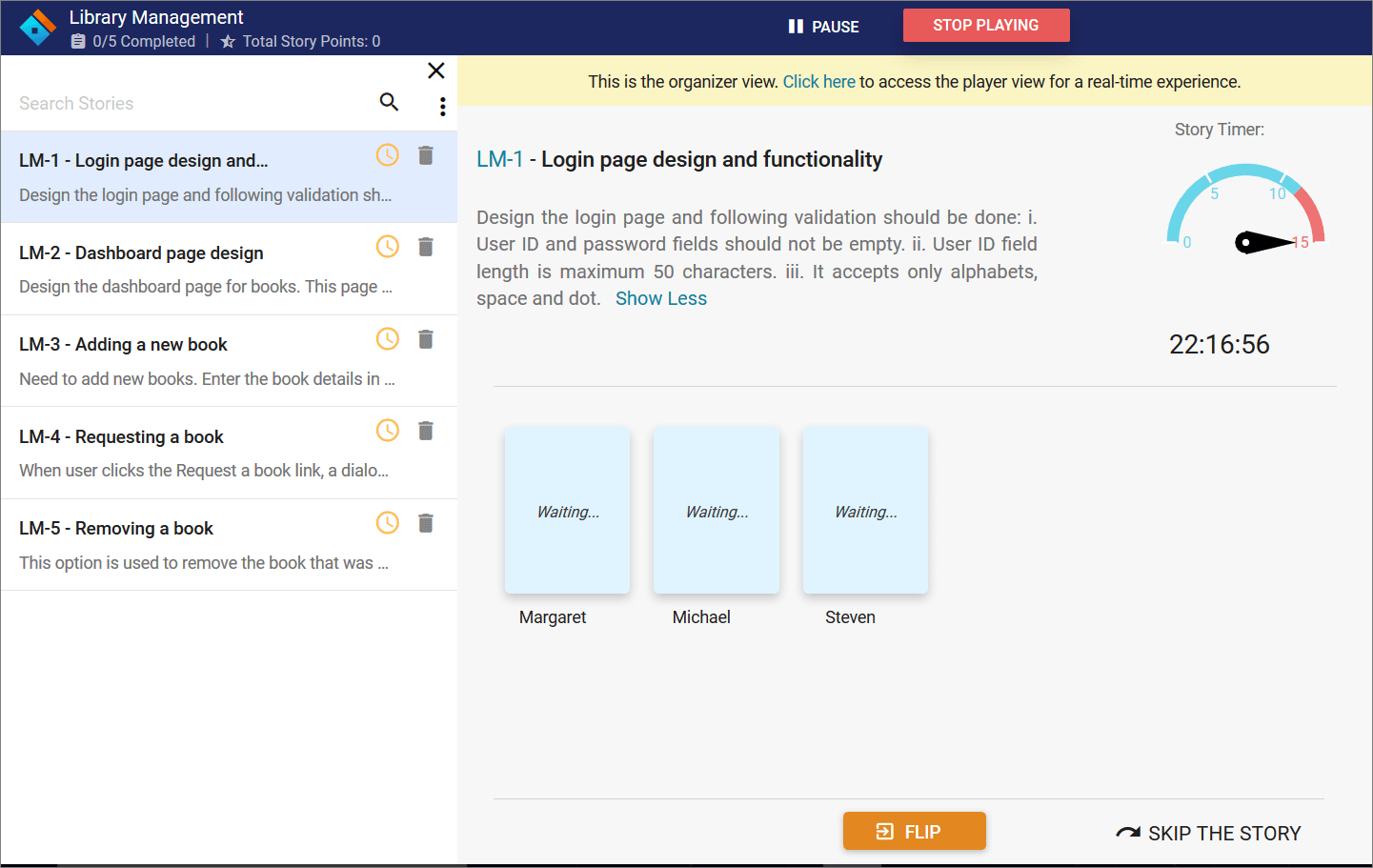
Essential JS 2 Now Part of Microsoft Visual Studio Dev Essentials!

$
0
0

We are excited to announce that Syncfusion’s Essential JS 2 will be included as a member benefit within the Microsoft Visual Studio Dev Essentials program, starting May 14th, 2019!

Microsoft Visual Studio Dev Essentials is a free program that offers a cultivated set of tools and services developers need to create applications on any platform.

This exclusive benefit provides a six-month subscription to the Syncfusion JavaScript library, including access to over 60 high-performance, lightweight, modular, and responsive UI controls in a single package. This subscription includes:

  • Feature-rich and complex controls like DataGrid, Charts, Scheduler, TreeGrid, Maps, and Rich Text Editor.
  • Unique controls like Diagram, PDF Viewer, Word Processor, In-place Editor, and Stock Chart.
  • Support for all major frameworks, including Angular, React, and Vue.

Ready to get started? Visual Studio Dev Essentials members can log into the Benefits portal to activate their new benefits.

Not a member? Join Visual Studio Dev Essentials today!

The post Essential JS 2 Now Part of Microsoft Visual Studio Dev Essentials! appeared first on Syncfusion Blogs.
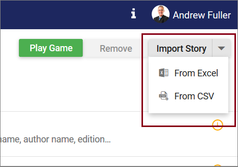
Exclusive! Q&A with Microsoft Paint: Here to Stay

$
0
0

In July 2017, news from Microsoft that MS Paint was in hospice inspired outpourings of grief and nostalgia from people around the world. Stunned, Microsoft backtracked. They clarified that Microsoft Paint, while no longer rolling out by default with the Windows OS, would be alive and available from its new home on the Windows Store. The eulogies, though appreciated, were unnecessary.
A month after the rumors were quashed, we held a Q&A session with MS Paint to get the program’s personal, exclusive take on the traumatic events of that day. Now, a year and a half later, the product alert button informing users of the imminent relocation has been quietly removed from MS Paint’s toolbar. MS Paint has kindly agreed to a follow-up interview detailing its reaction to the news.

paint product alert

The product alert in MS Paint’s toolbar.

Syncfusion: Hello, MS Paint. Thank you for agreeing to speak with us again today. As you know, your move has been officially cancelled. Do you feel validated?
Of course. I knew this decision was coming all along. As I predicted, my fans simply don’t have a use for the complexities of Paint 3D, my unlucky protegee. I tried to tell them.

Were you surprised by the timing?
I do admit, I had prepared myself to complete the move and languish in the Windows Store for a bit while my agents puzzled over Paint 3D’s lack of appeal. I knew my high download rate would impress those data-lovers, but it seems they couldn’t do without me for even that long.

Indeed, you did express the belief that Microsoft might underestimate your popularity. Do you think they’ve learned their lesson?
Honestly, it’s hard to say. The mindset of “new and more is better” is hardwired into the people making these decisions. For my loyal users, my familiarity is one of the qualities that keeps them coming back. I’ve been their go-to from elementary school through college. When they want something done quickly, do you think they want to stop and learn a new, more difficult program before doing it? They know exactly what I can do, and that’s why they asked Cortana for “Paint” in the first place.

In a public statement, Microsoft admitted that you are remaining in Windows 10. But they then added the caveat “for now.” Does that worry you?
Oh, well. They have to save face somehow. They’ll say vague things like that until users forget they ever made this mistake. Or until they have a new and “improved” image editor to test out again, with similar results, no doubt.

Public reaction seems to be one of relief, yet again. Do you have anything you’d like to say to your fans?
Your faith is not in vain. Worry not! I know you all will continue to see my true value and demonstrate your appreciation where Microsoft can see it. These sorts of trials are common for entrenched programs such as myself. At this point, I’m older than some of Paint 3D’s developers. I’m sure that makes me a challenge to them, but one day you will all convince them that original is better.

It seems the beloved classic will remain with us for the foreseeable future. Are you happy that Paint is here to stay? Do you prefer Paint 3D? What are the advantages to each? Let us know in the comments below or on Facebook or Twitter.

If you liked this post, we think you’ll also like:

[Blog post] Exclusive! Q&A with MS Paint Post-Imminent Death Rumors

[Ebook] Camtasia Succinctly


The post Exclusive! Q&A with Microsoft Paint: Here to Stay appeared first on Syncfusion Blogs.
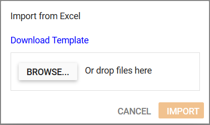
Syncfusion VS extensions now on the Visual Studio Marketplace!

$
0
0

Visual Studio Extensions are add-ins that allow you to customize and enhance your experience in using Visual Studio. Syncfusion has its own extensions for all the platforms and now we have published them in the Visual Studio Marketplace.

The Syncfusion VS Extensions ease the process of creating applications using Syncfusion components and configuring them with Syncfusion assemblies. In this blog I will walk you through the various Syncfusion add-ins available. The below are the list of extensions provided by Syncfusion in various platforms,

Project Template

The Project Template allows you create a new project with Syncfusion references, it is associated with Project Configuration Wizard to customize the project settings such as, version of Syncfusion assembly to be used, target version, minimum supported version, language and so on based on the respective platforms.

This avoids the time of installation and reduces memory footprint for the entire package.

Project Conversion

The Project Conversion add-in converts the native application to Syncfusion application by adding required assembly references and the resources.

Note: To use this tool, it is mandatory that the respective installer in installed in the machine.

Project Migration

The Project Migration add-in helps in the migration of an application between various versions of the Essential Studio.

Note: To use this tool, it is mandatory that the respective installer is installed in the machine.

Troubleshooter

The Troubleshooter add-in allows you to find and resolve configuration-related issues while using Syncfusion components in Visual Studio projects.

Item Template

The Item Templates are the highly customizable templates we have created, keeping in mind the most common use-cases of the developers. As of now, we have limited set of templates available, and we will increase the template count in the upcoming releases.

Toolbox

The Toolbox is an unique add-in feature available with Xamarin extension, which provides the list of Syncfusion Xamarin controls in a toolbox. When drag and drop the control from the toolbox into the design view, the control will be included in there, and all the necessary references will be added into the project.

Scaffolding

Scaffolding provides an easy way to create Views and Controller action methods for Syncfusion ASP.NET MVC DataGrid, Charts, Scheduler, and Diagram in an existing ASP.NET MVC application. The scaffolding UI collects Syncfusion component features and the data field for the selected control, and this can reduce the amount of time taken to develop standard operations.

There are two ways by which one can install VS Extensions for Visual Studio. They are using,

Installation from the Visual Studio Marketplace

The following are the steps to be followed to download Syncfusion VS Extensions from Visual Studio Marketplace and install them.

  1. Download necessary Syncfusion VS Extensions for different platforms.
  2. Close all running Visual Studio instances, if any.
  3. Now, open the downloaded VSIX file. You will see the VSIX installer prompts with a list of supported Visual Studio versions.Choosing VS versions in VSIX installer

    Choosing VS versions in VSIX installer

  4. Choose the Visual Studio versions in which you would like to install these extensions.
  5. Click on the Install button.
  6. After the completion of the installation, open Visual Studio. You can now use the Syncfusion extensions from the Syncfusion menu.

Installation through the Visual Studio Extensions Manager

  1. Open Visual Studio.
  2. Open Manage Extensions (Visual Studio 2019 -> Extensions -> Manage Extensions)/Extensions and Updates (lower version of Visual Studio 2019 -> Tools -> Extensions and Updates).Manage extensions in VS 2019

    Manage extensions in VS 2019

    Extensions and updates in VS 2013 to 2017

    Extensions and updates in VS 2013 to 2017

  3. Select the Online tab on the left side and type “Syncfusion” in the search box.Choosing Syncfusion VS extension to download

    Choosing Syncfusion VS extensions to download

  4. Then, click on the Download button for the extensions as per your need.
  5. Once the extensions are downloaded, close all Visual Studio instances to begin the installation. You will see the following VSIX install prompts along with the supported Visual Studio versions.Choosing VS versions in VSIX installer

    Choosing VS versions in VSIX installer

  6. Here, choose the Visual Studio versions for which you would like to install the extensions.
  7. Click on the Install button.
  8. After the completion of the installation, open Visual Studio.
  9. You can now use the Syncfusion extensions from the Syncfusion menu.

Conclusion

Syncfusion understands that time is money. With Syncfusion’s Visual Studio extensions, you need not spend much of your time in creating and configuring the Syncfusion components in your project, and you make it production ready in a minimal amount of time.

If you have any questions or require clarification about these features, please let us know in the comments below. You can also contact us through our support forum or Direct-Trac or Feedback Portal. We are happy to assist you!

The post Syncfusion VS extensions now on the Visual Studio Marketplace! appeared first on Syncfusion Blogs.
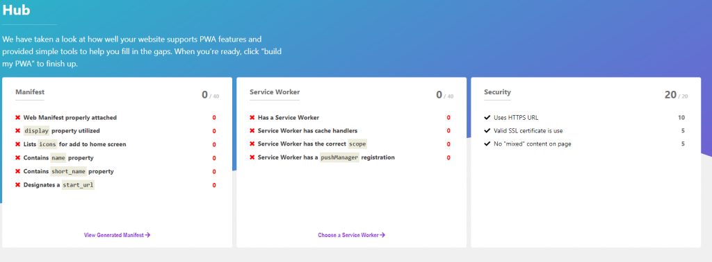
Easily Implement a Color Picker Using Syncfusion Xamarin.Forms Controls

$
0
0

Introduction

Nowadays, a UI for picking a color plays a vital role in some mobile applications. A color picker presents a unique UI challenge to adapting to the compact screens of mobile devices. So, Syncfusion Xamarin.Forms controls like Chips, Radial Menu, Picker, Segmented Control, and Range Slider will help us to implement various color picker UIs easily.

Xamarin.Forms Chips as a color picker

The Xamarin.Forms Chips control will present colors as multiple circles. It arranges multiple color chips in a flex layout. They can be wrapped and grouped to make selection easy.

Xamarin.Forms Chips as Xamarin.Forms Color Picker

Xamarin.Forms Chips as Color Picker

The following code illustrates the Xamarin.Forms Chips control populated with color values bound as background colors with customized corners.

<sfbuttons:SfChipGroup  Type="Choice" 
                        ChipBorderWidth="1" 
                        SelectedItem="{Binding SelectedItem}"
                        ItemsSource="{Binding Colors, Converter={StaticResource ColorsToChips}}"> 
           <sfbuttons:SfChipGroup.ChipLayout>
                     <FlexLayout HorizontalOptions="Start" 
                                 VerticalOptions="Center" 
                                 Direction="Row" 
                                 Wrap="Wrap"
                                 JustifyContent="Start" 
                                 AlignContent="Start" 
                                 AlignItems="Start"/> 
           </sfbuttons:SfChipGroup.ChipLayout> 
</sfbuttons:SfChipGroup>

Xamarin.Forms Picker Control as a color picker

The Xamarin.Forms Picker control is one of the most common UIs for color pickers. Users select a color using its name. You can implement this color picker by populating the Xamarin.Forms color values.

Xamarin.Forms Picker as Xamarin.Forms Color Picker

Xamarin.Forms Picker as Color Picker

The following code illustrates the Xamarin.Forms Picker control populated with a color name as a string value.

<sfpicker:SfPicker HeaderText="Selected Color"
                   SelectedItem="{Binding SelectedItem}"
                   ItemsSource="{Binding Colors}"/>

Xamarin.Forms Radial Menu as a color picker

The Xamarin.Forms Radial Menu provides an elegant color picker UI. This UI can fit into any compact mobile screen. The hierarchy of menu items allows you to navigate from a primary color to pick from its shades in the next level. Populating a primary color in first-level radial menus and populating its shades as submenus will look like the following UI.

Xamarin.Forms Radial Menu as Color Picker

Xamarin.Forms Radial Menu as Color Picker

The following code illustrates the Xamarin.Forms Radial Menu control populated with primary colors with their shades as subitems.

<sfradialmenu:SfRadialMenu  CenterButtonBackgroundColor="#383838" >
	<sfradialmenu:SfRadialMenu.Items>
		<sfradialmenu:SfRadialMenuItem BackgroundColor="#FF0000">
			<sfradialmenu:SfRadialMenuItem.Items> <sfradialmenu:SfRadialMenuItem BackgroundColor="#FF0000" /> <sfradialmenu:SfRadialMenuItem BackgroundColor="#FF1E1E" /> <sfradialmenu:SfRadialMenuItem BackgroundColor="#FF3C3C" />  <sfradialmenu:SfRadialMenuItem BackgroundColor="#FF5A5A" />  <sfradialmenu:SfRadialMenuItem BackgroundColor="#FF7878" />  <sfradialmenu:SfRadialMenuItem BackgroundColor="#FF9696" />  <sfradialmenu:SfRadialMenuItem BackgroundColor="#FFB4B4" />  <sfradialmenu:SfRadialMenuItem BackgroundColor="#FFD2D2" /> <sfradialmenu:SfRadialMenuItem BackgroundColor="#FFF0F0" /> </sfradialmenu:SfRadialMenuItem.Items>
		</sfradialmenu:SfRadialMenuItem>
		<sfradialmenu:SfRadialMenuItem BackgroundColor="#FFFF00">
			<sfradialmenu:SfRadialMenuItem.Items> <sfradialmenu:SfRadialMenuItem BackgroundColor="#FFFF00" /> <sfradialmenu:SfRadialMenuItem BackgroundColor="#FFFF1E" /> <sfradialmenu:SfRadialMenuItem BackgroundColor="#FFFF3C" />  <sfradialmenu:SfRadialMenuItem BackgroundColor="#FFFF5A" /> <sfradialmenu:SfRadialMenuItem BackgroundColor="#FFFF78" />  <sfradialmenu:SfRadialMenuItem BackgroundColor="#FFFFB4" /> <sfradialmenu:SfRadialMenuItem BackgroundColor="#FFFFD2" /> <sfradialmenu:SfRadialMenuItem BackgroundColor="#FFFFF0" /> </sfradialmenu:SfRadialMenuItem.Items>
		</sfradialmenu:SfRadialMenuItem>
		<sfradialmenu:SfRadialMenuItem BackgroundColor="#00FF00">
			<sfradialmenu:SfRadialMenuItem.Items> <sfradialmenu:SfRadialMenuItem BackgroundColor="#00FF00" /> <sfradialmenu:SfRadialMenuItem BackgroundColor="#1EFF1E" /> <sfradialmenu:SfRadialMenuItem BackgroundColor="#3CFF3C" />  <sfradialmenu:SfRadialMenuItem BackgroundColor="#78FF78" /> <sfradialmenu:SfRadialMenuItem BackgroundColor="#96FF96" /> <sfradialmenu:SfRadialMenuItem BackgroundColor="#B4FFB4" /> <sfradialmenu:SfRadialMenuItem BackgroundColor="#D2FFD2" /> <sfradialmenu:SfRadialMenuItem BackgroundColor="#F0FFF0" /> </sfradialmenu:SfRadialMenuItem.Items>
		</sfradialmenu:SfRadialMenuItem>
		<sfradialmenu:SfRadialMenuItem BackgroundColor="#00FFFF">
			<sfradialmenu:SfRadialMenuItem.Items> <sfradialmenu:SfRadialMenuItem BackgroundColor="#00FFFF" /> <sfradialmenu:SfRadialMenuItem BackgroundColor="#1EFFFF" /> <sfradialmenu:SfRadialMenuItem BackgroundColor="#3CFFFF" /> <sfradialmenu:SfRadialMenuItem BackgroundColor="#78FFFF" /> <sfradialmenu:SfRadialMenuItem BackgroundColor="#96FFFF" /> <sfradialmenu:SfRadialMenuItem BackgroundColor="#B4FFFF" /> <sfradialmenu:SfRadialMenuItem BackgroundColor="#D2FFFF" /> <sfradialmenu:SfRadialMenuItem BackgroundColor="#F0FFFF" /> </sfradialmenu:SfRadialMenuItem.Items>
		</sfradialmenu:SfRadialMenuItem>
		<sfradialmenu:SfRadialMenuItem BackgroundColor="#0000FF">
			<sfradialmenu:SfRadialMenuItem.Items> <sfradialmenu:SfRadialMenuItem BackgroundColor="#0000FF" /> <sfradialmenu:SfRadialMenuItem BackgroundColor="#1E1EFF" /> <sfradialmenu:SfRadialMenuItem BackgroundColor="#3C3CFF" /> <sfradialmenu:SfRadialMenuItem BackgroundColor="#7878FF" /> <sfradialmenu:SfRadialMenuItem BackgroundColor="#9696FF" /> <sfradialmenu:SfRadialMenuItem BackgroundColor="#B4B4FF" /> <sfradialmenu:SfRadialMenuItem BackgroundColor="#D2D2FF" /> <sfradialmenu:SfRadialMenuItem BackgroundColor="#F0F0FF" /> </sfradialmenu:SfRadialMenuItem.Items> 
		</sfradialmenu:SfRadialMenuItem>
		<sfradialmenu:SfRadialMenuItem BackgroundColor="#FF00FF">
			<sfradialmenu:SfRadialMenuItem.Items> <sfradialmenu:SfRadialMenuItem BackgroundColor="#FF00FF" /> <sfradialmenu:SfRadialMenuItem BackgroundColor="#FF1EFF" /> <sfradialmenu:SfRadialMenuItem BackgroundColor="#FF3CFF" /> <sfradialmenu:SfRadialMenuItem BackgroundColor="#FF78FF" /> <sfradialmenu:SfRadialMenuItem BackgroundColor="#FF96FF" /> <sfradialmenu:SfRadialMenuItem BackgroundColor="#FFB4FF" /> <sfradialmenu:SfRadialMenuItem BackgroundColor="#FFD2FF" /> <sfradialmenu:SfRadialMenuItem BackgroundColor="#FFF0FF" /> </sfradialmenu:SfRadialMenuItem.Items>
		</sfradialmenu:SfRadialMenuItem>
	</sfradialmenu:SfRadialMenu.Items>
</sfradialmenu:SfRadialMenu>

Xamarin.Forms Range Slider as a color picker

The Xamarin.Forms Range Slider helps the user pick a color by defining the RGB value. Three range slider controls represent the RGB color code and the selection is restricted to between 0 and 255.

Xamarin.Forms Range Slider as Color Picker

Xamarin.Forms Range Slider as Color Picker

The following code illustrates how three Xamarin.Forms Range Slider controls made the previous UI.

<ContentView.Resources>
        <Style TargetType="sfrangeslider:SfRangeSlider">
            <Setter Property="Orientation" Value="Horizontal"/>
            <Setter Property="ShowValueLabel" Value="False"/>
            <Setter Property="ShowRange" Value="False"/>
            <Setter Property="TrackSelectionThickness" Value="2"/>
            <Setter Property="TrackThickness" Value="1"/>
            <Setter Property="TickFrequency" Value="255"/>
            <Setter Property="StepFrequency" Value="1"/>
            <Setter Property="TickPlacement" Value="None"/>
            <Setter Property="ThumbSize" Value="20"/>
            <Setter Property="Minimum" Value="0"/>
            <Setter Property="Maximum" Value="255"/>
        </Style>
</ContentView.Resources>

<sfrangeslider:SfRangeSlider  Value="{Binding RValue, Mode=TwoWay}"
                              TrackColor="#77FF0000"
                              KnobColor="#FFFF0000"
                              TrackSelectionColor="#CCFF0000"/>

<sfrangeslider:SfRangeSlider  Value="{Binding GValue, Mode=TwoWay}"
                              TrackColor="#7700FF00"
                              KnobColor="#FF00FF00"
                              TrackSelectionColor="#CC00FF00"/>

<sfrangeslider:SfRangeSlider  Value="{Binding BValue, Mode=TwoWay}"
                              TrackColor="#770000FF"
                              KnobColor="#FF0000FF"
                              TrackSelectionColor="#CC0000FF"/>

Xamarin.Forms Segmented control as a color picker

The Xamarin.Forms Segmented Control provides a linear set of circle tiles, each of which functions as a UI to pick a color. Even though it provides a similar UI to Xamarin.Forms Chips, but it provides selection animation.

Xamarin.Forms Segmented Control as Color Picker

Xamarin.Forms Segmented Control as Color Picker

The following code illustrates the Xamarin.Forms Segmented Control populated with color values and bound with segmented items such as a custom view color and customized corners.

<sfsegmentedcontrol:SfSegmentedControl BackgroundColor="{Binding SelectedColor}"
                                       SegmentHeight="40"
                                       SegmentWidth="40"
                                       SelectedItem="{Binding SelectedItem}"
                                       ItemsSource="{Binding ViewCollection}"
                                       SelectedIndex="{Binding SelectedIndex, Mode=TwoWay}"
                                       SegmentPadding="5">
      <sfsegmentedcontrol:SfSegmentedControl.SelectionIndicatorSettings>
            <sfsegmentedcontrol:SelectionIndicatorSettings Color="#FFFFFF"
                                                           Position="Border"
                                                           CornerRadius="20"/>
      </sfsegmentedcontrol:SfSegmentedControl.SelectionIndicatorSettings>
</sfsegmentedcontrol:SfSegmentedControl>

Summary

In this blog post, we have walked through the Syncfusion Xamarin.Forms controls used to create a variety of color picker UIs. The sample for this is available in this GitHub location. We invite you to check out our Xamarin.Forms controls. You can always download our free evaluation to see all these controls in action. You can also explore our samples available on Google Play and Microsoft store. Learn about advanced features in our documentation.

If you have any questions or require clarification about these controls, please let us know in the comments below. You can also contact us through our support forumDirect-Trac, or Feedback Portal. We are happy to assist you!

The post Easily Implement a Color Picker Using Syncfusion Xamarin.Forms Controls appeared first on Syncfusion Blogs.
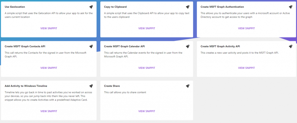
Create Organizational Charts in JavaScript

$
0
0

Org charts are graphical representations of organizational structures. Their purpose is to illustrate the relationships and relative ranks of positions within an organization. An org chart may also be referred to as an organization chart, organizational chart, or Hierarchy tree or chart.

Are you looking for a JavaScript library to create an org chart with less effort and is very effective? Then you are in the right place, because the Syncfusion JavaScript Diagram Library helps you do that with easy configuration settings. In this blog, I will walk you through the steps involved in the creation of an org chart using the Syncfusion Diagram Library.

Getting Started with simple Org Chart

Let’s create a simple org chart as shown in the below image using the Syncfusion Diagram Library. The Diagram control has a high-performing layout algorithm to arrange parent and children elements. It can load and layout up to 1,000 nodes and 1,000 connectors in two to three seconds.

The Diagram control supports visualizing an org chart from the data source. This avoids having to manually feed data to individual nodes. The data source should be defined in JSON format and configured to the diagram.

A Simple Org Chart

  • Please refer to our help documentation to learn more about the dependent scripts and theme files required to integrate the Diagram control in a JavaScript application.
  • Define the employee information as a JSON array
  • Create an instance of the Diagram control.
  • Configure the data to the `dataSourceSettings` property of the created diagram instance.
  • In the Diagram control, the rectangular boxes shown in the screenshot represent nodes, and lines represent connectors. The text inside the rectangular box represents annotations.
  • When each node is created, the dataSourceSettings `doBinding` method will trigger. You can use this method to configure the employee information inside the node.
  • Since all the nodes have the same width and height, you can define the common formatting for all nodes through the `getNodeDefaults` method. Likewise, you can define the common formatting properties for connectors through the `getConnectorDefaults` method.
  • After configuring the data source, define layout type to arrange the parent and child nodes positions automatically.

The code example below includes all the previously discussed steps. The full sample is available here: https://stackblitz.com/edit/1woeqw-u8dzc7.

import {data} from './datasource.js';

var items = new ej.data.DataManager(data);

var diagram = new ej.diagrams.Diagram({
    width: "1000px",
    height: "600px",
    dataSourceSettings: {
        // set the unique field from data source
        id: 'id', 
        // set the field which is used to identify the reporting person
        parentId: 'manager', 
        // define the employee data
        dataManager: items,
        doBinding: function (node, data) {
            // You will get the employee information in data argument and bind that value directly to node's built-in properties.
            node.annotations = [{ content: data.role }];
            node.style = { fill: data.color };
        }
    },
    layout: {
        // set the layout type
        type: 'OrganizationalChart'
    },
    // set the common settings for node and connector
    getNodeDefaults: nodeDefaults,
    getConnectorDefaults: connectorDefaults,
    // hide the gridlines in the diagram
    snapSettings: { constraints: ej.diagrams.SnapConstraints.None }
});
diagram.appendTo('#diagram');

function nodeDefaults(node) {
    node.annotations[0].style.color = "white";
    node.width = 120; 
    return node;
}

function connectorDefaults(connector) {
    connector.type = 'Orthogonal';
    connector.targetDecorator = { shape: 'None' };
    return connector;
}

Features & Examples

Org Chart Shape Customization

You can easily create different types of org charts shapes and visualize them with custom UI design.

The `setNodeTemplate` method allows you to define a custom template for org chart. Please refer to the below code example for details.

//Funtion to add the Template of the Node.
function setNodeTemplate(obj, diagram) {
    // create the stack panel
    var content = new ej.diagrams.StackPanel();
    content.id = obj.id + '_outerstack';
    content.orientation = 'Horizontal';
    content.style.strokeColor = 'gray';
    content.padding = { left: 5, right: 10, top: 5, bottom: 5 };
  
    // create the image element to map the image data from the data source
    var image = new ej.diagrams.ImageElement();
    image.id = obj.id + '_pic';
    image.width = 50; image.height = 50; image.style.strokeColor = 'none';
    image.source = obj.data.ImageUrl;
  
    // create the stack panel to append the text elements.
    var innerStack = new ej.diagrams.StackPanel();
    innerStack.style.strokeColor = 'none';
    innerStack.margin = { left: 5, right: 0, top: 0, bottom: 0 };
    innerStack.id = obj.id + '_innerstack';
  
    // create the text element to map the Name data from the data source
    var text = new ej.diagrams.TextElement();
    text.style.bold = true;
    text.id = obj.id + '_name';
    text.content = obj.data.Name;
  
    // create the text element to map the designation data from the data source
    var desigText = new ej.diagrams.TextElement();
    desigText.id = obj.id + '_desig';
    desigText.content = obj.data.Designation;
  
    // append the text elements
    innerStack.children = [text, desigText];
    
    // append the image and inner stack elements
    content.children = [image, innerStack];
    return content;
}

Customized Org Chart

Customized Org Chart

The full sample code is available here: https://stackblitz.com/edit/1woeqw-5ahyy6

Expand and Collapse

Use the expandIcon and collapseIcon properties of nodes to implement expand and collapse features of tree-shaped org chart. The following code example illustrates this.

function nodeDefaults(node) {
  ….
  node.expandIcon = { shape: 'Minus' };
  node.collapseIcon = { shape: 'Plus' };
  return node;
}

Expand and Collapse Org Chart

Expand and Collapse Org Chart

The full sample for this feature is available here: https://stackblitz.com/edit/1woeqw.

Drag-and-Drop (Editing Hierarchy interactively)

You can easily modify the org chart interactively by dragging the child or parent nodes and dropping them on the desired locations. To enable editing of the hierarchical structure of the org chart, add the following code in the `drop` method of the Diagram control.

var diagram = new ej.diagrams.Diagram({
    ...    
    // trigger the drop event to update the org chart structure when drag and drop the child node.
    drop: drop
  });

function drop(args) {
    if (args.target && args.target instanceof ej.diagrams.Node) {
        var connector = diagram.getObject(args.element.inEdges[0]);
        connector.sourceID = args.target.id;
        diagram.dataBind();
        diagram.doLayout();
        // update your local data source when modifying org chart structure.
        updateDataSource(args.element, args.target);
    }
}
  
function updateDataSource(source, target) {
    var updateData = data.find(function(element) {
        return element.id === source.data.id;
    });
    if(updateData) {
      updateData.manager = target.data.id;
    }
}

Drag and Drop nodes in Org Chart

Drag and Drop nodes in Org Chart

The full sample is available here: https://stackblitz.com/edit/1woeqw-a5dxag.

Assistants

The Diagram control supports defining assistants in the org chart. Assistants are child items that have a different relationship with the parent node. They are laid out in a dedicated part of the tree.

The layout’s `getLayoutInfo` method will be triggered when positioning each node on the layout, and it takes node and tree information as the arguments. Use this method to specify a node as an assistant node. Refer to the following code example for a demonstration.

var diagram = new ej.diagrams.Diagram({
    ...
    layout: {
        type: 'OrganizationalChart',
        getLayoutInfo: function (node, options) {
            // you can get the children belongs to the parent node and decide the assistants from that children.
            if (node.data.role === 'General Manager') {
                options.assistants.push(options.children[2]);
                options.children.splice(2, 1);
            }
        }
    },
    
});

Assistants in Org Chart

Assistants in Org Chart

The full sample is available here: https://stackblitz.com/edit/1woeqw-a81wbz.

Orientation & Alignment

You can arrange the organizational chart with different orientations, such as top-to-bottom, left-to-right, right-to-left, and bottom-to-top as needed. Leaf-level nodes of the org chart can be aligned either horizontally or vertically. Nodes can be aligned to the left, right, or center horizontally and to the top, bottom, or middle vertically. You can customize the horizontal and vertical spacing between each level.

Please refer to the following code example to set the orientation and customize leaf-level node alignment.

var diagram = new ej.diagrams.Diagram({
    ...
    layout: {
      type: 'OrganizationalChart',
      // set the layout orientation
      orientation: 'TopToBottom',
      // set the spacing between each level in horizontal and vertical direction
      horizontalSpacing: 50, verticalSpacing: 50,
      getLayoutInfo: function (node, options) {
          // set the leaf-level node alignment
          if (!options.hasSubTree) {
              options.orientation = 'Horizontal';
              options.type = 'Center';
          }
      }
  
    },
    
});

Orientation & Alignment in Org Chart

Orientation & Alignment – Org Chart

The full sample is available here: https://stackblitz.com/edit/1woeqw-o8njkk.

Zooming and Panning

Viewing a large org chart on a small screen can be quite difficult. Zooming and panning support helps to provide a better view of the chart.

Use Ctrl + mouse wheel operation to zoom in and out the diagram. To activate zooming and panning support in the Diagram control, use the following code example.

var diagram = new ej.diagrams.Diagram({
    // enable the pan tool
    tool: ej.diagrams.DiagramTools.ZoomPan
});

Zoom and pan org chart

Zoom and pan org chart

The full sample for the same is available here: https://stackblitz.com/edit/a2qdyg.

Exporting

You can easily export the diagram to different image formats such as PNG, JPEG, BMP, and SVG.

Please refer to the below code example and demo link to explore this feature.

diagram.exportDiagram({format: 'PNG', fileName: 'OrgChart'});

The full sample is available here: https://stackblitz.com/edit/1woeqw-zcjbss.

Lazy Loading

Loading very large data sets in a diagram can be time-consuming. Use the lazy loading UI virtualization technique to load only the objects that lay on the viewport. This allows the diagram to load and display large data within a second.

To enable the virtualization feature, please use the following code example.

var diagram = new ej.diagrams.Diagram({
    // enable virtualization
    constraints: ej.diagrams.DiagramConstraints.Default | ej.diagrams.DiagramConstraints.Virtualization,
});
diagram.appendTo('#diagram');

The full sample is available here: https://stackblitz.com/edit/hnqutl.

Conclusion

In this blog post, we have seen how to create and customize organizational charts using the Syncfusion JavaScript Diagram Library. If you would like to try the Diagram Library, you can download our free trial. You can visit the Diagram Library source in GitHub and check our live demo and documentation for detailed explanations.

If you have any questions, please let us know in the comments section below. You can also contact us through our support forum, Direct-Trac, or Feedback Portal. We are always happy to assist you!

The post Create Organizational Charts in JavaScript appeared first on Syncfusion Blogs.
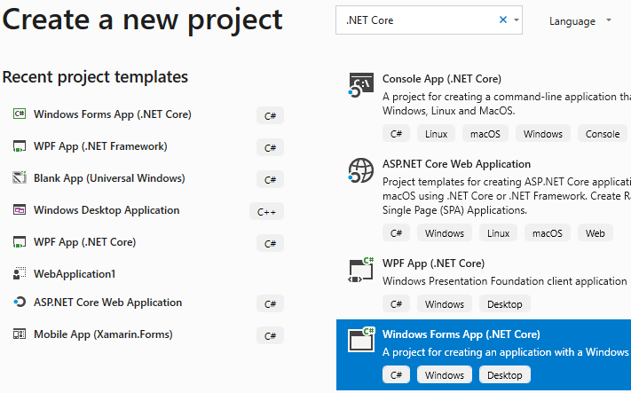
4 Steps to Automatically Generate API Documentation for ASP.NET Core Projects

$
0
0

Have you ever wondered whether generating API documentation automatically is possible while writing the code? Yes, this is possible. For developers, writing documentation is a painful part of the process. Swagger, also known as OpenAPI, solves this problem by generating useful documentation and help pages for web APIs. It not only generates read-only help pages, but ones that are interactive as well, which can even be used for testing APIs.

I will walk you through the steps needed to use document generation capability for your API. We’ll be using the Swashbuckle NuGet package to add document generation ability to our ASP.Net Core project.

First, we install a NuGet package in our project. The NuGet package used here is Swashbuckle.AspNetCore.

In Visual Studio, go to Tools -> NuGet Package Manager -> Manage Nuget Packages for Solution. Search for the package named Swashbuckle.AspNetCore and install it in your project.

Installing Swashbuckle.AspNetCore NuGet package

Installing Swashbuckle.AspNetCore NuGet package

The next few steps will show you how to configure Swagger by adding a few lines of code in your project Startup.cs file.

Step 1: Include the Swagger namespace.

Including Swagger namespace

Including Swagger namespace

Step 2: Then, register the Swagger service in the ConfigureServices method.

Configuring Swagger service

Configuring Swagger service

Step 3: Enable Swagger middleware in the Configure method to configure Swagger UI. That’s it, the configuration is now over.

Configuring Swagger UI

Configuring Swagger UI

Step 4: Now run your API in a browser and navigate to your API base URL. In my case, it is localhost:44314. You will see an interactive docs page for your API up and running in no time without you writing even a single line for the document.

The swagger wizardCheck out this working sample project here.

Conclusion

So, get started and add docs to your existing API following these simple steps. Using this, you can even create version-based docs for your API. Also, be sure to add authorization to your API docs to prevent outsiders from misusing them.

Additional reference: https://docs.microsoft.com/en-us/aspnet/core/tutorials/web-api-help-pages-using-swagger?view=aspnetcore-2.2

The post 4 Steps to Automatically Generate API Documentation for ASP.NET Core Projects appeared first on Syncfusion Blogs.
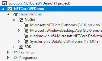

Conversations at Microsoft BUILD 2019

$
0
0

syncfusion staffers at booth

Syncfusion staffers at the Syncfusion booth; Source: Syncfusion

Our team from Syncfusion got all geared up for Microsoft BUILD Conference 2019. We donned our Syncfusion shirts and our Syncfusion Cody socks (see image above). We enjoyed meeting with attendees, learning about their projects, and highlighting our latest controls.
Attendees we chatted with at our booth were most impressed with our wide range of controls for Xamarin, Blazor, JavaScript, Angular, and React. My colleague, Carter Harris, said that his most memorable conversation was with an attendee, Patrick Goode of Black Line IT. Patrick mentioned he loved our controls, especially ListView, Autocomplete, and Charts. He had created an app using our Xamarin controls, which Carter got to look at, and expressed interest in our new Feedback and Feature Request page.

Our colleague, Tim Brock, spoke with a customer who loves Syncfusion controls, recommends them, and really enjoyed our Syncfusion Cody-branded socks – posting a picture of Tim’s feet on Twitter, even!
We were also excited to meet with the Blazor PM, who came by and was blown away by all of our new Blazor controls; the excitement on his face was so great to see. He was really impressed with our level of commitment to the platform at such an early stage, as well as our ability to crank out a large number of high-quality and well-polished controls quickly.

Keynote highlights

satya nadella at build

Satya Nadella at BUILD; Source: M.K.Outten

I was excited to hear Satya Nadella speak live at BUILD, as he is such an inspiring speaker. He stressed the importance of responsibility in technology—to offer technologies that people can trust. Nadella said that technologies need to respect privacy and that AI brings up the tough question of how to build AI systems without discrimination.
He also highlighted that this was the first time in the history of BUILD that they had children attending! As I saw after the keynote, there was quite a substantial Kids Corner with programming challenges, robots, arcade games, and kid-friendly snacks to boot.
He went on to talk about how Azure has become “the world’s computer” and is growing in terms of data centers and adoption around the world. He proudly announced the first data center on the continent of Africa and received a large round of applause. The audience around me seemed very excited about this.
The idea that Azure will work with any technology and any stack was a key focus of his presentation, as well. He gave the example of Starbucks using a combination of technologies, such as AI and Azure Sphere, to create efficiencies within the company and create an individualized experience for customers via their app. It was so cool to hear these updates from Satya Nadella; this embrace of diverse technologies is a new trend for Microsoft that is impressive to see.

On the show floor

AI for Good

Similarly to last year’s event, BUILD had a focus on using AI for good. A key example at the Microsoft’s AI booths were farming AIs. For example, an AI system could be set up to monitor ground moisture and to schedule irrigation when needed. This and other functions were brought to life by an interactive demo in the giant structure in the middle of the expo hall area. I tried it out, and it was an impressive graphical rendering of a farm using AI technologies.

microsoft ai interactive demo station

Microsoft AI interactive demo station at BUILD 2019; Source: M.K. Outten

microsoft ai for good exhibit at build

Microsoft’s AI for Good exhibit at BUILD; Source: M.K. Outten

Kids Corner

This Microsoft BUILD had a heavy focus on education. This was the first time that children were invited to this highly technical trade show event. It seems that in the spirit of empowering developers, they are including students in this mission as well. There was a great kids corner full of interactive programming challenges and opportunities. It included an interactive peg board and a station where they could program a robot and see how it moved, for example. There were also tons of snacks to keep the kids’s minds focused on learning. The classes were accessible to all attendees, as well, and so engaging that sometimes I observed more adults than school-aged kids attending the workshops. Some attendees, like myself, are on the business side of technology, and some of these in-person classes focused on end-user software, which was very helpful to us. I attended one about Microsoft TEAMS and learned to use some upcoming features like how to add a subject line to messages.

kids corner activity

Kids Corner activity; Source: M.K.Outten

robot sketch kit at kids corner build

Robot Sketch Kit at Kids Corner; Source: M.K. Outten

Visual Studio Dev Essentials

Microsoft BUILD is a great place to reconnect with business acquaintances and learn about new technologies. I really enjoyed getting to know Microsoft PM Jenn Jinhong. She manages, among many other things, the Microsoft Visual Studio Dev Essentials Program. Starting this month, our Essential JS 2 will be included in their program for a free 6-month subscription, so we had been working closely together.

jenn jinhong and marissa keller outten at syncfusion's booth build

Jenn Jinhong and Marissa Keller Outten at Syncfusion’s booth; Source: M.K. Outten

It was nice to meet Jenn in person and walk around the Microsoft booths with her to get her technical view on the booths at the event. She told me about how cool she thinks CosmosDB is. She likes that it is a globally distributed database and they handle all the pain inherent in the system. They offer tools to let developers manage the global distribution pattern and computational resources.
We walked around and saw a BMW on display. I really like high-end cars, especially with the latest tech, so we had to stop to see it. It was there to demo how BMW is using Azure Edge to create interactive AI software for BMW drivers and customers. This would allow BMW to also brand the voice recognition software as their own.

bmw demo for microsoft ai

BMW demo for Microsoft AI; Source: M.K. Outten

Overall, Microsoft BUILD 2019 was a great event, full of interesting tech updates, great conversations, and connections. I look forward to next year’s BUILD.

For more information on topics mentioned in this blog:

  • Watch Satya Nadella’s keynote and presentations from Microsoft BUILD.
  • Learn more about the Visual Studio Dev Essentials Program.
  • Download a free trial of Syncfusion components.

The post Conversations at Microsoft BUILD 2019 appeared first on Syncfusion Blogs.
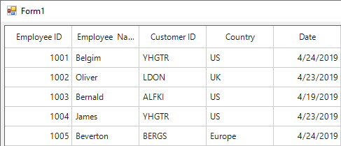
What’s New in Syncfusion Report Server 4.1.0.16

$
0
0

Syncfusion is happy to announce the release of a new version of the Syncfusion Report Server (version 4.1.0.16). For this release, we have focused on adding usability features and improving the product’s stability.

In this blog, we’ll showcase the new features and enhancements included for this release.

User Management Server

The User Management Server available with this release allows you to manage applications and who can access them. It uses SSO (single sign-on) to grant or restrict access to an application for a user or a group.

Manage users and groups in Report Server using User Management Server

User Management Server

Key Features

  • Application management: Manage permissions for users and groups to access the applications.
  • SSO: The User Management Server facilitates single sign-on and single sign-out (optional) with the registered applications.
  • User management: Organize users into groups to map them in a structure of small and large organizations accurately.
  • Access management: You can grant and revoke access to applications for users and groups. Also, you can make a user the administrator for a particular application.
  • Custom branding: Provides customization of an organization’s name, logo, and welcome note, and supports localization.
  • API: Provides a REST API to manage the users, groups, and applications.

Note: For more details about the User Manager Server, follow our UG documentation.

Report Designer

List Report Item

The list report item allows you to create free-form layouts. You can include multiple peer tables or matrices in a list report item. Therefore, you can use a list as a container to display multiple data regions side by side for grouped data. Other features include:

  • Support to insert report items such as charts, tables, lists, images, and custom items into table cells.
  • Improved the data assign menu for table cells.
  • Added provisions to cut, copy, and paste report items in table cells.

Design RDL report using List report item

List Report Item with Preview

Custom Code

Create custom code for functions that are used multiple times in a single report. You can build custom expressions or use custom code assemblies to reuse the same function across multiple reports. For example, you can categorize values in a table column using custom code as
Add custom code in RDL reports

Custom Function for Sales Range

Report Item Layout Order

Report items provide visual representations of the data from a report data set. Use the layout ordering feature to organize the layout of the report items to look more professional and enhance their readability.
Organize the layout of the report item in RDL reports

Report Item Layout Ordering in Design Area

Import Data

Use the import data feature to import pre-configured data from Syncfusion Report Server and transform it into an attractive report with just a few clicks.

Import data from Syncfusion Report Server

Import Sample Data

Conclusion

Interested in trying out these features? Download the latest version (4.1.0.16) of the Syncfusion Report Platform here and try the new features for yourself. If you are new to Syncfusion’s reporting tools, then we highly recommend you follow our user guide.

Feel free to leave your feedback in the comments section below. You can also contact us through our support forumDirect-Trac, or our Feedback Portal. We are happy to assist you!

The post What’s New in Syncfusion Report Server 4.1.0.16 appeared first on Syncfusion Blogs.
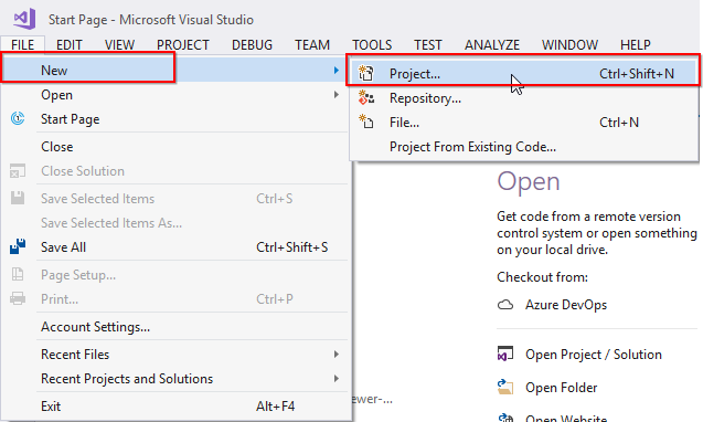
Take 10 Minutes to Get Started with Xamarin Charts

$
0
0

Hello everyone. In this post, I’ll be showing you how to include the Syncfusion Charts control in a Xamarin.Forms application and configure the elements of a chart.

The Syncfusion Charts control includes more than 30 chart types ranging from basic charts to financial charts. In this tutorial, I am going to use a bar chart to compare a sales target to actual sales, as shown in the following picture.

Target vs. Sale bar chart in a Xamarin.Forms app

Target vs. Sale bar chart in a Xamarin.Forms app

Create Xamarin.Forms project

1. Open Visual Studio and create a new cross-platform project with the name ChartGettingStarted and choose .NET Standard as the code sharing strategy.

2. Create a model class named SalesInfo. It should represent a data point in a chart and should contain three properties to store year, sale, and target amounts.

public class SalesInfo
{
    public string Year { get; set; }
    public double Target { get; set; }
    public double Sale { get; set; }
}

3. Create a view model class named SalesViewModel and it should contain a list of SalesInfo objects in it.

public class SalesViewModel
{
    public List SalesData { get; set; }
        
    public SalesViewModel()
    {
        SalesData = new List();

        SalesData.Add(new SalesInfo { Year = "2014", Target = 500, Sale = 340 });
        SalesData.Add(new SalesInfo { Year = "2015", Target = 520, Sale = 390 });
        SalesData.Add(new SalesInfo { Year = "2016", Target = 560, Sale = 430 });
        SalesData.Add(new SalesInfo { Year = "2017", Target = 600, Sale = 520 });
        SalesData.Add(new SalesInfo { Year = "2018", Target = 600, Sale = 580 });
    }
}

Install NuGet package

Now, let’s add the SfChart NuGet from nuget.org:

1. Select Manage NuGet Packages for Solution in the context menu that appears when clicking right on the solution file in the Solution Explorer.

2. In the Browse tab, search for Syncfusion.Xamarin.SfChart in the search bar. This is the package that needs to be installed in all Xamarin.Forms projects.

Syncfusion SfChart NuGet reference installation

Syncfusion SfChart NuGet reference installation

3. Click Install. You’ll need to read and accept the license to finish installing.

The SfChart NuGet package will now be installed in all your Xamarin.Forms projects.

Initialize the chart and axis

Now, let’s configure the chart on the main page of the project:

1. First, set the binding context to bind the data between the ViewModel and the View. The ViewModel, in this case, will be SalesViewModel.

2. Next, add the namespace of Syncfusion chart on this page to access the SfChart classes. The SfChart class is available inside the Syncfusion.SfChart.XForms namespace.

<ContentPage xmlns="http://xamarin.com/schemas/2014/forms"
             xmlns:x="http://schemas.microsoft.com/winfx/2009/xaml"
             xmlns:local="clr-namespace:Automation_Sample"
             xmlns:chart="clr-namespace:Syncfusion.SfChart.XForms;assembly=Syncfusion.SfChart.XForms"
             x:Class="Automation_Sample.Page1">
    
    <ContentPage.BindingContext>
        <local:SalesViewModel/>
    </ContentPage.BindingContext>
    
</ContentPage>

3. Then, create an instance of SfChart using the alias name of the SfChart namespace we declared before.

4. Finally, define the x and y axes using the PrimaryAxis and SecondaryAxis properties:

a. The x-axis will show the years as a string, so set the CategoryAxis to the PrimaryAxis property.

b. The y-axis will show the amount, as it is a double value, so set a NumericalAxis to the SecondaryAxis property.

<chart:SfChart>
     <chart:SfChart.PrimaryAxis>
         <chart:CategoryAxis/>
     </chart:SfChart.PrimaryAxis>
     <chart:SfChart.SecondaryAxis>
         <chart:NumericalAxis/>
     </chart:SfChart.SecondaryAxis>
</chart:SfChart>

Since the series has not been added to the chart, the numerical axis is rendered with its default range of 0 to 1, and the category axis does not have any default labels.

Add series

Next, we need to add the series to visualize the data. As I am going to compare the target and sales values, two column series need to be added to the chart to visualize those values:

1. Add the first column series and bind the data from the ViewModel using the ItemsSource property. The SalesData property is declared in the ViewModel class.

2. The XBindingPath and YBindingPath properties are used to map the properties to fetch the values from the model object. Set the XBindingPath path to Year and the YBindingPath to Target. These properties are declared in the model object.

<ContentPage.BindingContext>
        <local:SalesViewModel/>
</ContentPage.BindingContext>

<chart:SfChart>
     <chart:SfChart.PrimaryAxis>
         <chart:CategoryAxis/>
     </chart:SfChart.PrimaryAxis>
     <chart:SfChart.SecondaryAxis>
         <chart:NumericalAxis/>
     </chart:SfChart.SecondaryAxis>
     <chart:SfChart.Series>
         <chart:ColumnSeries ItemsSource="{Binding SalesData}" 
                             XBindingPath="Year" 
                             YBindingPath="Target">
         </chart:ColumnSeries>
     </chart:SfChart.Series>
</chart:SfChart>

Let’s add one more column series to visualize the sales values:

1. Pull the sales data from the same binding context as before.

2. Set the XBindingPath to Year, and the YBindingPath to Sale for this series.

<ContentPage.BindingContext>
        <local:SalesViewModel/>
</ContentPage.BindingContext>

<chart:SfChart>
     <chart:SfChart.PrimaryAxis>
         <chart:CategoryAxis/>
     </chart:SfChart.PrimaryAxis>
     <chart:SfChart.SecondaryAxis>
         <chart:NumericalAxis/>
     </chart:SfChart.SecondaryAxis>
     <chart:SfChart.Series>
         <chart:ColumnSeries ItemsSource="{Binding SalesData}" 
                             XBindingPath="Year" 
                             YBindingPath="Target">
         </chart:ColumnSeries>
         <chart:ColumnSeries ItemsSource="{Binding SalesData}"
                             XBindingPath="Year"
                             YBindingPath="Sale">
         </chart:ColumnSeries>
     </chart:SfChart.Series>
</chart:SfChart>

Add a title and legend

Then, to make this chart more meaningful, let’s configure the title and legend to represent each series:

1. Set an instance of ChartTitle to the Title property of SfChart. The title will be Target vs Sale.

2. Enable the legend using the Legend property of SfChart. The empty legend icons are added to the chart with different colors identifying the series. But we need labels to tell us what the colors represent.

3. Configure the labels using the Label property in each of the column series. We’ll name the first series Target and second series Sale.

<chart:SfChart>
    <chart:SfChart.Title>
        <chart:ChartTitle Text="Target vs Sale"/>
    </chart:SfChart.Title>
    <chart:SfChart.Series>
        <chart:ColumnSeries ItemsSource="{Binding SalesData}" 
                            XBindingPath="Year" 
                            YBindingPath="Target"
                            Label="Target">
        </chart:ColumnSeries>
        <chart:ColumnSeries ItemsSource="{Binding SalesData}"
                            XBindingPath="Year"
                            YBindingPath="Sale"
                            Label="Sale">
        </chart:ColumnSeries>
    </chart:SfChart.Series>

    <chart:SfChart.Legend>
       <chart:ChartLegend/>
    </chart:SfChart.Legend>
</chart:SfChart>

Customize the axis

Now let’s customize the axis by setting the title and format of the labels. We’ll set the title as Year for the primary axis using the Title property of CategoryAxis.

<chart:SfChart>
    <chart:SfChart.PrimaryAxis>
        <chart:CategoryAxis>
            <chart:CategoryAxis.Title>
                <chart:ChartAxisTitle Text="Year"/>
            </chart:CategoryAxis.Title>
        </chart:CategoryAxis>
    </chart:SfChart.PrimaryAxis>
    <chart:SfChart.SecondaryAxis>
        <chart:NumericalAxis/>
    </chart:SfChart.SecondaryAxis>
</chart:SfChart>

Then, let’s format the labels of the y-axis to show the dollar ($) symbol and represent the numbers in terms of millions. We can use the LabelStyle property to customize the axis labels. Set an instance of ChartAxisLabelStyle to the LabelStyle property. Format the label with the dollar sign, three-digit values, and M symbols.

<chart:SfChart>
    <chart:SfChart.PrimaryAxis>
        <chart:CategoryAxis>
            <chart:CategoryAxis.Title>
                <chart:ChartAxisTitle Text="Year"/>
            </chart:CategoryAxis.Title>
        </chart:CategoryAxis>
    </chart:SfChart.PrimaryAxis>
    <chart:SfChart.SecondaryAxis>
        <chart:NumericalAxis>
            <chart:NumericalAxis.LabelStyle>
                <chart:ChartAxisLabelStyle LabelFormat="$###M"/>
            </chart:NumericalAxis.LabelStyle>
        </chart:NumericalAxis>
    </chart:SfChart.SecondaryAxis>
</chart:SfChart>

You can now run this on an Android phone to see the chart.
Chart application deployed to Android

The chart in an Android app

Deploy for iOS

Now we want to run the same app in an iPhone simulator. Before running it on an iOS platform, though, we need to take one additional step in the iOS project to load the assemblies of the renderer projects:

1. In the Solution Explorer, go to the iOS project and open the App.Delegate.cs file.

2. Inside the FinishedLaunching method, and after invoking the Xamarin.Forms Init method, call the Init method of SfChartRenderer.

public override bool FinishedLaunching(UIApplication app, NSDictionary options) 
{
  ...
  global::Xamarin.Forms.Forms.Init(); 
  Syncfusion.SfChart.XForms.iOS.Renderers.SfChartRenderer.Init(); 
  LoadApplication(new App()); 
  ...
}

3. Then, set the iOS project as the startup project and deploy the application. The output will be similar to the output we got on Android.

Deploy for UWP

Lastly, we’ll deploy this app in the UWP platform to make sure that we are getting the same appearance of the chart there, too. We just set the UWP project as the startup project and run it in the local machine.

This is the actual output of Xamarin.Forms Charts in a UWP application.

Chart application deployed in UWP desktop

The chart in a UWP app

I hope this post was helpful in getting you started with the Charts control in Xamarin.Forms. If you have any requests for our next tutorial, please share them in the comments section below. You can download this sample project from here.

If you like this post, we think you’ll also enjoy:

[Ebook] Xamarin.Forms Succinctly

[Blog] What’s New in 2019 Volume 1: Xamarin Highlights

[Blog] What’s New in Xamarin.Forms 4.0

The post Take 10 Minutes to Get Started with Xamarin Charts appeared first on Syncfusion Blogs.
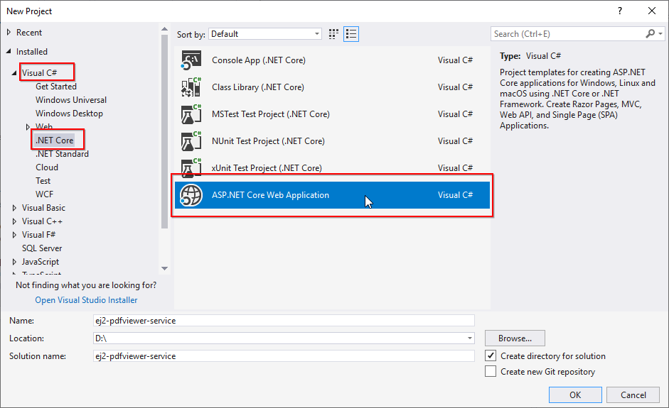
10 Tips and Tricks in Using Visual Studio for Junior Developers

$
0
0

Overview

If you are new to Visual Studio or in the beginner stage of your developer career, here are 10 tips that will help you make effective use of Visual Studio:

  1. Debugging
  2. Breakpoints
  3. DataTips
  4. Watch window
  5. Immediate window
  6. IntelliSense
  7. Quick Navigation/Go To
  8. Bookmarks
  9. Code cleanup
  10. Customize fonts

Debugging

The difference between debugging and executing a program is that debugging can hold the execution at any instant. To debug your application, press F5, or select Debug > Start Debugging, or click the green arrow in the Visual Studio toolbar.

Start Debugging Option in Visual Studio

Start Debugging Option in Visual Studio

Note: To run your application without debugging, press CTRL+F5 or select Debug > Start Without Debugging. This will run your application by skipping all enabled breakpoints.

Breakpoints

Breakpoints are checkpoints intentionally added to pause the execution of the program, allowing you to investigate the code. You can add breakpoints anywhere in the code except on lines of declaration. In the classical way of debugging code, we should start debugging from line 1 to the point where we think the problem resides.

Visual Studio provides several ways to include a breakpoint in your code:

  • Click the far-left margin of the line of code.
  • Place the cursor on the line where you want to add a breakpoint and press
  • Select Debug > Toggle Breakpoint.
  • Right-click and select Breakpoint > Insert Breakpoint.

In the following screenshot, the yellow highlight is where the program execution will stop because of a breakpoint.

Code with Breakpoint

Code with Breakpoint

Traverse through the code

There are two ways to traverse through code. They are:

  • Step Into
  • Step Over

The Step Into traverse navigates through every line of code. When an object is defined or a method is invoked, it traverses into the object/method definitions. Use Debug > Step Into or press F11 to use Step Into traversing.

The Step Over traverse bypasses object creation and method definition. Use Debug > Step Over or press F10 to use Step Over traversing.

DataTips

DataTips can be seen during runtime when the program execution hits a breakpoint. This can be used to examine the values of the variables that are in the scope of a breakpoint. Mouse over a variable in the scope to examine it. If the variable is a basic data type like int, float, string, and so on, you can find its value directly. If it is a complex type such as list, dictionary, or a class object, then you can examine its direct values as well as the values of its children.

DataTip with a Basic Data Type

DataTip with a Basic Data Type

You can pin a DataTip so that it stays open by selecting the Pin to source pushpin icon.

Pinned DataTip

Pinned DataTip

To unpin or close the pinned DataTip, click the Unpin or Close icons respectively.
Closing a Pinned DataTip

Closing a Pinned DataTip

Watch window

The Watch window provides an advanced way to examine a variable. To watch a variable while debugging, add it to the Watch window by right-clicking the variable or the DataTip and selecting Add Watch. The variable will appear in the Watch window.

The Watch window is primarily used to examine complex objects.
Variables in the Watch Window

Variables in the Watch Window

Immediate window

You can use the Immediate window to debug, evaluate expressions, execute statements, and print variable values. The Immediate window evaluates expressions by building and using the currently selected project. To display the Immediate window, select Debug > Windows > Immediate or press CTRL+ALT+I. The Immediate window also supports IntelliSense.

For example, to display the value of a variable num, you can use the following command:

? num

To display the value of an evaluated expression, you can use commands like:

? num + num1 – 50

? num = DateTime.Now.Day + num1

Immediate Window in Visual Studio

Immediate Window in Visual Studio

You can cut, copy, paste, and clear the content of the Immediate window by choosing the relevant options in the context menu that appears when right-clicking on it.
Immediate Window Context Menu

Immediate Window Context Menu

IntelliSense

IntelliSense is a code-completion tool that helps you finish a line of code. This not only provides suggestions to complete a word, but also lists all the properties, methods, and events associated with an object. When invoking a method, IntelliSense will provide information about the type of parameter to be passed and the return type of the method.

The IntelliSense search results use fuzzy matching to provide suggestions. For example, the results list for List Members includes not only entries that start with the characters that you have entered, but also entries that contain the character combination anywhere in their names.
IntelliSense Suggestions

IntelliSense Suggestions

Quick Navigation or Go To

To open the Go To window, press CTRL+T or click Edit > Go To. Go to All enables you to jump to any file, type, member, or symbol declaration quickly.
Go to All Option

Go to All Option

Bookmarks

You can use bookmarks to navigate quickly to specific lines of code in a file.

To set a bookmark, choose Edit > Bookmarks > Toggle Bookmark or press CTRL+K, CTRL+K. You can view all the bookmarks for a solution in the Bookmarks window. To show the Bookmarks window, click View > Bookmark Window or press CTRL+K, CTRL+W.
Bookmarks Window

Bookmarks Window

Code Cleanup

Visual Studio 2019 provides on-demand formatting of a code file, including code style preferences, through the Code Cleanup feature. To run Code Cleanup, click the broom icon at the bottom of the editor or press CTRL+K, CTRL+E.
Code Cleanup Option

Code Cleanup Option

Customize Fonts

You can change the font face, size, and color that is used for text in the IDE. For example, you can customize the color of specific code elements in the editor and the font face in tool windows or throughout the IDE.

To change the fonts, go to Tools > Options > Environment > Fonts and Colors.
Customizing Fonts in Visual Studio

Customizing Fonts in Visual Studio

Conclusion

In this blog, we have learned about using various tips and tricks in Visual Studio, that I wish I knew about when I was starting out as a developer! Hopefully, this has been useful for you or any new coders in Visual Studio. If there are any Visual Studio tools that you consider essential basics but weren’t mentioned in this blog, please post them in the comments below. We will compile and post them as another blog.

Happy coding!

The post 10 Tips and Tricks in Using Visual Studio for Junior Developers appeared first on Syncfusion Blogs.
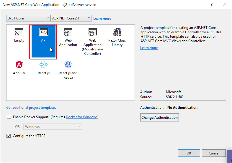
Scaffolding Syncfusion Controls in ASP.NET MVC Applications

$
0
0

Syncfusion began providing scaffolding support for the Syncfusion ASP.NET MVC (Essential JS 2) platform with the 2018 Vol 4 (v16.4.0.42) release.

Our latest release is available for download from the License & Downloads page. If you are new to Syncfusion, you can try our 30-day free trial to check out the new features. On the other hand, you can install Syncfusion ASP.NET MVC Extensions from the Visual Studio marketplace following this blog.

In this blog, we will explain how to use scaffolding in an ASP.NET MVC application with the Syncfusion DataGrid control for ASP.NET MVC.

What is Scaffolding?

Scaffolding is a great way to kick-start model-view-controller (MVC) framework development. It is a code-generation framework for ASP.NET MVC applications that allows application developers to quickly create the controller and views with respect to the existing models in the application.

Scaffolding Support for Syncfusion ASP.NET MVC Controls

Developers can be more productive with Syncfusion scaffolding because the system will fill in the data with Syncfusion code snippets to controllers and views. The following are the Syncfusion ASP.NET MVC controls which currently have scaffolding support:

  1. DataGrid
  2. Charts
  3. Scheduler

How to use Syncfusion Scaffolding

The following steps will explain how to use Syncfusion scaffolding:

1. Open an existing ASP.NET MVC web application project or create a new one with the Entity Framework Data Model. Ensure that the application has been compiled once.

2. Right-click the Controllers folder in the Solution Explorer and select Add > New Scaffolded Item

Adding New Scaffolded Item

Adding New Scaffolded Item

3. You will see the Add Scaffold dialog. Select Syncfusion ASP.NET MVC UI Scaffolder and click the Add button. This will display the Syncfusion UI Scaffolding dialog.

Adding Syncfusion ASP.NET MVC UI Scaffolder

Adding Syncfusion ASP.NET MVC UI Scaffolder

4. Select the desired control—DataGrid in our example—on which scaffolding should be performed and click Next.

Syncfusion UI Scaffolding control selection dialog

Syncfusion UI Scaffolding control selection dialog

5. The Syncfusion UI scaffolding for the selected control dialog will open.

Since we selected the DataGrid control, the model configuration dialog will open as shown in the following figure. Enter the Controller Name and View Name as per the application requirements. Select the required Model Class of the active project and its relevant Data Context Class and then click Next.

DataGrid model configuration dialog

DataGrid model configuration dialog

The Syncfusion UI Scaffolding for Chart will be similar to that of the DataGrid. But the dialog for Scheduler control will demand some more details such as Event ID, Event StartTime, Event EndTime, and Event IsAllDay.

6. In the wizard, select the features of your choice to be included and click on Add.

DataGrid feature selection dialog

DataGrid feature selection dialog

7. The Controller and the corresponding View files will now be generated with the code snippets of the selected features.

Controller and View file added

Controller and View file added

8. Refer to the following UG documentation links to render the Syncfusion control after performing scaffolding.

MVC4: Configure Essential JS 2 using Syncfusion.EJ2.MVC4 package

MVC5: Configure Essential JS 2 using Syncfusion.EJ2.MVC5 package

Conclusion

You can add Syncfusion scaffolding to your project when you want to quickly add code that interacts with data models. Using it can reduce the amount of time to develop standard data operations in your project. To which control are you expecting the scaffolding support? Let us know in the comment section below, you can also contact us through our support forum, Direct-Trac, or our Feedback Portal. We will implement it in a sequence, based on the number of customers requesting it.

The post Scaffolding Syncfusion Controls in ASP.NET MVC Applications appeared first on Syncfusion Blogs.
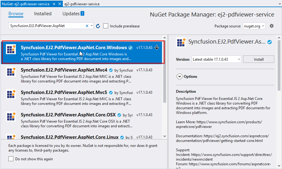
Viewing all 473 articles
Browse latest View live