Quantcast
Channel: Syncfusion Blogs
Viewing all 473 articles
Browse latest View live

Top 10 Most Popular Developer Controls

$
0
0

Which third-party developer controls are the best?

Third-party enterprise components exist for one reason: enterprise applications are complicated, packed with lots of complex pieces that developers don’t want to spend ages building themselves. Because that’s the boring part. Reusable component libraries like ours let you work on the aspects of your app that make it yours. We’ve worked closely with developers to determine their priorities over the years, and we now have over 1,000 controls we know you’re fond of. But which components do developers find most useful in lightening their workloads?

Which would you vote most popular?

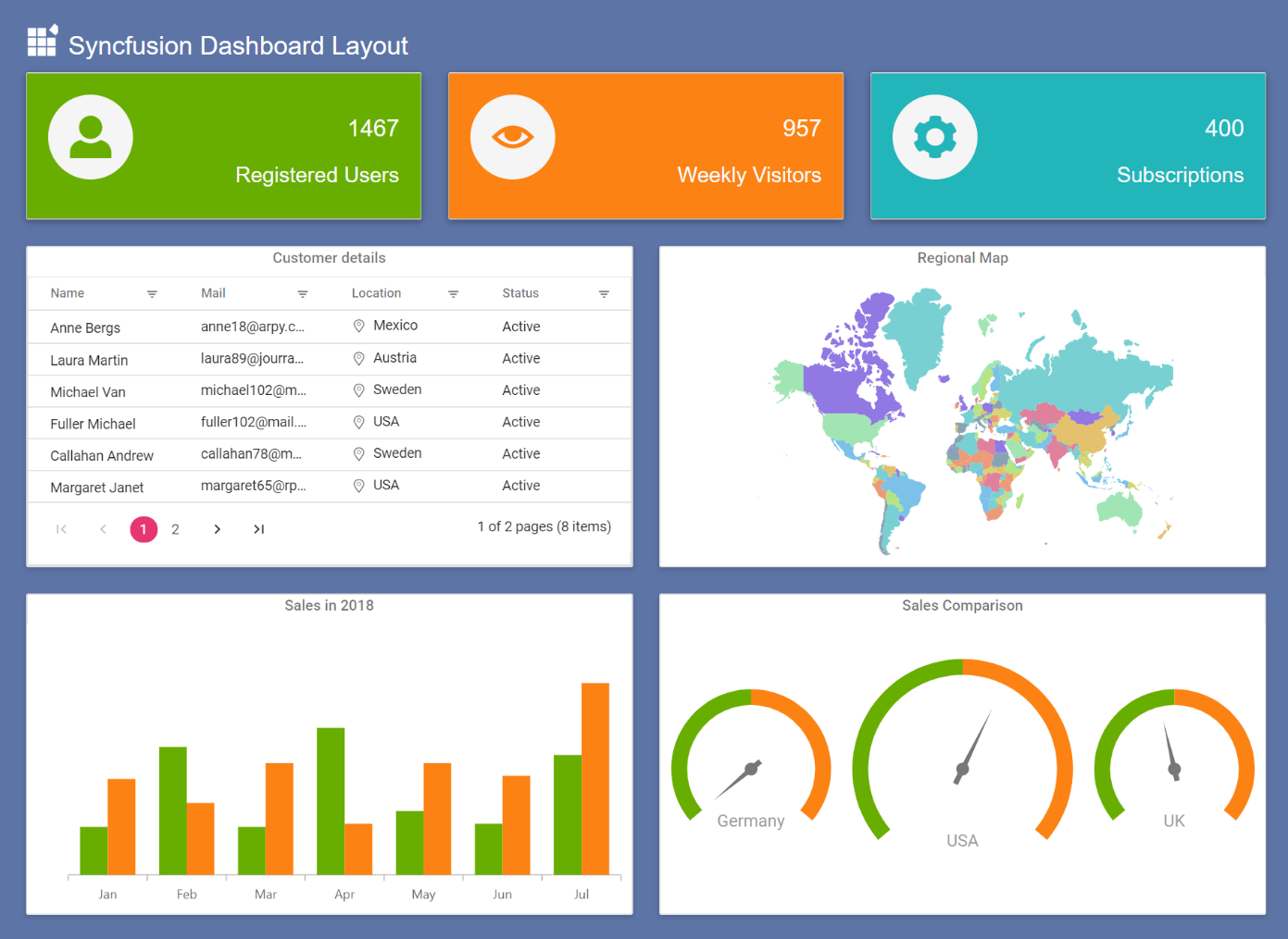
We drudged through our data (OK, we asked Google Analytics) for the top Syncfusion controls by usage in the Xamarin, Angular, JavaScript, WinForms, WPF, and ASP.NET MVC platforms. These are the UI components you use most.
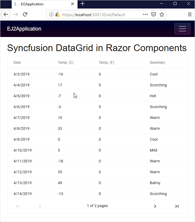
1. DataGrid

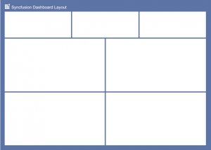
In this popularity contest, DataGrid is homecoming queen. In all platforms, the DataGrid control took one of the top three spots. Desktop developers especially found it essential, putting it in first place.

datagrid shows off its conditional formatting feature

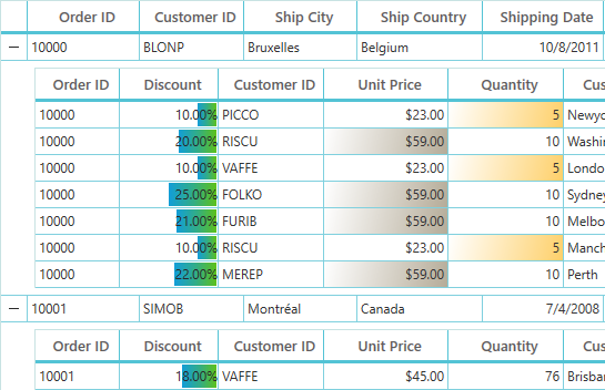
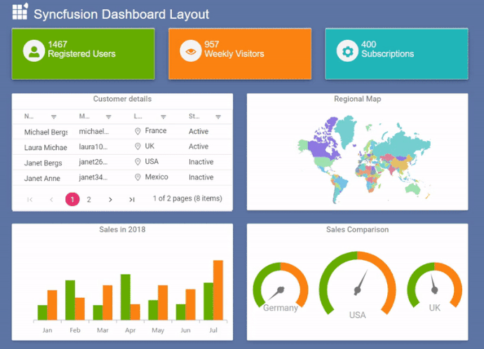
Here, DataGrid shows off its conditional formatting feature. Lovely zap of color there.

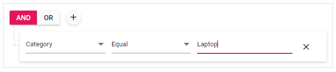
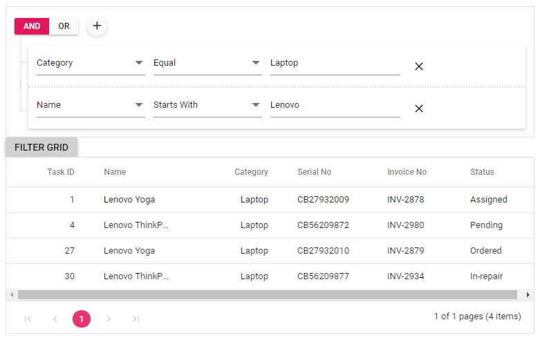
Enterprise applications manage huge amounts of data and need efficient, flexible ways to present it. Luckily our homecoming queen has both style and substance. Don’t let those pretty templates fool you, this DataGrid is quick, loading millions of records instantly, and can handle high-frequency updates even under the most demanding scenarios, sorting and grouping data in real time.

Check out one happy fan’s story in this case study.
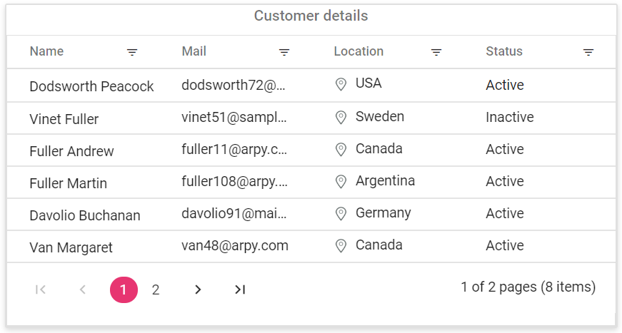
2. Charts

The next crown goes to the Charts control. Though it’s the special darling of Xamarin users, Charts was still only a step behind DataGrid for desktop users, as well.

Colorful pie chart cost breakdown

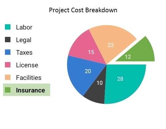
Color coordination, perfect proportions, simple labels: this is what we call a legend.

Featuring over 30 series types, this control can display data in the most suitable way and do it with serious artistic flare. With high-quality interactivity and helpful legends, even ASP.NET MVC and Angular users couldn’t help keeping Charts in their top five for nomination to Syncfusion royalty.

Check out one satisfied fan’s story in this case study.

This control is available for: Angular, ASP.NET Core, ASP.NET MVC, ASP.NET Web Forms, JavaScript, React, Vue, Xamarin, UWP, WPF, and WinForms.

See all the Charts control’s features here: https://www.syncfusion.com/xamarin-ui-controls/charts

3. TreeView

The competition was fierce from here, but numbers have the TreeView control appearing in the top six list of four of the platforms. Although Xamarin users turn up their noses in favor of the List View control, Angular users are particular fans of the TreeView control, ranking it number two.

Treeview check box feature

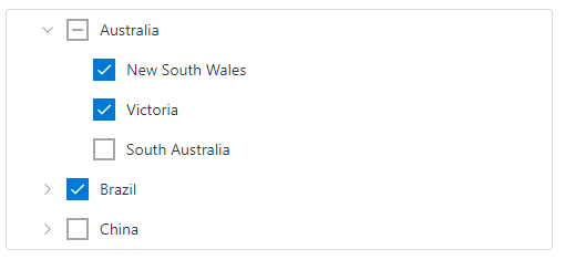
TreeView’s so impressive, you can check all the boxes.

ASP.NET MVC users also highly esteem this control, citing the way it dynamically loads data and supports icons as the height of ingenuity. The values of its hidden depths, they say, are ever expanding. With its expertise in representing hierarchical data with great performance, the TreeView control is a princely addition to the lineup.

Here’s a case study from a pleased TreeView control user.

This control is available for: Angular, ASP.NET Core, ASP.NET MVC, ASP.NET Web Forms, JavaScript, React, Vue, Xamarin, WPF, WinForms.

See all the TreeView control’s features here: https://www.syncfusion.com/angular-ui-components/treeview
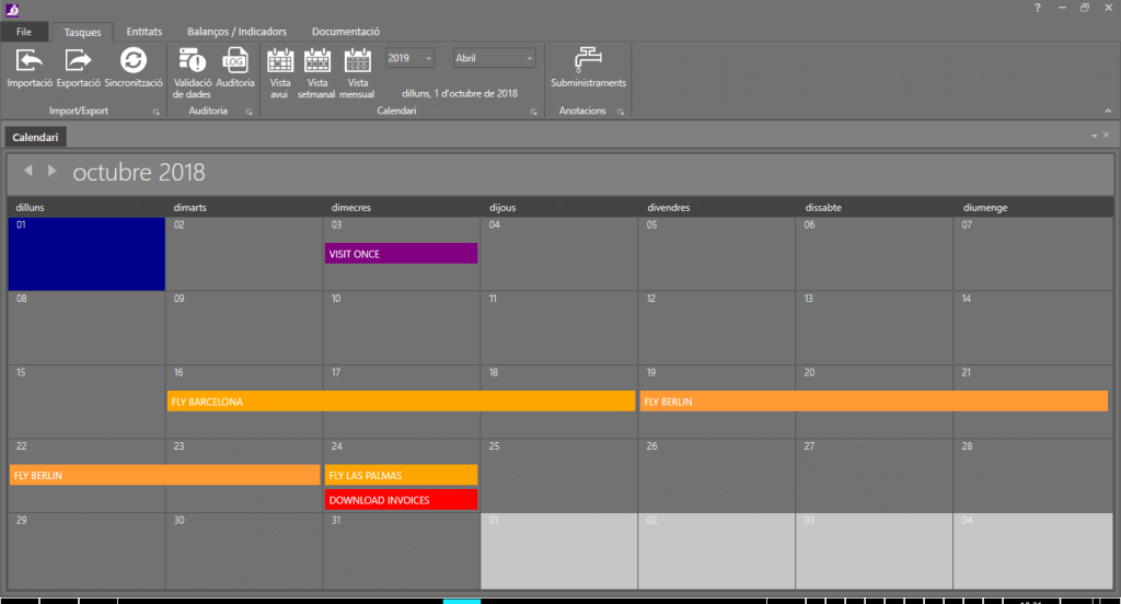
4. Scheduler

For the Scheduler control, our users either love it, or it falls off their radar completely. This organizing control is all about efficiency, and apparently, so are users of the Essential Studio web platforms, who all ranked it their number one. For mobile and desktop developers? It didn’t even make the list.

Adjust first day of week with scheduler control

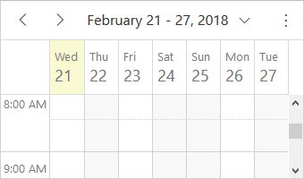
As far as the Scheduler control is concerned, the first day of the week could be any day.

The Scheduler control may be a proper princess when it comes to punctuality, but it also has flexibility down pat. With seven view options, pop-up rescheduling, and a customizable UI, this control keeps customers as on track as they want to be. Web developers know that, one day, desktop and mobile developers will recognize Scheduler’s awesomeness, too.

This control is available for: Angular, ASP.NET Core, ASP.NET MVC, ASP.NET Web Forms, JavaScript, React, Vue, Xamarin, UWP, WPF, and WinForms.

See all the Scheduler control’s features here: https://www.syncfusion.com/jquery/aspnet-core-ui-controls/scheduler

5. Docking Manager

While the top four controls may have dominated the competition, they are backed up by a supporting crew of popular components. In this homecoming court, the Docking Manager control, known better as just “Docking control” to its WPF supporters, is the parade leader.

Docking manager demonstrates complex layouts

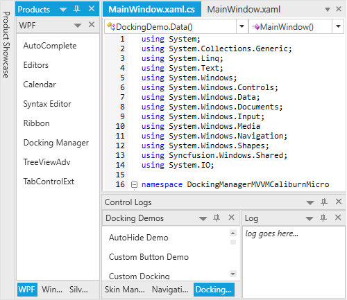
Docking Manager demonstrates one of its complex layouts. Desktop users go wild.

Visual organization is a breeze for Docking Manager with dockable windows that can float about the screen, snap together, or be pinned in place as needed. The control is also a multitasking master. Working with multiple documents at one time is as simple as splitting workspaces with the tab groups feature.

Check out a case study loving on the Docking Manager.

This control is available for: UWP, WPF, and WinForms.

See all the Docking Manager control’s features here: https://www.syncfusion.com/wpf-ui-controls/docking

6. Diagram

JavaScript users are rooting hard for their number two, the Diagram control. WPF and WinForms users also gave it a nod, at fifth and sixth place for those platforms, respectively. The Diagram control is a true people-pleaser, easily adapting itself to your preferences for mapping data.

Create mind map with a diagram control

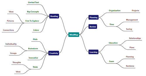
Now, Diagram, that’s a beautiful mind map.

Will you go with the flowchart? Will only a proper organizational chart do for your nodes? Or is a mind map more your bent? Take your pick and the Diagram control is there to automatically lay out your data for you. Tweak your symbol and connector shapes to your heart’s content. The Diagram control aims to please and always appreciates your vote.

See this case study by one of the Diagram control’s first fans.

This control is available for: Angular, ASP.NET Core, ASP.NET MVC, ASP.NET Web Forms, JavaScript, React, Vue, Xamarin, UWP, WPF, and WinForms.

See all the Diagram control’s features here: https://www.syncfusion.com/jquery/javascript-ui-controls/diagram
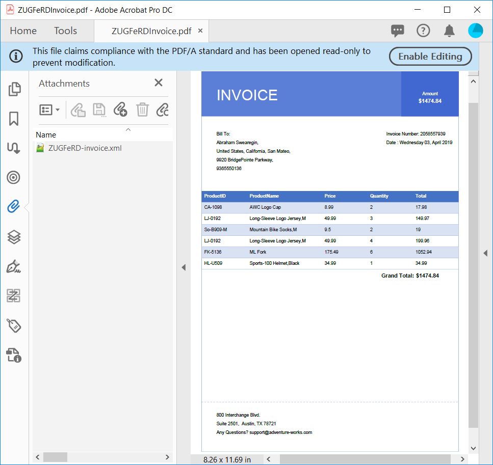
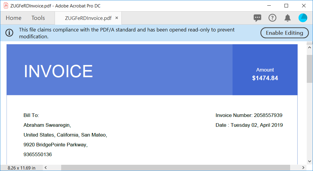
7. PDF Viewer

The desktop user crowd pushes up one of its favorites to seventh place, the PDF Viewer. Dealing with PDFs can be annoying, but it’s a common and inevitable necessity. Syncfusion’s PDF Viewer comes to the rescue to whip those PDF documents into shape.

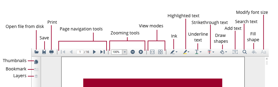
Fab features for freedom from frustration.

Well, actually, PDF Viewer just gives you a really nice toolbar to whip those documents into shape yourself, which is more useful, anyway. Equip yourself with annotation, navigation, and conversion methods and the ability to print and fill forms to build your confidence. Then watch those PDFs go from nuisances to effective mediums.

This control is available for: Angular, ASP.NET Core, ASP.NET MVC, ASP.NET Web Forms, JavaScript, React, Vue, Xamarin, UWP, WPF, and WinForms.

See all the PDF Viewer control’s features here: https://www.syncfusion.com/wpf-ui-controls/pdf-viewer

8. ListView

As mentioned previously, our Xamarin users insist on the superiority of our ListView control, even if no other platform’s users agree. They see the awesome (mostly because tree views are not awesome on mobile screens).

Listview control paging feature

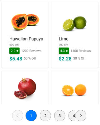
The ListView control puts its paging feature up for show in a campaign against papayas.

For Xamarin users, ListView shows them vertical or horizontal orientations, linear or grid views, and has rewarded their appreciation with lots of mobile-specific features like view swiping and pull-to-refresh. With other platforms, this control is a bit shyer in features, but Xamarin users are all right with it being their control and will continue to vote for it, anyway.

This control is available for: Angular, ASP.NET Core, ASP.NET MVC, ASP.NET Web Forms, JavaScript, React, Vue, Xamarin, and WinForms.

See all the ListView control’s features here: https://www.syncfusion.com/xamarin-ui-controls/listview

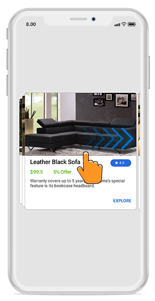
9. MultiSelect Dropdown

The MultiSelect Dropdown control has a solid base of support, earning fourth place on the lists of both Angular and ASP.NET MVC platform users. Sometimes, basic is best. This control may not be flashy, but its steady usefulness in apps keeps it in the spotlight of this contest.

Multiselect dropdown control improves filtering and searching

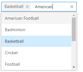
The MultiSelect DropDown control prefers picky people.

This control is a team player. Templates are its favorite way to display unity, so it offers plenty, as well as category grouping if a team gets too big to be functional. Extensive features help you be picky when it counts. When choosing items for your group, you need to be quick and accurate, so MultiSelect Dropdown recommends its filtering, searching, and sorting options, but assures fans that custom tagging is also possible.

This control is available for: Angular, ASP.NET Core, ASP.NET MVC, JavaScript, React, Vue, UWP, and WPF.

See all the MultiSelect Dropdown control’s features here: https://www.syncfusion.com/angular-ui-components/multiselect-dropdown

10. HTML Viewer

Another niche favorite is the HTML Viewer control, a browser alternative held on the shoulders of WinForms fans, and carried up to third place on their platform’s own list, strong enough to come in at number ten overall.

HTML viewer displays UI with event bubbling

The HTML Viewer breaks out the bubbles to efficiently display a UI.

You won’t find any dependence on other browsers with this control, but you will find support for CSS, web-related functionalities, and creating custom controls with custom tags.

This control is available for: WinForms.

See all the HTML Viewer control’s features here: https://www.syncfusion.com/winforms-ui-controls/html-viewer

Did your favorite control not top Syncfusion’s popularity contest? Would you like to dispute the ranking, dethrone the royalty, or cast a vote? Well, you can really only recommend more people use the controls you like best, since this was a measure of which ones are used most often. Send those friends to our free trial. You’re welcome to debate in the comments below, or on Facebook or Twitter, which controls should reign next time.

If you like this post, we think you’ll also enjoy:

The post Top 10 Most Popular Developer Controls appeared first on Syncfusion Blogs.


Syncfusion Sponsoring Visual Studio 2019 Launch Parties

$
0
0

Visual Studio Launch Event Date and Time

Next month, Microsoft will be hosting the Visual Studio 2019 Launch Event on Tuesday, April 2, 2019 at 9:00 AM PDT in Redmond, Washington. The event will celebrate the release of the newest version of Visual Studio and will highlight tons of cool new features. It will be live-streamed, beginning with a keynote from Scott Hanselman, and continue with a full day of in-depth talks about everything Visual Studio. Check out What’s New in Visual Studio 2019.

Starting at 4:00 PM PDT, the event transitions into the #CodeParty live on Twitch, where Syncfusion Product Manager Chad Church and many others will be interviewed. During the #CodeParty, Syncfusion and other vendors are holding a Visual Studio-themed trivia contest on Twitter and giving away many cool prizes. Syncfusion will be giving away a $500 Microsoft gift card! Check back later for more updates.

In addition to the celebration at Microsoft Redmond, there will be over 190 Visual Studio 2019 launch parties across the globe throughout April, May, and June. Chances are that there is one near your hometown.

Syncfusion will be sponsoring a few, including:

For more information, visit the Visual Studio 2019 Launch Event page.

To find events in your area, visit the VS2019 Launch Local Events page.

To follow the conversation on Twitter, follow @Syncfusion, @VisualStudio, and #VS2019.

The post Syncfusion Sponsoring Visual Studio 2019 Launch Parties appeared first on Syncfusion Blogs.

Processing More Data in Less Time

$
0
0

Want to see how fast we can summarize a billion rows of data? Don’t blink. It takes just six seconds.

Remember the good ol’ days, before Apache Spark 2.0, when life was simpler and processing 173 GB of data took a whole 30 seconds? You actually had time to sip your coffee before the bar charts rendered.

Those days are gone. In this post-Spark 2.0 world, using the combined force of the Syncfusion Big Data Platform and the Dashboard Platform, you can process and visualize that same amount of data within six seconds. Advances in Apache Spark have increased Syncfusion’s data processing speed by a factor of five to ten times, generally speaking.

You can find all the details on how this is done by reading “Using Business Dashboards to Summarize a Billion Records in Seconds,” a whitepaper written by two of Syncfusion’s big data experts.

The data used in the speed test described in the whitepaper was sourced from information the New York City Taxi & Limousine Commission collected from approximately 1.1 billion taxi trips that occurred from 2009 to 2015. That’s a lot of fares.

After using the Big Data Platform to upload the data, tune its performance, cache it, and partition it, we then called upon the Dashboard Platform to create a visualization of it.

Running on nothing more than commodity hardware that anyone can access, massive amounts of data were visualized in just a few seconds by using these Syncfusion platforms. Getting started with them is easy. Simply refer to the following Syncfusion resources, and you’ll be on your way.

The post Processing More Data in Less Time appeared first on Syncfusion Blogs.

Major Improvements in Mixed Reality: HoloLens 2

$
0
0

Four years after Microsoft introduced the first HoloLens to the world, it has finally presented the new and much-improved version 2. The mixed reality headset benefits from its creators’ attention to customer feedback on the first version and from a massive technological upgrade.

The major complaints for HoloLens 1 were about how uncomfortable it was to wear, and how narrow a user’s field of view was. HoloLens 2 dramatically improves these aspects.

Improved comfort

Physically, the HoloLens 2 is only a little lighter weight than the original. Now, though, you won’t topple over from that weight being solely concentrated on the front of the headset. Developers have moved the battery and processor to the back of your head, evening out the center of gravity to around your ears. The heat from these components is piped away from the user by redesigned thermals. Early testers of the headset say it’s easier to put on and appreciate the fact that the visor can now be raised if you need to interact with someone in person.

hololens 2 side viewSide view of HoloLens 2. Source: Microsoft

Twice the field of vision

The HoloLens’s field of vision has been doubled thanks to new technology developed by the HoloLens engineers. Their revolutionary microelectromechanical system (MEMS) display is a combination of lasers and tiny mirrors that direct the light to reflect off the visor, two layers of etched glass called waveguides. Combined, these elements project the holograms into your field of vision. While it’s still not a completely immersive visual experience, it’s a vast improvement.

Upgraded sensors

Also praised as a dramatic upgrade is the eye-tracking sensors. Tiny cameras on the bridge of your nose identify the location of your pupils and then track their movement to align the holograms with your visual focus. This facilitates the interactivity of the device. Speculatively, the system could also use these cameras for retina scans as a security measure.

With the HoloLens 1, users had to learn an array of awkward motions to interact with the AR set. Now, the technology recognizes more common gestures and is better able to identify and track users’ hands. Users can tap buttons and move sliders in motions made intuitive by other technology they’re accustomed to. Hololens 2 is also much better at mapping reality. It uses an 8-megapixel camera and Azure Kinect sensors to identify objects and their relative locations in a room with precision.

For a more complete and lengthy description of HoloLens 2’s new features, check out the article from The Verge.

Current goals and limitations

Microsoft has designed HoloLens 2 for corporate customers. In fact, they will only be selling devices to enterprises intending to implement them in work environments. For example, workers in factories or, in general, places where products (or people) are made or fixed will use them. This version of the mixed reality headset is a huge advancement from the first one. It still has quite a way to go, though, before being ready for entertainment purposes, technically and content-wise. For businesses looking to utilize the HoloLens 2, Microsoft is waiting on government authorization but currently taking preorders at $3,500 a set, with shipments expected to begin this August.

Have you tried out the HoloLens 2? What do you hope to be able to do with it? Let us know in the comments below or on Facebook or Twitter.

If you like this post, we think you’ll also enjoy:

[Ebook] HoloLens Succinctly

[Ebook] Natural Language Processing Succinctly

The post Major Improvements in Mixed Reality: HoloLens 2 appeared first on Syncfusion Blogs.

What’s New in Xamarin.Forms 4.0

$
0
0

This blog post was written by Alessandro Del Sole, a Xamarin Certified Mobile Developer, Microsoft MVP, author, and much more. He has contributed several books to the Succinctly series, including his latest, Visual Studio for Mac Succinctly. You can follow him on Twitter at @progalex.

With the announced release of Visual Studio 2019 on April 2, Microsoft is also shipping a new major release of Xamarin.Forms, 4.0. This new version includes several improvements and bug fixes, and also some interesting new features that I’ll discuss in this blog post.

In order to try the new features, when you create a Xamarin.Forms project in Visual Studio, make sure you update the Xamarin.Forms NuGet package to the latest version available. At the time of this writing, Xamarin.Forms 4.0 is available as a pre-release package, so you might need to include pre-release packages in the NuGet package manager list.

It is worth mentioning that a preview of these features is also available in Xamarin.Forms 3.6, but they’re still in a pre-release state.

Displaying data with the CollectionView

The CollectionView is a new view in Xamarin.Forms 4.0 that allows displaying a list of data. It aims to be an alternative to the ListView control by providing a simpler API surface and more flexible layout management options. For example, consider the following ContactViewModel class that exposes a collection of Contact objects with the FullName, DateOfBirth, and PhoneNumber properties:

    public class ContactsViewModel
    {
        public ObservableCollection Contacts { get; set; }

        public ContactsViewModel()
        {
            // Populate with sample data
            Contact newContact1 = 
                new Contact { FullName = "Alessandro", 
                DateOfBirth = new DateTime(1977, 5, 10), 
                PhoneNumber = "+39111111" };
            Contact newContact2 = 
                new Contact { FullName = "Graham", 
                DateOfBirth = new DateTime(1980, 1, 1), 
                PhoneNumber = "+1 222222" };
            Contact newContact3 = 
                new Contact { FullName = "Tres", 
                DateOfBirth = new DateTime(1980, 1, 1), 
                PhoneNumber = "+1 333333" };

            Contacts = new ObservableCollection() 
                           { newContact1, newContact2, newContact3 };
        }
    }

If you wanted to display the list of contacts in a CollectionView, you first assign an instance of the ContactsViewModel class to the BindingContext property of the page, then you might write the following XAML:

<?xml version="1.0" encoding="utf-8" ?>
<ContentPage xmlns="http://xamarin.com/schemas/2014/forms"
             xmlns:x="http://schemas.microsoft.com/winfx/2009/xaml"
             xmlns:local="clr-namespace:XF4_WhatsNew"
             x:Class="MainPage" Padding="0,30,0,0">

    <StackLayout>
        <CollectionView ItemsSource="{Binding Contacts}" SelectionMode="Single" >
            <CollectionView.ItemTemplate>
                <DataTemplate>
                    <Grid Margin="5">
                        <Grid.RowDefinitions>
                            <RowDefinition />
                            <RowDefinition />
                            <RowDefinition />
                        </Grid.ColumnDefinitions>

                        <Label Text="{Binding FullName}" />
                        <Label Text="{Binding PhoneNumber}" Grid.Row="1"/>
                        <DatePicker Date="{Binding DateOfBirth}" Grid.Row="2"/>
                    </Grid>
                </DataTemplate>
            </CollectionView.ItemTemplate>
            <CollectionView.EmptyView>
                <Label Text="No data is available" TextColor="Red" FontSize="Medium"/>
            </CollectionView.EmptyView>
        </CollectionView>
    </StackLayout>
</ContentPage>

Key points in the CollectionView implementation:

  • Like in the ListView, you can bind a collection that derives from IEnumerable<T> to the ItemsSource property.
  • Like in the ListView, you can define the user interface of every single item with a DataTemplate object in the ItemTemplate property.
  • Differently from the ListView, you no longer need to deal with cells (TextCell, ImageCell, ViewCell…). Not only does this make the code simpler, but it also reduces the number of views that will be rendered at runtime.
  • It is easy to provide a view for empty states. For example, if the bound collection is empty, you can show a message or a warning image via the EmptyView property. In the code above, the EmptyView is a Label with some text. Alternatively, you can implement a more complex view with the EmptyViewTemplate property.

From a layout perspective, the CollectionView makes it easy to create horizontal lists by using the ItemsLayoutOrientation object as follows:

            <CollectionView.ItemsLayout>
                <ListItemsLayout>
                    <x:Arguments>
                        <ItemsLayoutOrientation>Horizontal</ItemsLayoutOrientation>
                    </x:Arguments>
                </ListItemsLayout>
            </CollectionView.ItemsLayout>

It is also easy to implement grid views. The following code demonstrates how to accomplish this:

            <CollectionView.ItemsLayout>
                <GridItemsLayout Orientation="Vertical" Span="2" />
            </CollectionView.ItemsLayout>

With the Span property of the GridItemsLayout, you specify how many items should be visible per row.

This is only a quick overview of the CollectionView, so don’t forget to check out the documentation for a full discussion. The CollectionView is also the foundation for the CarouselView, discussed in the next section.

Swiping data with the CarouselView

The CarouselView control is not new in Xamarin.Forms, but in version 4.0 it has been re-implemented and it now derives from the CollectionView. With the CarouselView, you can easily swipe items in a list and it works very similar to the CollectionView, as you can see in the following code:

            <CarouselView ItemsSource="{Binding Contacts}">
                <CarouselView.ItemsLayout>
                    <GridItemsLayout Orientation="Horizontal" />
                </CarouselView.ItemsLayout>
 
                <CarouselView.ItemTemplate>
                <DataTemplate>
                    <Grid Margin="5">
                        <Grid.RowDefinitions>
                            <RowDefinition />
                            <RowDefinition />
                            <RowDefinition />
                        </Grid.ColumnDefinitions>
 
                        <Label Text="{Binding FullName}" />
                        <Label Text="{Binding PhoneNumber}" Grid.Row="1"/>
                        <DatePicker Date="{Binding DateOfBirth}" Grid.Row="2"/>
                    </Grid>
                </DataTemplate>
            </CarouselView.ItemTemplate>
                <CarouselView.EmptyView>
                    <Label Text="No data is available"
                    TextColor="Red" FontSize="Medium"/>
                </CarouselView.EmptyView>
            </CarouselView>

Notice how you can still implement the EmptyView for situations where the bound collection has no data.

Consistent user interface with Visual

One of the biggest challenges with cross-platform development is being able to create user interfaces that are consistent across devices and platforms. In simpler words, the ability to define controls and views that have the same look and feel, regardless of the platform they run on. In Xamarin.Forms 4.0, this is possible with a new property called Visual, which is exposed by several controls. This property makes it easy to assign a visual style based on the most popular design guidelines, such as the Material design. This feature is not yet in its final state, but it allows you to set a design style as follows:

<Button Visual="Material" />

The current state of Xamarin.Forms 4 has support for Google’s Material design in a few views such as Button, Entry, Frame, and ProgressBar. Browse the official documentation to see how the UI will look using Visual, and for specific system requirements on both iOS and Android which make this big feature available only with specific API sets (especially on Android). You will also find technical details about how this feature provides new control renderers behind the scenes.

Simplified page structure with Shell

The Shell is another important introduction to Xamarin.Forms. It basically provides a single place to describe the visual structure of an application with pages, and includes a common navigation user interface, a search handler, and a navigation service. In its most basic form, the Shell acts as a container of pages like in the following XAML:

<?xml version="1.0" encoding="utf-8" ?>
<Shell xmlns="http://xamarin.com/schemas/2014/forms"
       xmlns:x="http://schemas.microsoft.com/winfx/2009/xaml"
       xmlns:local="clr-namespace:ShellDemo"
       x:Class="ShellDemo"
       Title="Shell Demo">
    <ShellItem Title="Home">
        <ShellSection>
            <ShellContent>
                <local:HomePage />
            </ShellContent>
        </ShellSection>
    </ShellItem>
</Shell>

In this code, only one content page is declared (HomePage), but the Shell can contain many. When you declare pages in the Shell definition, the runtime will automatically create a flyout menu with the popular “hamburger” icon, making it easy to navigate to other pages. The ShellItem is the top-level object in the visual structure and it is represented by an item in the flyout. ShellSection groups application contents, and ShellContent contains a list of pages in the app. The Shell automatically generates a flyout menu, but you can define a custom one with simple code like this:

    <Shell.FlyoutHeader>
        <local:FlyoutHeader />
    </Shell.FlyoutHeader>

where FlyoutHeader is a custom view defined in your project.

You can customize the Shell in infinite ways, from contents, to the flyout appearance, to items in the flyout, to navigation configuration and so on. Full support for the Mode-View-ViewModel (MVVM) pattern is included.

The Shell is a very big feature and cannot be easily summarized in a blog post, so it is important that you check out the official documentation for further details and examples.

It is worth mentioning that Visual Studio 2019 has a new project template that allows for generating a Xamarin.Forms project based on the Shell feature.

Conclusion

Microsoft is continuing to invest enormously in making Xamarin.Forms an even more powerful technology that makes it simpler for C# developers to create beautiful, powerful apps for mobile and desktop devices. Xamarin.Forms 4.0 takes several steps forward in all the most important areas, such as performance improvements, UI design, and development experience. If you are new to Xamarin.Forms and want to get started quickly and efficiently, you can download for free my ebook Xamarin.Forms Succinctly 3rd edition, which targets Xamarin.Forms 3.1 and can give you the foundations to start with this very powerful technology.

The post What’s New in Xamarin.Forms 4.0 appeared first on Syncfusion Blogs.

Introducing Syncfusion’s React Splitter Component

$
0
0

We are happy to introduce the final version of the React Splitter component. The preview version of the React Splitter component was introduced with the 2018 Volume 4 release. Now, the official version of the Splitter has been improved with collapsible panes to enhance its use case in our 2019 Volume 1 release.

The React Splitter component is a layout component that supports all important features such as resizing, collapsing, and nesting panes. It is designed using a CSS3 flexbox to bring a properly structured layout to its panes. The component simplifies design layouts when an application has different and complex layouts.

In this blog post, we will summarize key features of the React Splitter component:

  • Panes with different orientations.
  • Resizable panes.
  • Collapsible panes.
  • Nesting panes.
  • Integration with other React UI components.

Panes with different orientations

The Splitter component’s panes flow either from left to right or top to bottom. The Splitter renders its panes horizontally with default settings, but you can change its orientation to vertical using the ‘orientation’ property.

The following code example explains how to render a horizontal or vertical splitter.

import { PaneDirective, PanesDirective, SplitterComponent } from '@syncfusion/ej2-react-layouts';
import * as React from 'react';
import './App.css';

class Splitter extends React.Component {

public LeftPane(): JSX.Element {
return (
<div className='splitter-content'> <span > Left pane </span> </div>
)
}

public RightPane(): JSX.Element {
return (
<div className='splitter-content'> <span > Right pane </span> </div>
)
}

public TopPane(): JSX.Element {
return (
<div className='splitter-content'> <span > Top pane </span> </div>
)
}

public BottomPane(): JSX.Element {
return (
<div className='splitter-content'> <span > Bottom pane </span> </div>
)
}

public render() {
return (
<div className="App">

{/* Horizontal Splitter */}
<SplitterComponent id="horizontalSplitter" height="100px" width="50%" separatorSize={4}>
<PanesDirective>
<PaneDirective size="50%" min="60px" content={this.LeftPane} />
<PaneDirective content={this.RightPane} />
</PanesDirective>
</SplitterComponent>

{/* Vertical Splitter */}
<SplitterComponent id="verticalSplitter" height="200px" width="50%" separatorSize={4}
orientation="Vertical">
<PanesDirective>
<PaneDirective size='50%' min='60px' content={this.TopPane} />
<PaneDirective content={this.BottomPane} />
</PanesDirective>
</SplitterComponent>

</div>

);
}
}

export default Splitter;
Horizontal and vertical splitters

Resizable panes

You can adjust a pane’s width or height dynamically by resizing it horizontally or vertically using the resize gripper. The resize gripper is available in the middle of all the panes. If you want to disable the resize action for specific panes, use the pane settings.

The following code snippet shows how we can control resizing behavior in specific panes.

import { PaneDirective, PanesDirective, SplitterComponent } from '@syncfusion/ej2-react-layouts';
import * as React from 'react';
import './App.css';

class ResizePanes extends React.Component {

public Pane1(): JSX.Element {
return (
<div className='splitter-content'> <span> Pane 1 </span> </div>
)
}

public Pane2(): JSX.Element {
return (
<div className='splitter-content'> <span> Pane 2 </span> </div>
)
}

public Pane3(): JSX.Element {
return (
<div className='splitter-content'> <span> Pane 3 </span> </div>
)
}

public render() {
return (
<div className="App">
{/* Resizable Panes */}
<SplitterComponent id="ResizableSplitter" height="100px" width="50%" separatorSize={4}>
<PanesDirective>
<PaneDirective content={this.Pane1} />
<PaneDirective content={this.Pane2} />
<PaneDirective content={this.Pane3} resizable={false} />
</PanesDirective>
</SplitterComponent>
</div>
);
}
}

export default ResizePanes;
Resizable split panes
Panes with hided resizing bar

Collapsible panes

In the preview version of Splitter, you could only resize panes. Now, the Splitter is enhanced with collapsible support for them. You can dynamically expand or collapse the panes by interacting with related icons. A pane’s width or height automatically adjusts to accommodate the remaining space. In addition, there is an option to collapse the pane on component initialization itself.

The expand and collapse functionality of the Splitter component is explained in the following code block.

import { PaneDirective, PanesDirective, SplitterComponent } from '@syncfusion/ej2-react-layouts';
import * as React from 'react';
import './App.css';

class CollapsibleSplitter extends React.Component {

public Pane1(): JSX.Element {
return (
<div className='splitter-content'> <span> This pane has expand/collapse functionality </span> </div>
)
}

public Pane2(): JSX.Element {
return (
<div className='splitter-content'> <span> This pane with collapse state on init </span> </div>
)
}

public Pane3(): JSX.Element {
return (
<div className='splitter-content'> <span> This pane has not collapsible feature </span> </div>
)
}

public render() {
return (
<div className="App">
{/* Expand and Collapse Panes */}
<SplitterComponent id="CollapsibleSplitter" height="100px" width="70%" separatorSize={4}>
<PanesDirective>
<PaneDirective content={this.Pane1} collapsible={true} />
<PaneDirective content={this.Pane2} collapsible={true} collapsed={true} />
<PaneDirective content={this.Pane3} />
</PanesDirective>
</SplitterComponent>
</div>
);
}
}

export default CollapsibleSplitter;
Collapsible splitter
The Splitter with expand and collapse actions

Nesting panes

You can nest a Splitter component within the panes of another Splitter component to create a complex layout. To create nested panes, render the Splitter as shown in the following code example.

import { PaneDirective, PanesDirective, SplitterComponent } from '@syncfusion/ej2-react-layouts';
import * as React from 'react';
import './App.css';

class NestedSplitter extends React.Component {

public NestPanes = () => {
return (<SplitterComponent id="NestedSplitter">
<PanesDirective>
<PaneDirective content={this.LeftPane} />
<PaneDirective content={this.MiddlePane} />
<PaneDirective content={this.RightPane} />
</PanesDirective>
</SplitterComponent>
)
}

public LeftPane(): JSX.Element {
return (
<div className='splitter-content'> <span> Left pane </span> </div>
)
}

public MiddlePane(): JSX.Element {
return (
<div className='splitter-content'> <span> Middle pane </span> </div>
)
}

public RightPane(): JSX.Element {
return (
<div className='splitter-content'> <span> Right pane </span> </div>
)
}

public BottomPane(): JSX.Element {
return (
<div className='splitter-content'> <span> Bottom pane </span> </div>
)
}

public render() {
return (
<div className="App">
{/* Nested Splitter */}
<SplitterComponent id="MainSplitter" orientation="Vertical" height="200px" width="70%" separatorSize={4}>
<PanesDirective>
<PaneDirective content={this.NestPanes} />
<PaneDirective content={this.BottomPane} />
</PanesDirective>
</SplitterComponent>

</div>
);
}
}

export default NestedSplitter;
React nested splitter
The Splitter with nesting panes


Integrate other React UI components

Since the React Splitter is a layout container, you can load different types of content within panes, whether it be plain text, HTML content, or another React UI component.

The following code example demonstrates how to integrate other React UI components within the panes of a splitter.

import { PaneDirective, PanesDirective, SplitterComponent } from '@syncfusion/ej2-react-layouts';
import { AccordionComponent, AccordionItemDirective, AccordionItemsDirective } from '@syncfusion/ej2-react-navigations';
import * as React from 'react';
import './App.css';

export class AccordionIntegration extends React.Component {

public RightPane(): JSX.Element {
return (
<div className='splitter-content'> <span> Right pane to display the details. </span> </div>
)
}

public AccordionRender() {
return (
<div className='splitter-content'><span>Left pane with React UI Accordion component. </span>
<div>
<AccordionComponent>
<AccordionItemsDirective>
<AccordionItemDirective header="ASP.NET MVC" content="Content of pane 1" />
<AccordionItemDirective header="ASP.NET Core" content="Content of pane 2" />
<AccordionItemDirective header="JavaScript" content="Content of pane 3" />
</AccordionItemsDirective>
</AccordionComponent>
</div>
</div>
);
}

public render() {
this.AccordionRender = this.AccordionRender.bind(this);
return (
<div className="App">
<SplitterComponent id="AccordionUI" height="200px" width="70%" separatorSize={4}>
<PanesDirective>
<PaneDirective content={this.AccordionRender} />
<PaneDirective content={this.RightPane} />
</PanesDirective>
</SplitterComponent>
</div>
);
}
}

export default AccordionIntegration;
React UI Accordion within a split pane
Integrated React UI Accordion within a pane

Note: Refer to our documentation page for more details on the React UI Accordion component and its properties.

Creating a layout for a use case example

Use the Splitter component to construct different layouts with flexible options such as an Outlook-style layout, code editor layout, or Windows Explorer-style layout. Now, let’s see how the React Splitter helps to render a code editor UI layout with the following code examples.

Step 1: Declare the panes with content.

import { PaneDirective, PanesDirective, SplitterComponent } from '@syncfusion/ej2-react-layouts';
import * as React from 'react';
import './App.css';

class App extends React.Component {

public LeftPane(): JSX.Element {
return (
<div className='splitter-content'>
<span><strong>HTML</strong> </span>
<p dangerouslySetInnerHTML={{ __html: "&lt;!DOCTYPE html&gt; &lt;html&gt; &lt;body&gt; &lt;div id='custom-image'&gt; &lt;img src='src/albert.png'&gt; &lt;div&gt; &lt;/body&gt; &lt;/html&gt;" }} />
</div>
)
}

public MiddlePane(): JSX.Element {
return (
<div className='splitter-content'>
<span><strong>CSS</strong> </span>
<p dangerouslySetInnerHTML={{ __html: "img { margin:0 auto; display:flex; height:70px; }" }} />
</div>
)
}

public RightPane(): JSX.Element {
return (
<div className='splitter-content'>
<span><strong>JavaScript</strong> </span>
<p dangerouslySetInnerHTML={{ __html: "var image = document.getElementById('custom-image');<br/>image.addEventListener('click', function()<br/> { }" }} /> </div>
)
}

public BottomPane(): JSX.Element {
return (
<div className='splitter-content'><strong>Preview of Sample</strong>
<div className="splitter-image">
<img className="img1" src="https://ej2.syncfusion.com/demos/src/listview/images/albert.png" />
</div>
</div>
)
}


}
export default App;

Step 2: Create the child (inner) splitter as shown in the following code example.

import { PaneDirective, PanesDirective, SplitterComponent } from '@syncfusion/ej2-react-layouts';
import * as React from 'react';
import './App.css';

class App extends React.Component {

public LeftPane(): JSX.Element {
return (
<div className='splitter-content'>
<span><strong>HTML</strong> </span>
<p dangerouslySetInnerHTML={{ __html: "&lt;!DOCTYPE html&gt; &lt;html&gt; &lt;body&gt; &lt;div id='custom-image'&gt; &lt;img src='src/albert.png'&gt; &lt;div&gt; &lt;/body&gt; &lt;/html&gt;" }} />
</div>
)
}

public MiddlePane(): JSX.Element {
return (
<div className='splitter-content'>
<span><strong>CSS</strong> </span>
<p dangerouslySetInnerHTML={{ __html: "img { margin:0 auto; display:flex; height:70px; }" }} />
</div>
)
}

public RightPane(): JSX.Element {
return (
<div className='splitter-content'>
<span><strong>JavaScript</strong> </span>
<p dangerouslySetInnerHTML={{ __html: "var image = document.getElementById('custom-image');<br/>image.addEventListener('click', function()<br/> { }" }} /> </div>
)
}

public BottomPane(): JSX.Element {
return (
<div className='splitter-content'><strong>Preview of Sample</strong>
<div className="splitter-image">
<img className="img1" src="https://ej2.syncfusion.com/demos/src/listview/images/albert.png" />
</div>
</div>
)
}

public NestPanes = () => {
return (<SplitterComponent id="NestedSplitter">
<PanesDirective>
<PaneDirective content={this.LeftPane} />
<PaneDirective content={this.MiddlePane} />
<PaneDirective content={this.RightPane} />
</PanesDirective>
</SplitterComponent>
)
}
}
export default App;

Step 3: Render the parent (main) splitter with following code example.

import { PaneDirective, PanesDirective, SplitterComponent } from '@syncfusion/ej2-react-layouts';
import * as React from 'react';
import './App.css';

class App extends React.Component {

public LeftPane(): JSX.Element {
return (
<div className='splitter-content'>
<span><strong>HTML</strong> </span>
<p dangerouslySetInnerHTML={{ __html: "&lt;!DOCTYPE html&gt; &lt;html&gt; &lt;body&gt; &lt;div id='custom-image'&gt; &lt;img src='src/albert.png'&gt; &lt;div&gt; &lt;/body&gt; &lt;/html&gt;" }} />
</div>
)
}

public MiddlePane(): JSX.Element {
return (
<div className='splitter-content'>
<span><strong>CSS</strong> </span>
<p dangerouslySetInnerHTML={{ __html: "img { margin:0 auto; display:flex; height:70px; }" }} />
</div>
)
}

public RightPane(): JSX.Element {
return (
<div className='splitter-content'>
<span><strong>JavaScript</strong> </span>
<p dangerouslySetInnerHTML={{ __html: "var image = document.getElementById('custom-image');<br/>image.addEventListener('click', function()<br/> { }" }} /> </div>
)
}

public BottomPane(): JSX.Element {
return (
<div className='splitter-content'><strong>Preview of Sample</strong>
<div className="splitter-image">
<img className="img1" src="https://ej2.syncfusion.com/demos/src/listview/images/albert.png" />
</div>
</div>
)
}

public NestPanes = () => {
return (<SplitterComponent id="NestedSplitter">
<PanesDirective>
<PaneDirective content={this.LeftPane} />
<PaneDirective content={this.MiddlePane} />
<PaneDirective content={this.RightPane} />
</PanesDirective>
</SplitterComponent>
)
}

public render() {
return (
<div className="App">
{/* Code Editor UI */}
<SplitterComponent id="MainSplitter" orientation="Vertical" height="300px" width="80%" separatorSize={4}>
<PanesDirective>
<PaneDirective content={this.NestPanes} />
<PaneDirective content={this.BottomPane} />
</PanesDirective>
</SplitterComponent>

</div>
);
}
}
export default App;
Code editor UI layout using React Splitter
Code editor UI layout

Summary

I hope you find this React Splitter component helpful to design your layout-related applications with simple configurations. We look forward to you trying this component and providing your feedback through this feedback portal. You can also contact us through our support forum or Direct-Trac.

You can explore our online demo and our documentation to learn more. You can check out the source for our React Splitter on GitHub, too, at https://github.com/syncfusion/ej2-react-ui-components. The component is also available for JavaScript, Angular, Vue, ASP.NET Core, and ASP.NET MVC.

The post Introducing Syncfusion’s React Splitter Component appeared first on Syncfusion Blogs.

Introducing UI Templates for Xamarin.Forms

$
0
0

Creating a great user interface is very important to make users stay on your app and avoid it being uninstalled from their devices. It’s not as easy to create this kind of design in cross-platform development as in native development. However, Xamarin.Forms is actively improving the designing experience in all aspects by adding new views and layouts and enabling developers to access the native APIs from the shared code base.

We at Syncfusion really understand the need in Xamarin.Forms to produce the best user interface. We provide more than 50 UI views to build any complex design from the shared code base. From our 2019 Volume 1 release, we are moving one more step forward by providing complete context-based designs. This lets developers focus on business logic and not worry about the UI, as we are taking care of that part.

Login screen templates

In this release, we have included designs of login screens that fulfill the requirements of any login process. The login screens include login, sign up, forgot password, and reset password pages. Adding, removing, or editing the existing elements is simple and any Xamarin.Forms developer can easily understand the code.

Additionally, we have provided a ContentView called EmailEntry to add a rounded-corner appearance to a page for entry and validation of email addresses. The EmailEntry view get email addresses from the user for the login, sign up, and forgot password pages.

Login screens:

  • Login – The login page includes entries to take emails and passwords and a button to redirect from the login page to log in using a Facebook account. This page uses the Border, Button and GradientView components from Syncfusion.
  • Sign up – The sign-up page asks only a bit of common information from a user. But you may need this additional information, such as a phone number or address. You can simply insert those input views like any other view. Finally, you will get the perfect UI with the new items.
  • Forgot password – This page asks for an email address from the user to which to send the link to reset the forgotten password to a new password. This page has visual elements for entering the registered email and a button to request a reset-password link.
  • Reset password – When the user clicks the link received from the forgot password page, you can launch this page to have them set a new password. This page has visual elements for entering a new password, confirming that password, and a button to submit the new password.

xamarin-forms-ui-templates-login-screen

Add templates from Visual Studio

The Visual Studio item template extension will be installed with your Syncfusion Essential Studio for Xamarin installation. Add the required Syncfusion page from the item template, as with any framework items. All the files, including the XAML design page, view model, view, and resources, will be added in their own folders. You don’t have to make any changes to the folder structure or namespace inside the files, as it will all be set up in a meaningful and standard pattern.

The following image shows Syncfusion item templates in Visual Studio.

xamarin-forms-login-screen-vs-item-template

Specify the name for the folder that keeps the required files for the chosen template. For example, if you specify Login, our extension adds the Login as a subfolder inside the Views and ViewModels folder to keep the login files in.

xamarin-forms-login-screens-add-new-item

The following image shows the Solution Explorer after adding the Login page from the Visual Studio item template. Additionally, the images and font icons will be added in the platform-specific projects.

xamarin.forms login screen templatesIntegrating business logic in your templates

Adding the functionalities of your business logic is easy since the template follows the MVVM design pattern and has a clear separation between views and business logic. All the clickable items in the view have been linked to a command in ViewModel. So, you don’t need to touch the design unless you are required to add or remove an element from the UI.

The following image shows the command to add functionalities in the view model of a sign-up page.

xamarin-forms-login-screen-code

Summary

This is the initial set of templates for Xamarin.Forms. More templates will be added in our upcoming releases to quickly build any complex user interface in cross-platform development.

Please share your valuable feedback for these login screens in the comments section below. If you would like to request a new design, please create a new feature request through our feedback portal.

https://www.syncfusion.com/feedback

Make sure to explore all our controls for Xamarin.Forms available on Google Play and the Microsoft Store.

The post Introducing UI Templates for Xamarin.Forms appeared first on Syncfusion Blogs.

Building Apps for Everyone with Syncfusion

$
0
0

This blog post was written by Josep-Maria Roy i Balagué, a developer in Barcelona, Spain.

I’ve been a software developer for nearly 30 years, starting with Visual Basic. For 14 years I worked as an Analyst Developer on the .NET platform, primarily working in Windows Forms and ASP.NET. Now, I am retired.

The thing is, I was forced to retire due to a visual impairment.

Choosing my next project

As I transitioned into this new stage of my life, I began volunteering with the Organización Nacional de Ciegos Españoles (ONCE). I read, explained, and reviewed utility bills for people with total blindness. Following this, I asked other people with visual impairments how they managed their personal accounting and finances. I was shocked to learn that most delegated these responsibilities to close friends or family. With the great progress that software and hardware have made in accessibility for users of all kinds, I couldn’t believe there wasn’t a solution for people with visual impairments to maintain autonomy over their finances.

So, I decided to build a solution myself.

I knew I could write the back-end without any problems. Where I needed some help was in quickly building a user interface that had a professional, modern look and feel that worked with accessibility features in current browsers and devices. That’s when I found Syncfusion.

Syncfusion simplifies development

I’ve tried out the Syncfusion components for WPF, UWP, ASP.NET Core, and Xamarin.Forms, and found them all very easy to integrate and use in my test apps. I’m able to throw together a prototype of what I want to do with a particular control in about five minutes. Each control offers a variety of visual themes to end users. Even better, most of the controls found in one platform are available on the others. If I find a certain button while experimenting with Windows Forms, for example, I can almost always find the same button available on WPF or ASP.NET.

When I’m not sure how to approach implementing a feature, the Syncfusion support team is there to provide working samples—and not just boilerplate samples. They consider my scenarios and constraints to match what I’m facing. In addition to directly corresponding with the support team, I find many answers to my questions in the online forums and even on StackOverflow.

I began my personal accounting project for the visually impaired as a WPF app because it’s what I’m most accustomed to working with. I named it VPA, meaning Visually-Impaired Personal Accounting. The primary Syncfusion controls used in it are the Ribbon, Chromeless Window, Docking Manager, DataGrid, Schedule, ButtonAdv, DateTimeEdit, and TextBoxExt. They provided the intuitive user data entry tools and versatile layout management that I needed.

VPA featuring Syncfusion Schedule and Ribbon controls

Pivoting from WPF to ASP.NET Core with Syncfusion

After finishing an initial version of VPA on WPF though, I realized that it relied too heavily on keyboard navigation and interaction to be suitable for people with significant visual impairments, or people who may not be familiar with using a desktop computer. In addition, the trend in app development seems to be deployment on Android, iOS, and the web.

So, I began rebuilding VPA as an ASP.NET Core app because of its cross-platform functionality and support for voice commands. I plan to build it as a PWA, with a main development core and mobile containers that make it usable on Android and iOS.

Despite my lack of familiarity with ASP.NET Core, working with Syncfusion’s ASP.NET Core components have actually helped me learn how to develop for the platform and how to use MVVM and MVC paradigms in applications. Plus, Syncfusion ASP.NET Core components based on Essential JS 2 follow the WAI-ARIA accessibility standards for building accessible applications.

VPA featuring Syncfusion ButtonAdv, DateTimeEdit, and TextBoxExt controls

Reaching more users

As soon as I get the ASP.NET Core version of VPA working with voice commands, I will submit it as an open-source app to the Tiflotécnica Research, Development, and Application Center of ONCE, which maintains a catalog of assistive technologies for visually impaired people. If all goes well, VPA will be included in the catalog so that it may reach as many members and clients of ONCE as possible.

Syncfusion Community License empowers independent developers

None of this would be possible without the generosity of the Syncfusion Community License. It grants me an impressive, robust toolkit worth thousands of dollars absolutely free. As an independent developer, I do not have the backing to be able to purchase enterprise-grade frameworks that would help me achieve my development goals and complete my projects faster. With the Syncfusion Community License, hundreds of obstacles both big and small are removed. It allows me to develop VPA faster, which in turn will help the people who need it most more quickly.

I would like to thank Syncfusion for allowing me to participate in the Community License program, and I hope it will continue for many, many years.

If you like this post, we think you’ll also enjoy:

The post Building Apps for Everyone with Syncfusion appeared first on Syncfusion Blogs.


What’s New in 2019 Volume 1: Syncfusion File Format Libraries

$
0
0

Syncfusion 2019 Volume 1 (version 17.1) release introduces exciting new features and improvements aimed at making document processing easier with its file-format libraries. Syncfusion’s file format libraries allow users to create, read, edit, and convert ExcelPDFWord, and PowerPoint files in .NET applications without the need of Microsoft Office or Adobe dependencies.

In this blog, we will describe in detail the newly added features and enhancements.

PDF Library

ZUGFeRD PDF invoice

ZUGFeRD is an electronic billing data format for exchanging invoices. It consists of two parts: a pictorial or textual representation of the invoice for human reading and machine-readable structured data. Therefore, it helps to automate the reading and processing of invoices. The machine-readable structured data in XML format is attached to the PDF/A-3 document. The Syncfusion PDF Library now supports creating ZUGFeRD PDF invoice documents.

The following code example illustrates how to create a ZUGFeRD PDF invoice using Syncfusion PDF Library.

//Create ZUGfeRD invoice PDF
PdfDocument document = new PdfDocument(PdfConformanceLevel.Pdf_A3B);
document.ZugferdConformanceLevel = ZugferdConformanceLevel.Basic;
//Creates an PDF attachment.
//Important Note: XML name must be as “ZUGFeRD-invoice.xml”
PdfAttachment attachment = new PdfAttachment("ZUGFeRD-invoice.xml","../../Data/ZUGFeRD-invoice.xml");
attachment.Relationship = PdfAttachmentRelationship.Alternative;
attachment.ModificationDate = DateTime.Now;
attachment.Description = "ZUGFeRD-invoice";
attachment.MimeType = "application/xml";
document.Attachments.Add(attachment);
// save and close the document.
document.Save("Zugferd.pdf");
document.Close(true);

PDF ZUGFeRD invoice using C#PDF ZUGFeRD invoice created via Syncfusion PDF Library

For more information on creating ZUGFeRD PDF invoices, please refer to our documentation page—Generating ZUGFeRD invoice.

PDF/A-2b and PDF/A-3b conformance

Syncfusion PDF Library already supports creating PDF/A-1b-conforming documents. In addition, you can create PDF document from scratch with conformance of PDF/A-2b (ISO 19005-2) and PDF/A-3b (ISO 19005-3), now.

  • PDF/A-2b represents minimal compliance to ensure that the rendered visual appearance of the file is preservable long term.
  • PDF/A-3b represents PDF/A-2b documents with file attachments.


PDF/A-2B conformance document created using Syncfusion PDF libraryPDF/A-2b-conforming document created using Syncfusion PDF Library

PDF/A-3B conformance document created using Syncfusion PDF libraryPDF/A-3b-conforming document created using Syncfusion PDF Library

To learn more about PDF conformance, please refer to our documentation page—PDF Conformance.

Create and fill XFA form fields in .NET Core

Syncfusion PDF Library already supports creating and filling XFA form fields in the .NET Framework. Now, that support extends to the .NET core platform, as well. Using this, you can create rich-looking XFA forms and fill any XFA documents in .NET Core and Xamarin applications.

The following code example shows how to fill XFA form fields in an existing PDF document.

//Load the PDF file with XFA form as stream.
FileStream file1 = new FileStream(dataPath + "xfaTemplate.pdf", FileMode.Open, FileAccess.Read, FileShare.ReadWrite);
PdfLoadedXfaDocument ldoc = new PdfLoadedXfaDocument(inputPdfFileStream);
 
//Loaded the existing XFA form.
PdfLoadedXfaForm lform = ldoc.XfaForm;
 
//Fill the XFA form fields.
 (((lform.Fields["subform1[0]"] as PdfLoadedXfaForm).Fields["subform3[0]"] as PdfLoadedXfaForm).Fields["title[0]"] as PdfLoadedXfaComboBoxField).SelectedIndex = 0;
 (((lform.Fields["subform1[0]"] as PdfLoadedXfaForm).Fields["subform3[0]"] as PdfLoadedXfaForm).Fields["fn[0]"] as PdfLoadedXfaTextBoxField).Text = "Simons";
 (((lform.Fields["subform1[0]"] as PdfLoadedXfaForm).Fields["subform3[0]"] as PdfLoadedXfaForm).Fields["ln[0]"] as PdfLoadedXfaTextBoxField).Text = "Bistro";
 
MemoryStream ms = new MemoryStream();
 
//save and close the document.
ldoc.Save(ms);
ldoc.Close();

XFA form fields filled using Syncfusion PDF libraryXFA form fields filled using Syncfusion PDF Library

To find further information about XFA creation and filling, please check our documentation page—Working with XFA.

Retrieve annotation review status and comment

Syncfusion PDF Library let’s you retrieve annotation review status and comments from the reviewed PDF document.

//Load the existing PDF document.
PdfLoadedDocument loadedDocument = new PdfLoadedDocument("input.pdf");
 
//Get the existing PDF page.
PdfLoadedPage loadedPage = loadedDocument.Pages[0] as PdfLoadedPage;
 
//Get the annotation.
PdfLoadedTextMarkupAnnotation loadedMarkup = loadedPage.Annotations[0] as PdfLoadedTextMarkupAnnotation;
 
//Get the review history collection for the annotation.
PdfLoadedPopupAnnotationCollection reviewCollection = loadedMarkup.ReviewHistory;
 
//Get the annotation state.
PdfAnnotationState state = reviewCollection[0].State;
 
//Get the annotation state model.
PdfAnnotationStateModel model = reviewCollection[0].StateModel;
 
//Get the comments of the annotation.
PdfLoadedPopupAnnotationCollection commentsCollection = loadedMarkup.Comments;
 
//Get the review history of the comment.
PdfLoadedPopupAnnotationCollection reviewCollection1 = commentsCollection[0].ReviewHistory;
 
//Close the PDF document.
loadedDocument.Close(true);

Import and export annotations to XFDF/FDF format

FDF (Forms Data Format)/XFDF (XML based FDF) is a format for representing forms and annotations data. Annotations and their comments can be exported or imported from PDF documents. It will be easier for users to manipulate the annotations in a separate file or format. We have added support for importing and exporting annotation data to XFDF/FDF format.

The following is a code example for exporting annotations to FDF and XFDF format.

//Load an existing PDF document.
PdfLoadedDocument document = new PdfLoadedDocument(@"..\..\Data\Annotations.pdf");
 
//Export annotation to FDF format.
document.ExportAnnotations(@"Annotations.fdf", AnnotationDataFormat.Fdf);
 
//Close the PDF document.
document.Close(true);

The following is a code example for importing annotations to FDF format data:

//Load an existing PDF document.
PdfLoadedDocument document = new PdfLoadedDocument(@"EmptyTemplate.pdf");
 
//Import annotation data from FDF/XFDF file.
document.ImportAnnotations(@"Annotations.fdf", AnnotationDataFormat.Fdf);
 
//Save and close the document.
document.Save(@"Annotations.pdf");
document.Close(true);

Import and export annotation as FDF or XFDF with Syncfusion PDF libraryImport and export annotations as FDF or XFDF with Syncfusion PDF Library

Excel Library

Chart to image in .NET Core and Xamarin

The Syncfusion Excel Library (XlsIO) now supports converting an Excel chart to an image in .NET Core and Xamarin applications. All 2D and 3D charts can be converted, along with their elements such as chart titles, axis titles, data labels, and legends. The charts can be converted to JPEG and PNG.

The following C# example shows how to convert an Excel chart to an image.

//Create Excel engine
using (ExcelEngine excelEngine = new ExcelEngine())
{
    //Instantiate the application and Excel renderer objects.
    IApplication application = excelEngine.Excel;
    application.XlsIORenderer = new XlsIORenderer();
    application.XlsIORenderer.ChartRenderingOptions.ImageFormat = ExportImageFormat.Png;
    
    //Open an Excel file with chart.
    IWorkbook workbook = application.Workbooks.Open(File.OpenRead("Sample.xlsx"));
    IWorksheet worksheet = workbook.Worksheets[0];
    IChart chart = worksheet.Charts[0];

    //Create the memory stream for saving chart image.
    Stream stream = new FileStream("chart.png", FileMode.Create, FileAccess.ReadWrite);
    //Convert chart to image.
    chart.SaveAsImage(stream);
    stream.Dispose();
}

Excel Chart to image conversion with Syncfusion Excel libraryExcel Chart-to-image conversion with Syncfusion Excel library

Excel to PDF enhancements

The Syncfusion Excel (XlsIO) Library now provides the following improvements in Excel-to-PDF conversion:

  • All the 2D and 3D charts are preserved in the PDF document with .NET Core and Xamarin applications.
  • Convert Excel files to PDF with the PDF-A1B conformance standard in all the .NET applications.

The following code example illustrates how to convert an Excel file to PDF

using (ExcelEngine engine = new ExcelEngine())
{
    IApplication application = engine.Excel;
    application.DefaultVersion = ExcelVersion.Excel2016;

    //Initialize the Excel renderer class to convert Excel charts with PDF conversion.
    XlsIORenderer renderer = new XlsIORenderer();

    Stream fileStream = File.OpenRead("Sample.xlsx");
    IWorkbook workbook = application.Workbooks.Open(fileStream);

    Stream stream = File.Create("output.pdf");
    PdfDocument pdf = renderer.ConvertToPDF(workbook);

    pdf.Save(stream);
    pdf.Close();

    stream.Dispose();
}

To know more about Excel-to-PDF conversion, please refer to our documentation pages—Excel-to-PDF conversion and convert Excel-to-PDF with conformance level.

Custom table styles

Syncfusion Excel Library has the support to apply formatting to Excel tables using built-in table styles. From this release, you can create your own table style and apply it to Excel tables, too.

The following code example illustrates how to create a new table style and apply it.

//Create Excel engine instance.
using (ExcelEngine excelEngine = new ExcelEngine())
{
    IApplication application = excelEngine.Excel;

    //Open an existing Excel file with data.
    IWorkbook workbook = application.Workbooks.Open(File.Open("Sample.xlsx", FileMode.Open));
    IWorksheet worksheet = workbook.Worksheets[0];

    //Create style for table number format.
    IStyle style = workbook.Styles.Add("CurrencyFormat");
    style.NumberFormat = "_($* #,##0.00_);_($* (#,##0.00);_($* \" - \"??_);_(@_)";
    worksheet["B2:E8"].CellStyleName = "CurrencyFormat";

    //Create table instance.
    IListObject table = worksheet.ListObjects.Create("Table1", worksheet["A1:E7"]);
                
    //Create and apply custom table style.
    ITableStyles tableStyles = workbook.TableStyles;
    ITableStyle tableStyle = tableStyles.Add("Table Style 1");
    ITableStyleElements tableStyleElements = tableStyle.TableStyleElements;
    ITableStyleElement tableStyleElement = tableStyleElements.Add(ExcelTableStyleElementType.SecondColumnStripe);
    tableStyleElement.BackColorRGB = Color.FromArgb(217, 225, 242);

    ITableStyleElement tableStyleElement1 = tableStyleElements.Add(ExcelTableStyleElementType.FirstColumn);
    tableStyleElement1.FontColorRGB = Color.FromArgb(128, 128, 128);

    ITableStyleElement tableStyleElement2 = tableStyleElements.Add(ExcelTableStyleElementType.HeaderRow);
    tableStyleElement2.FontColor = ExcelKnownColors.White;
    tableStyleElement2.BackColorRGB = Color.FromArgb(0, 112, 192);

    ITableStyleElement tableStyleElement3 = tableStyleElements.Add(ExcelTableStyleElementType.TotalRow);
    tableStyleElement3.BackColorRGB = Color.FromArgb(0, 112, 192);
    tableStyleElement3.FontColor = ExcelKnownColors.White;

    table.TableStyleName = tableStyle.Name;

    
    table.ShowTotals = true;
    table.ShowFirstColumn = true;
    table.ShowTableStyleColumnStripes = true;
    table.ShowTableStyleRowStripes = true;
    table.Columns[0].TotalsRowLabel = "Total";
    table.Columns[1].TotalsCalculation = ExcelTotalsCalculation.Sum;
    table.Columns[2].TotalsCalculation = ExcelTotalsCalculation.Sum;
    table.Columns[3].TotalsCalculation = ExcelTotalsCalculation.Sum;
    table.Columns[4].TotalsCalculation = ExcelTotalsCalculation.Sum;

    //Save the workbook.
    workbook.SaveAs("CustomTableStyle.xlsx");
}

Applying custom table style to Excel table with Syncfusion Excel libraryApplied custom table style to Excel table with Syncfusion Excel Library

Conditional formatting enhancement

Now, Syncfusion Excel Library supports applying formatting for unique and duplicate values in Excel worksheets through conditional formatting. This conditional formatting enhancement is supported with Excel-to-PDF conversion, as well.

using (ExcelEngine engine = new ExcelEngine())
 {
     IApplication application = engine.Excel;
     IWorkbook workbook = application.Workbooks.Open("Sample.xlsx");
     IWorksheet worksheet = workbook.Worksheets[0];
 
     //conditional format to choose single range.
     IConditionalFormats conditionformat1 =   
     worksheet.Range["C5:C50"].ConditionalFormats;
     IConditionalFormat condition1 = conditionformat1.AddCondition();
     condition1.FormatType = ExcelCFType. Duplicate;
     condition1.BackColor = ExcelKnownColors.Light_pink;

     //Save as file in xlsx format
     workbook.SaveAs("xml.xlsx");   
 }

Highlighted duplicate values with conditional format support in Syncfusion Excel libraryHighlighted duplicate values using conditional formatting support in Syncfusion Excel Library

Word Library

Word-to-PDF enhancements in .NET Core and Xamarin platforms

The Syncfusion Word (DocIO) library now provides the following improvements in Word-to-PDF conversion with .NET Core and Xamarin platforms:

  • Preservation of 2D and 3D charts.
  • Improvements in text-size calculation to paginate Word documents properly.
  • Improvements in font retrieval and substitution.

The following code example illustrates how to convert a Word document to PDF with charts in ASP.NET Core and Xamarin platforms.

FileStream fileStream = new FileStream("Template.docx", FileMode.Open);

//Loads an existing Word document.
WordDocument wordDocument = new WordDocument(fileStream, FormatType.Docx);

//Instantiates DocIORenderer instance for Word-to-PDF conversion.
DocIORenderer renderer = new DocIORenderer();

//Set the chart-rendering options to export chart as PNG format image.
renderer.Settings.ChartRenderingOptions.ImageFormat = ExportImageFormat.Png;

//Converts Word document into PDF document.
PdfDocument pdfDocument = renderer.ConvertToPDF(wordDocument);

//Closes the instance of Word document object.
wordDocument.Close();

//Releases the resources occupied by DocIORenderer instance.
renderer.Dispose();

//Saves the PDF file.
MemoryStream outputStream = new MemoryStream();
pdfDocument.Save(outputStream);

//Closes the instance of PDF document object.
pdfDocument.Close();

"<yoastmark

Chart to image in .NET Core and Xamarin

The charts in a Word document can be converted to JPEG or PNG images in .NET Core and Xamarin applications. All 2D and 3D charts can be converted along with their elements.

FileStream fileStream = new FileStream("Template.docx", FileMode.Open); 
 
//Loads an existing Word document.
WordDocument wordDocument = new WordDocument(fileStream, FormatType.Docx); 
 
//Instantiates DocIORenderer instance for Word-to-PDF conversion.
DocIORenderer renderer = new DocIORenderer(); 
 
//Sets chart-rendering options to export chart as PNG format image.
renderer.Settings.ChartRenderingOptions.ImageFormat = ExportImageFormat.Png; 
 
//Converts chart to image and saves to stream. 
MemoryStream outputStream = new MemoryStream();
renderer.SaveChartAsImage((wordDocument.LastParagraph.ChildEntities[0] as WChart).OfficeChart, outputStream); 

//Closes the instance of Word document object. 
wordDocument.Close(); 
 
//Releases the resources occupied by DocIORenderer instance. 
renderer.Dispose();

Convert Chart from Word document to image using Syncfusion Word libraryConvert chart from Word document to an image using Syncfusion Word Library

PowerPoint Library

Convert PowerPoint to PDF in .NET Core and Xamarin

The Syncfusion PowerPoint Library now supports the conversion of PowerPoint to PDF in .NET Core and Xamarin platforms with the following customization options:

  • Specify the number of slides per PDF page with the ‘Handouts’ option.
  • Convert slides with a notes pages to PDF.
  • Embed fonts in a PowerPoint file into the converted PDF document to avoid font-related issues across different machines and different platforms.
  • Convert a PowerPoint document to PDF with PDF-A1B conformance standards.
  • Specify fallback fonts to be used in place of missing fonts.
  • Skip or include hidden slides.
  • Set the quality of images in the PowerPoint slides to reduce the converted PDF document size.

To use PowerPoint-to-PDF conversion in your application, you can install the following NuGet packages from NuGet.org:

The following code describes how to convert a PowerPoint file to PDF.

//include these namespaces to perform PPTX-to-PDF conversion.
using Syncfusion.Pdf;
using Syncfusion.Presentation;
using Syncfusion.PresentationToPdfConverter;
using System.IO;
 
//Loads the PowerPoint presentation into stream.
using (FileStream fileStreamInput = new FileStream(@"Template.pptx", FileMode.Open, FileAccess.Read))
{
    //Open the existing PowerPoint presentation with loaded stream.
    using (IPresentation pptxDoc = Presentation.Open(fileStreamInput))
    {
        //Create the MemoryStream to save the converted PDF.
        using (MemoryStream pdfStream = new MemoryStream())
        {
            //Convert the PowerPoint document to a PDF document.
            using (PdfDocument pdfDocument = PresentationToPdfConverter.Convert(pptxDoc))
            {
                //Save the converted PDF document to MemoryStream.
                pdfDocument.Save(pdfStream);
                pdfStream.Position = 0;
            }
            //Create the output PDF file stream.
            using (FileStream fileStreamOutput = File.Create("Output.pdf"))
            {
                //Copy the converted PDF stream into created output PDF stream.
                pdfStream.CopyTo(fileStreamOutput);
            }
        }
    }
}

Convert PowerPoint to PDF conversion in .NET core and XamarinPowerPoint-to-PDF conversion in .NET core and Xamarin applications

Convert PowerPoint to image in .NET Core and Xamarin

From this release (v17.1) onwards, a PowerPoint slide can be converted to an image (JPEG or PNG) in .NET Core and Xamarin applications.

The following code shows how to convert a PowerPoint slide to an image.

//Namespaces to perform PPTX-to-Image conversion.
using Syncfusion.Presentation;
using Syncfusion.PresentationRenderer;
using System.IO;
 
 
//Load the PowerPoint presentation into stream.
using (FileStream fileStreamInput = new FileStream(@"Template.pptx", FileMode.Open, FileAccess.Read))
{
    //Open the existing PowerPoint presentation with stream.
    using (IPresentation pptxDoc = Presentation.Open(fileStreamInput))
    {
        //Initialize the PresentationRenderer to perform image conversion.
        pptxDoc.PresentationRenderer = new PresentationRenderer();
 
        //Convert PowerPoint slide to image as stream.
        using (Stream stream = pptxDoc.Slides[0].ConvertToImage(ExportImageFormat.Jpeg))
        {
            //Reset the stream position.
            stream.Position = 0;
 
            //Create the output image file stream.
            using (FileStream fileStreamOutput = File.Create("Output.jpg"))
            {
                //Copy the converted image stream into created output stream.
                stream.CopyTo(fileStreamOutput);
            }
        }
     }
}

PowerPoint to image conversion in .NET Core and XamarinPowerPoint-to-image conversion in .NET Core and Xamarin

You can refer to our documentation pages for more information: PowerPoint-to-PDF conversion and PowerPoint-to-image conversion.

Try it out

We hope you’ll like these new features and enhancements included in the 2019 volume 1 release. If you’d like to play around with these new features yourself, please download the latest version from the license and downloads page. Or you can get our NuGet packages from NuGet.org.

If you are new to Syncfusion’s file format libraries, we highly recommend that you follow our user guide. To get started with a desired file format, please follow these links:

If you have any questions or require clarification on these features, please let us know in the comments below. You can also contact us through our support forum or Direct-Trac. We are happy to assist you!

The post What’s New in 2019 Volume 1: Syncfusion File Format Libraries appeared first on Syncfusion Blogs.

What’s New in 2019 Volume 1: Syncfusion Xamarin Highlights

$
0
0

Syncfusion is excited to begin the year with some cool features to make Xamarin development easier and richer. In this post, I am going to highlight the major features that are included in the 2019 Volume 1 release.

New Components

This release includes four new components for Xamarin.Forms: Expander, Accordion, Cards, and Gradient View.

Expander

The Expander is a layout control for loading any UI view as a header or content that can then be easily expanded or collapsed by tapping on the header, saving valuable screen space. This control is very useful when you want to show only the primary content and allow the user to view the other portion of the UI as needed.

Xamarin.Forms Expander

Xamarin.Forms Expander Control

Accordion

The Accordion control allows content to be organized in a vertically stacked list of items that is collapsible. You can expand each item to reveal the content associated with that item. Also, it allows you to keep one item or multiple items in an expanded state at the same time.

Xamarin.Forms Accordion

Xamarin.Forms Accordion Control

Card

Card is a container control that allow you to arrange elements like image, button, and text elegantly. Using this control, you can create a dismissible card where swiping to the left or right will completely hide the card. You can also arrange a stack of cards where only one card is visible at a time until you swipe to see the next card.


Xamarin.Forms Cards

Xamarin.Forms Cards

Gradient View

It is now possible to apply linear or radial gradient colors directly in Xamarin.Forms by using the Gradient View component. All it does is paint itself with a color gradient. However, this becomes more useful and appealing when it is displayed behind other views.

Xamarin.Forms Linear Gradient

Linear Gradient

Xamarin.Forms Radial Gradient Colors

Radial Gradient

UI templates

As part of our initiative to make Xamarin.Forms development much easier and richer by adding UI templates, we have included four reusable login screens in this release. You can directly use these screens and wire them up with your view models. We are planning to continue adding more screens in each release. We guarantee this will make your life easier. For more details about how to include these templates into your project, refer to this blog post.

In addition to these items, it is also possible to apply dark themes to Syncfusion controls. For complete details about the new features included in this release, please take a look at our 2019 Volume 1 What’s New and Release Notes.

If you like these new additions, you can download 2019 Volume 1 of Essential Studio for Xamarin on our website and try them out. Please feel free to leave your feedback in the comments section below. We are happy to offer any help we can.

The post What’s New in 2019 Volume 1: Syncfusion Xamarin Highlights appeared first on Syncfusion Blogs.

Create ZUGFeRD-Compliant PDF Invoice in C#

$
0
0

Syncfusion PDF Library now supports creating ZUGFeRD-compliant PDF invoices in C#. ZUGFeRD (Zentraler User Guide des Forums Elektronische Rechnung Deutschland) is a German invoicing standard for the exchange of structured data in public and private sectors. A ZUGFeRD PDF is PDF/A-3 compliant and has an XML file attachment specifically designed for long-term archiving. Invoices made with ZUGFeRD PDF contain human-readable invoices with text, graphics, and images, as well as machine-readable structured invoice data in XML format.

This invoicing standard has multi-profile conformance:

  • Basic: represents structured data for simple invoices, and you can include additional information as free text.
  • Comfort: represents structured data for fully automated invoice processing.
  • Extended: represents additional structured data for exchanging invoices across different industry segments.

In this article, let’s create a basic ZUGFeRD invoice using C# like in the following screenshot.

ZUGFeRD PDF Invoice

ZUGFeRD PDF invoice

Creating a ZUGFeRD invoice

Create a PDF document with PDF/A-3b compliance and set the ZUGFeRD conformance level to basic.

//Create PDF with PDF/A-3b conformance.
PdfDocument document = new PdfDocument(PdfConformanceLevel.Pdf_A3B);
//Set ZUGFeRD profile.
document.ZugferdConformanceLevel = ZugferdConformanceLevel.Basic;

Now create the fonts and brushes you want to use in the document. Declare values for margin, line space, and height to create a rich-looking ZUGFeRD PDF invoice.

//Create border color.
PdfColor borderColor = new PdfColor(Color.FromArgb(255, 142, 170, 219));
PdfBrush lightBlueBrush = new PdfSolidBrush(new PdfColor(Color.FromArgb(255, 91, 126, 215)));

PdfBrush darkBlueBrush = new PdfSolidBrush(new PdfColor(Color.FromArgb(255, 65, 104, 209)));

PdfBrush whiteBrush = new PdfSolidBrush(new PdfColor(Color.FromArgb(255, 255, 255, 255)));
PdfPen borderPen = new PdfPen(borderColor, 1f);

//Create TrueType font.
PdfTrueTypeFont headerFont = new PdfTrueTypeFont(new Font("Arial", 30, System.Drawing.FontStyle.Regular), true);
PdfTrueTypeFont arialRegularFont = new PdfTrueTypeFont(new Font("Arial", 9, System.Drawing.FontStyle.Regular), true);
PdfTrueTypeFont arialBoldFont = new PdfTrueTypeFont(new Font("Arial", 11, System.Drawing.FontStyle.Bold), true);


const float margin = 30;
const float lineSpace = 7;
const float headerHeight = 90;

Here, most of the parameters (font size, margin, line space, and height) are adjusted based on a A4 page size.

It’s obvious that we can tune these parameters in proportion to the size of the page, but this will slightly complicate the example.

Adding a header and buyer information

Creating a PDF from scratch using Syncfusion PDF Library is easy and provides several ways to place elements in the document. In this example, we’ll place the invoice title and buyer’s information on the left, and the amount, invoice number, and date to the right.

The following code snippet is used to create the invoice header with basic information.

//Add page to the PDF.
PdfPage page = document.Pages.Add();

PdfGraphics graphics = page.Graphics;

//Get the page width and height.
float pageWidth = page.GetClientSize().Width;
float pageHeight = page.GetClientSize().Height;
//Draw page border
graphics.DrawRectangle(borderPen, new RectangleF(0, 0, pageWidth, pageHeight));

//Fill the header with light Brush.
graphics.DrawRectangle(lightBlueBrush, new RectangleF(0, 0, pageWidth, headerHeight));

RectangleF headerAmountBounds = new RectangleF(400, 0, pageWidth - 400, headerHeight);           

graphics.DrawString("INVOICE", headerFont, whiteBrush, new PointF(margin, headerAmountBounds.Height / 3));

graphics.DrawRectangle(darkBlueBrush, headerAmountBounds);

graphics.DrawString("Amount", arialRegularFont, whiteBrush, headerAmountBounds, new PdfStringFormat(PdfTextAlignment.Center, PdfVerticalAlignment.Middle));

PdfTextElement textElement = new PdfTextElement("Invoice Number: 2058557939", arialRegularFont);
            
PdfLayoutResult layoutResult = textElement.Draw(page, new PointF(headerAmountBounds.X - margin, 120));

textElement.Text = "Date : " + DateTime.Now.ToString("dddd dd, MMMM yyyy");
textElement.Draw(page, new PointF(layoutResult.Bounds.X, layoutResult.Bounds.Bottom + lineSpace));

textElement.Text = "Bill To:";
layoutResult = textElement.Draw(page, new PointF(margin, 120));

textElement.Text = "Abraham Swearegin,";
layoutResult = textElement.Draw(page, new PointF(margin, layoutResult.Bounds.Bottom + lineSpace));
textElement.Text = "United States, California, San Mateo,";
layoutResult = textElement.Draw(page, new PointF(margin, layoutResult.Bounds.Bottom + lineSpace));
textElement.Text = "9920 BridgePointe Parkway,";
layoutResult = textElement.Draw(page, new PointF(margin, layoutResult.Bounds.Bottom + lineSpace));
textElement.Text = "9365550136";
layoutResult = textElement.Draw(page, new PointF(margin, layoutResult.Bounds.Bottom + lineSpace));

PDF invoice with header and buyer information

PDF invoice with header and buyer information

Adding invoice data

Then, we add the invoice data from the database in a tabular format with five columns using Syncfusion PDF tables. We can use just a single line of code to apply table appearances, just like in Microsoft Word tables.

PdfGrid grid = new PdfGrid();

grid.DataSource = GetProductReport();

grid.Columns[1].Width = 150;
grid.Style.Font = arialRegularFont;
grid.Style.CellPadding.All = 5;

grid.ApplyBuiltinStyle(PdfGridBuiltinStyle.ListTable4Accent5);

layoutResult = grid.Draw(page, new PointF(0, layoutResult.Bounds.Bottom + 40));

textElement.Text = "Grand Total: ";
textElement.Font = arialBoldFont;
layoutResult = textElement.Draw(page, new PointF(headerAmountBounds.X - 40, layoutResult.Bounds.Bottom + lineSpace));

float totalAmount = GetTotalAmount(grid);
textElement.Text = "$" + totalAmount.ToString();
layoutResult = textElement.Draw(page, new PointF(layoutResult.Bounds.Right + 4, layoutResult.Bounds.Y));

graphics.DrawString("$" + totalAmount.ToString(), arialBoldFont, whiteBrush, new RectangleF(400, lineSpace, pageWidth - 400, headerHeight + 15), new PdfStringFormat(PdfTextAlignment.Center, PdfVerticalAlignment.Middle));

PDF invoice with table

PDF invoice with table

Adding seller information

Finally, we create the footer of the invoice with dashed lines and add the address of the seller. With this, we have successfully created a rich-looking PDF invoice from scratch using C#.

borderPen.DashStyle = PdfDashStyle.Custom;
borderPen.DashPattern = new float[] { 3, 3 };

PdfLine line = new PdfLine(borderPen, new PointF(0, 0), new PointF(pageWidth, 0));
layoutResult = line.Draw(page, new PointF(0, pageHeight - 100));

textElement.Text = "800 Interchange Blvd.";
textElement.Font = arialRegularFont;
layoutResult = textElement.Draw(page, new PointF(margin, layoutResult.Bounds.Bottom + (lineSpace * 3)));
textElement.Text = "Suite 2501,  Austin, TX 78721";
layoutResult = textElement.Draw(page, new PointF(margin, layoutResult.Bounds.Bottom + lineSpace));
textElement.Text = "Any Questions? support@adventure-works.com";
layoutResult = textElement.Draw(page, new PointF(margin, layoutResult.Bounds.Bottom + lineSpace));

PDF invoice with seller information in footer

PDF invoice with seller information in the footer

Create ZUGFeRD XML

ZUGFeRD XML is based on Cross Industry Invoice (CII) developed by the United Nations Centre for Trade Facilitation and Electronic Business (UN/CEFACT). In this section, we will create a basic profile ZUGFeRD XML using ZUGFeRD XML creation helper class files. The following code snippet will create a ZUGFeRD XML using the helper class for the created invoice data.

//Create ZUGFeRD Invoice.
ZugferdInvoice invoice = new ZugferdInvoice("2058557939", DateTime.Now, CurrencyCodes.USD);

//Set ZUGFeRD profile to basic
invoice.Profile = ZugferdProfile.Basic;

//Add buyer details.
invoice.Buyer = new UserDetails
{
    ID = "Abraham_12",
    Name = "Abraham Swearegin",
    ContactName = "Swearegin",
    City = "United States, California",
    Postcode = "9920",
    Country = CountryCodes.US,
    Street = "9920 BridgePointe Parkway"
};

//Add seller details
invoice.Seller = new UserDetails
{
    ID = "Adventure_123",
    Name = "AdventureWorks",
    ContactName = "Adventure support",
    City = "Austin,TX",
    Postcode = "78721",
    Country = CountryCodes.US,
    Street = "800 Interchange Blvd"
};


IEnumerable products = GetProductReport();

foreach (Product product in products)
    invoice.AddProduct(product);


invoice.TotalAmount = totalAmount;

MemoryStream zugferdXML = new MemoryStream();
invoice.Save(zugferdXML);

Embed ZUGFeRD XML in PDF

After creating the ZUGFeRD XML, embed it within the PDF/A-3b document. As per ZUGFeRD guidelines, the embedded XML file name should be ZUGFeRD-invoice.xml. The relationship of the attachment and the document must be Alternative. In PDF/A-3b, this is expressed with the AFRelationship key.

//Attach ZUGFeRD XML to PDF
PdfAttachment attachment = new PdfAttachment("ZUGFeRD-invoice.xml", zugferdXML);
attachment.Relationship = PdfAttachmentRelationship.Alternative;
attachment.ModificationDate = DateTime.Now;
attachment.Description = "ZUGFeRD-invoice";
attachment.MimeType = "application/xml";
document.Attachments.Add(attachment);
document.Save("ZUGFeRDInvoice.pdf");
document.Close(true);

The sample demonstrating ZUGFeRD invoice creation using Syncfusion PDF Library can be downloaded from ZUGFeRD-invoice.zip.

Conclusion

In conclusion, Syncfusion .NET PDF Library provides an easy way to create ZUGFeRD invoices using C#. With Syncfusion PDF Library, you can also extract the ZUGFeRD XML from a compliant invoice. You should also try other types of ZUGFeRD profiles.

To evaluate our ZUGFeRD PDF invoice using C# feature, try our online demo. Take a moment to peruse the documentation, where you’ll find other options and features, all with accompanying code examples.

If you have any questions or require clarification about these features, please let us know in the comments below. You can also contact us through our support forum or Direct-Trac. We are happy to assist you!

If you like this post, you may also like:

The post Create ZUGFeRD-Compliant PDF Invoice in C# appeared first on Syncfusion Blogs.

Introducing Syncfusion’s ASP.NET Core Blazor / Razor Components

$
0
0

Like everyone else, we are excited about the upcoming Microsoft ASP.Net Core 3.0 framework. We are particularly eager to try Blazor /Razor Components, which have the potential to turn web development more towards strongly-typed C# and WebAssembly. Syncfusion is thrilled to announce that a preview release of UI controls for ASP.NET Core Blazor /Razor Components is now available. In this post, we will provide a brief introduction to Blazor /Razor Components.

Introduction to Blazor

Blazor is a next-generation single-page application (SPA) for building client-side web apps with .NET. It supports writing C# code instead of using JavaScript for a client-side web application. The WebAssembly is used to build the .NET C# code in a web browser without any additional plugins.

blazor
Blazor runs .NET code in the browser with WebAssembly.

A Blazor app processes the following functionalities when it is built and run in the web browser:

  1. The Blazor application compiles the C# codes and Razor files into a .NET assembly.
  2. The client-side web browser downloads the assembly files.
  3. The WebAssembly will load the downloaded assembly files in the client-side.
  4. Blazor handles the DOM manipulation and triggers the browser API.

Blazor is the experimental client-side hosting model for Razor Components.

Introduction to Razor Components (Server-side Blazor)

Razor Components is a new web framework to build interactive web UI with .NET. It is designed to run client-side in the web browser on a Blazor application.

Now, .NET Core 3.0 provides support for hosting Razor Components from server-side by using an ASP.NET Core app. The SignalR connection handles UI updates from server to client and client to server.

razor components
Razor Components runs .NET code on the server and interacts with the DOM in the client over a SignalR connection.

Syncfusion ASP.NET Core Blazor / Razor Components

The Syncfusion UI controls for ASP.NET Core Razor Components is a complete suite of over 60+ UI controls for the Blazor framework that has been built on top of our popular Essential JS 2 JavaScript framework. We have put in a great deal of effort to ensure that the wrapper components behave exactly like native Razor Components from an application developer’s perspective. Application developers will be able to write all their code in C# and will not have to write a single line of JavaScript.

We could have taken the approach of building native Razor Components from scratch using C#, but the end result would have been little different from what we have achieved by building on Essential JS 2. Our current approach has enabled us to ship over 60 components in the very first version, and the framework will only grow richer over time as Essential JS 2 itself expands. We believe that the goal of the Blazor framework and WebAssembly itself is not to kill JavaScript, but rather to provide application developers the option to write all their application code in their favorite language, and our components help accomplish that.

Rendering a Syncfusion UI control in ASP.NET Core Razor Components

Now, we’ve learned about Blazor /Razor Components with their basic behavior. Let’s try out the Syncfusion DataGrid control with the server-side hosting model of ASP.NET Core Razor Components using the .NET Core CLI for practice:

  • Install the required software, .NET Core SDK 3.0 Preview, to start the implementation.
  • Create a new Razor Components application by running the following command line from command prompt.
dotnet new razorcomponents -o EJ2Application
creating new application
Creating a ASP.NET Core Razor Components application

  • This creates a new ASP.NET Core Razor Components application in the EJ2Application folder. Navigate to the application from the command prompt and open the application in Visual Studio Code or any code editor.
cd EJ2Application
Navigate to the application folder
dotnet add package Syncfusion.EJ2.AspNet.Core.RazorComponents -v 17.1.0.34-*
Installing Syncfusion ASP.NET Core Razor Components NuGet package
  • Open the ~/Components/_ViewImports.cshtml file and import the Syncfusion.EJ2.RazorComponents at the end.
@addTagHelper *, Syncfusion.EJ2.RazorComponents
  • Add the required client-side resources as CDN references in the <head> element of the ~/Pages/index.cshtml file.
<head>
    .....
    .....
    <link href="https://cdn.syncfusion.com/ej2/material.css" rel="stylesheet" />
    <script src="https://cdn.syncfusion.com/ej2/dist/ej2.min.js"></script>
    <script src="https://cdn.syncfusion.com/ej2/dist/ejs.introp.min.js"></script>
</head>
  • Create a folder named Grid inside ~/Components/Pages/ and add the Default.razor file for rendering the DataGrid component.
  • The Razor Components application itself has the WeatherForecastService for data binding. It can be validated in the link <localhost>/fetchdata once the application is run in the web browser. We are using the same service to bind the data to the Syncfusion DataGrid component.
@page "/Grid/Default"

@using EJ2Application.Services
@inject WeatherForecastService ForecastService
@using Syncfusion.EJ2.RazorComponents.Grids

<h2>Syncfusion DataGrid in Razor Components</h2>

<EjsGrid id="Grid" DataSource="@forecasts" AllowPaging="true" AllowSorting="true">
    <GridColumns>
        <GridColumn Field=@nameof(WeatherForecast.Date) HeaderText="Date" Format="yMd" Type="date" Width="130"></GridColumn>
        <GridColumn Field=@nameof(WeatherForecast.TemperatureC) HeaderText="Temp. (C)" Width="120"></GridColumn>
        <GridColumn Field=@nameof(WeatherForecast.TemperatureF) HeaderText="Temp. (F)" Width="150"></GridColumn>        
        <GridColumn Field=@nameof(WeatherForecast.Summary) HeaderText="Summary" Width="130"></GridColumn>
    </GridColumns>
</EjsGrid>

@functions {
    WeatherForecast[] forecasts;

    protected override async Task OnInitAsync()
    {
        forecasts = await ForecastService.GetForecastAsync(DateTime.Now);
    }
}
  • Now, use the following command line to run the application and it will run in a specific <localhost> port. For example: http://localhost:5000.
dotnet run
Running the application
  • Finally, navigate to the link <localhost>/Grid/Default and the final output of the Synfusion DataGrid in Razor Components will look like the following.
Final output of Syncfusion DataGrid in Razor Components
The Final output of Syncfusion DataGrid in Razor Components

The previous application is available in the GitHub repository for reference.

Summary

In this blog, we have learned about Blazor /Razor Components, and rendering a Syncfusion UI control in ASP.NET Core Razor Components. Blazor is still an experimental project. So it is not yet ready for production. We are eagerly waiting to integrate the complete support of Blazor / Razor Components in the Syncfusion UI controls. Currently, we have provided most of the basic supports in our components. We will implement more features in our upcoming Volume 2, 2019, release. Feel free to test our preview version of Razor Components (demos, documentation, GitHub) and share your feedback in the support incident page or feedback page.

The post Introducing Syncfusion’s ASP.NET Core Blazor / Razor Components appeared first on Syncfusion Blogs.

Theme Studio control for Syncfusion WinForms

$
0
0

In the Essential Studio 2019 Volume 1 release, Syncfusion has included the Theme Studio control for WinForms (beta version). It helps users transform their visual presentation with a new theme in a few minutes, without any involvement of code or a designer.

Home screen of Theme Studio WinFormsHome screen of WinForms Theme Studio

Launching WinForms Theme Studio

For convenience, the Theme Studio application reserves a special place in the start-up panel for its launch. On launching the application, you can see a couple of panels. One for theme customization on the left and the other for the control’s preview on the right. The theme customization panel has the primary color brushes mapped to appropriate colors from the controls skin. The skin of the control on the right-hand side will get refreshed automatically on changing these colors.

Important Note:
  • Theme Studio showcases only the primary colors.
  • Limited controls are placed in the preview section. However, Theme Studio will apply new colors to all the selected controls.

Modifying colors using Theme Studio

Tapping on the color mapped to the primary brush will open a color picker control, which displays a range of standard colors.

Customizing WinForms controls skin using Theme Studio

If you want to choose a different color, use the More Colors… option.

Choosing a different color to apply to WinForms Theme Skin
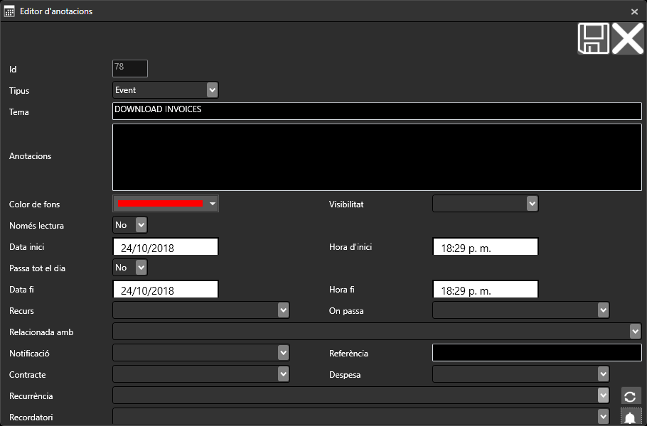
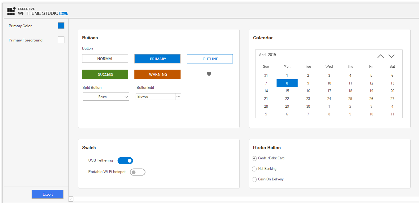
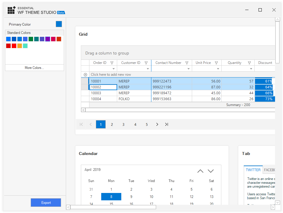
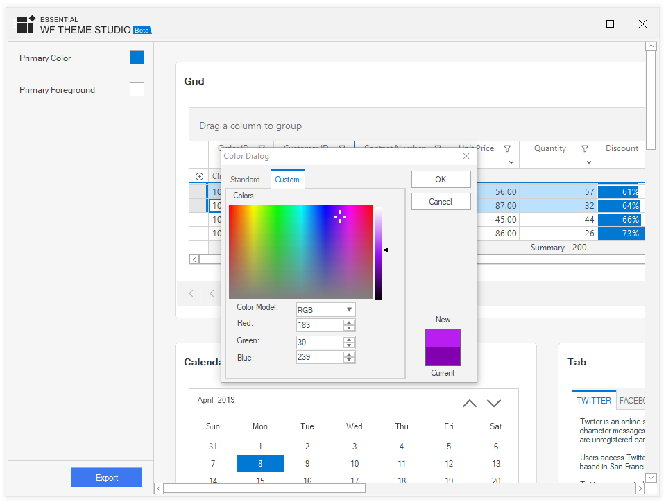
The chosen color from the More Colors… section is included in the Recent Colors section for quick access in the future.

Recent color listed in the color picker
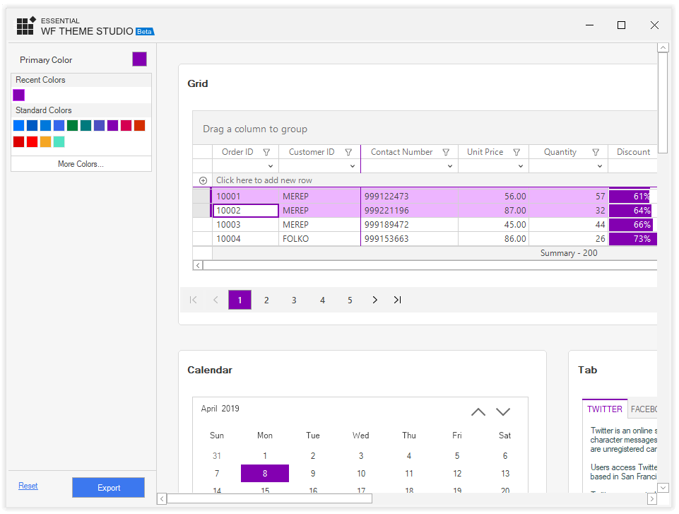
A modification made to a color will enable the Reset button in the bottom of the left pane. The user can use it to reset the color changes made to the control’s skin for a fresh start.
Reset color button to start over customization

Exporting color changes as theme dll

After making the necessary changes to a color, the user can export it in library format (*.dll). Click Export in the bottom of the left pane. In the export dialog that appears, all the controls are showcased based on their category. The user can click Select All to select all the listed controls, or choose individual controls as required. The size of the output assembly is proportional to the number and size of the selected controls.

Exporting the appearance changes as theme assembly using Theme StudioChoosing the controls to which to apply the appearance changes.

Important Note: The name used for applying the theme to the control should be same as the one used for saving the theme library.

Applying a theme to Syncfusion WinForms controls

To apply a theme to Syncfusion Windows Forms controls:

  • Add a reference to the exported theme library in the application.
  • Load the assembly using the SkinManager.
  • Set the ThemeName property of the appropriate controls to the name of the theme.

Now, run the application and experience the control’s rich user interface.

The following code demonstrates the application of a custom theme to the DataGrid control.

//Load Theme assembly into application using SkinManager
SkinManager.LoadAssembly(typeof(CustomTheme).Assembly);
//Apply theme to SfDataGrid
this.sfDataGrid.ThemeName = "CustomTheme";

Custom Theme applied to SfDataGrid controlCustom theme applied to SfDataGrid control

If you wish to override any part of the theme applied, you can set the CanOverrideStyle property of the appropriate control to false. Now, use the built-in appearance API under the ThemeStyle property to provide the desired color. For SF series controls, use the Style property instead of ThemeStyle.

For instance, here I don’t want to adopt Cell BackColor from the applied custom theme in the DataGrid control.

sfDataGrid.Style.CellStyle.BackColor = Color.LightGray;
//Restrict adopting colors from applied custom theme assembly in SfDataGrid, which is customized.
sfDataGrid.CanOverrideStyle = false;
sfDataGrid.ThemeName = "CustomTheme";

What’s next?

For the Theme Studio control for WinForms, we are planning to provide a couple of additional themes, along with a few more controls like menus, a pivot grid, and a spreadsheet. One of the additional themes planned is high contrast, in order to provide a rounded user experience.

Conclusion

If you are an existing customer, please download the new version of Essential Studio from the download page and try the Theme Studio for WinForms and its features for yourself. If you are a new customer, you can try our 30-day free trial to check out this new application.

Please post your queries in the comments section below. You can also contact us through our support forum or Direct-Trac.


The post Theme Studio control for Syncfusion WinForms appeared first on Syncfusion Blogs.

How to create a Simple, Responsive, and Dynamic Dashboard

$
0
0

Dashboards are very useful to track strategic data, key performance indicators, and important metrics from several data sources and visually present them. But designing a dashboard is a challenging job when you need features that let users place components, drag-and-drop, resize, and reorder. You’ll also need to present the dashboard with a responsive and adaptive layout, so it can be viewed at any resolution in any device without data loss.

Considering all these challenges, the Syncfusion Dashboard Layout component was implemented. It will create a dynamic dashboard quickly with the expected layout and allow you to think about only the data integration and projection.

You can place the component in a grid-structured layout at a desired place and design the layout by live-editing the panels with the help of reordering, drag and drop, resizing, add new, and removing functionalities.

Let’s try making a dashboard as shown in the following screenshot by using the Dashboard Layout component.

A simple dashboard with Grid, Chart and Map components.A simple dashboard with Grid, Chart and Map components.

You can get the demo sample from the GitHub repository: How to create a dynamic and responsive dashboard 

Initialize the Dashboard Layout component

The list of dependencies required to render the Dashboard Layout component are as follows.

|– @syncfusion/ej2-layouts

|– @syncfusion/ej2-base

To use the Dashboard Layout component, we need to import it from the @syncfusion/ej2-layouts packages from the npm and append it to an element as shown in the following code example.

[index.ts]

//importing DashboardLayout from ej2-layouts
import { DashboardLayout } from '@syncfusion/ej2-layouts'; 

let dashboard: DashboardLayout = new DashboardLayout({});

dashboard.appendTo('#editLayout');

[index.html]

<!-- dashboard layout element -->

<div id="editLayout"></div>

Creating panels

Panels are the building blocks of the Dashboard Layout component. It holds the data (components) to be visualized or presented. It has options to resize, reorder, or position a component in the desired manner. Configure the panels to place inside the dashboard as shown in the following code example.

[index.ts]

let dashboard: DashboardLayout = new DashboardLayout({
//splits the entire width of the component into 6 equal columns.
columns: 6,
//defines the width/height ratio of each panel, here panel height will be 10/8 of its width value.
cellAspectRatio: 100 / 80, 
//adding panel properties.
panels: [

{'sizeX': 2, 'sizeY': 1, 'row': 0, 'col': 0 },

{'sizeX':2, 'sizeY': 1, 'row': 0, 'col': 2 },

{'sizeX': 2, 'sizeY': 1, 'row': 0, 'col': 4 },

{'sizeX': 3, 'sizeY': 2, 'row': 1, 'col': 0 },

{'sizeX': 3, 'sizeY': 2, 'row': 1, 'col': 3 },

{'sizeX': 3, 'sizeY': 2, 'row': 4, 'col': 0 },

{'sizeX': 3, 'sizeY': 2, 'row': 4, 'col': 3 },

]});

dashboard.appendTo('#editLayout');

In the above code block, columns and cellAspectRatio properties defines the panel dimensions (height and width of each panel) to represent the number columns and panels placed in each row. In addition, you can turn on the panel resize option to enhance further live designing.

Dashboard layout with empty panelsDashboard layout with empty panels

Adding components with header information to panels

In the Dashboard Layout components, Panels has options to define the header and content with complete customization. Header holds the supplemental data and also any action items like buttons or menu. The content of the panels can adopt any data or even data visualizing component such as chart or gauge or map. Refer to the following code example to add header and content to panels.

[index.ts]

import { enableRipple } from '@syncfusion/ej2-base';

import { DashboardLayout } from '@syncfusion/ej2-layouts';

import { CircularGauge } from '@syncfusion/ej2-circulargauge';

import { gauge1, gauge2, gauge3 } from './gauge-component';

import { Grid } from '@syncfusion/ej2-grids';
// importing grid component.
import { gridComponent } from './grid-component';

import { Maps} from '@syncfusion/ej2-maps';
// importing map component.
import { mapsComponent } from './map-component';

import { Chart, Legend, Tooltip, ColumnSeries, Category, DataLabel } from '@syncfusion/ej2-charts';
// importing column chart.
import { columnChartComponent } from './chart-component';

Chart.Inject(ColumnSeries, DataLabel, Category, Legend, Tooltip);

enableRipple(true);
// initializing DashboardLayout component.
let dashboard: DashboardLayout = new DashboardLayout({

columns: 5,

cellSpacing: [25, 25],

cellAspectRatio: 100 / 80,

panels: [
{
'sizeX': 2, 'sizeY': 1, 'row': 0, 'col': 0, cssClass: 'card-template', content: '#card1'
},
{
'sizeX': 2, 'sizeY': 1, 'row': 0, 'col': 2, cssClass: 'card-template', content: '#card2'
},
{
'sizeX': 2, 'sizeY': 1, 'row': 0, 'col': 4, cssClass: 'card-template', content: '#card3'
},
{
'sizeX': 3, 'sizeY': 2, 'row': 1, 'col': 0,
header: '<div> Customer details</div>', content: '<div id="Grid"></div>'
},
{
'sizeX': 3, 'sizeY': 2, 'row': 1, 'col': 3,
header: '<div>Regional Map</div>', content: '<div id="map"></div>'
},
{
'sizeX': 3, 'sizeY': 2, 'row': 4, 'col': 0,
header: '<div>Sales in 2018 </div>', content: '<div id="colChart"></div>'
},
{
'sizeX': 3, 'sizeY': 2, 'row': 4, 'col': 3,
header: '<div> Sales Comparison </div>', content: '#card4'
}
]});

dashboard.appendTo('#editLayout');
// initializing gauge components.
let germany: CircularGauge = new CircularGauge(gauge1(), '#container1');

let usa: CircularGauge = new CircularGauge(gauge2(), '#container2');

let uk: CircularGauge = new CircularGauge(gauge3(), '#container3');
// initializing chart component.
let chart: Chart = new Chart (columnChartComponent(),'#colChart');
// initializing grid component.
let grid: Grid = new Grid(gridComponent(),'#Grid');
// intitalizing map component.
let map: Maps = new Maps(mapsComponent(), "#map");

Here the first row of panel contains the HTML template cards. Then the grid component is initialized and rendered by obtaining the model values from the grid-component.ts file.

Grid contains customer details as records Grid inside the panel

Similarly, the other components, chart, maps, and gauge, are also imported from the chart-component.ts, map-component.ts, and gauge-component.ts files, respectively.

Shows the chart, map and gauge inside the panelsChart, Map and Circular gauge inside the panels

Finally, you will get a simple dashboard with cards, grid, chart, gauges and map as shown in below screenshot with editable layout.

A simple dashboard with DataGrid, Chart and Map components.A simple dashboard with Grid, Chart and Map components

Redesign the layout to a different structure by live editing the dashboard as like below.

sales dashboard with live editingDashboard with live editing

Conclusion

We hope this blog and the sample shared help you design a dynamic dashboard with grids, charts, and gauges using the Dashboard Layout component. The Dashboard Layout is also available in Angular, React, Vue, ASP.NET MVC and ASP.NET Core framework, so you can try out the sample based on your preferred one.

To learn more about the Dashboard Layout component, refer to the Syncfusion online samples and documentation. We look forward to you trying this component and providing your feedback through this feedback portal. You can also contact us through our support forum or Direct-Trac. We are happy to assist you!

The post How to create a Simple, Responsive, and Dynamic Dashboard appeared first on Syncfusion Blogs.

Essential Studio 2019 Volume 1 Release

$
0
0

At Syncfusion, we’re hitting the ground running in 2019. Our first release of the year, Essential Studio 2019 Volume 1, brings our customers a whole new suite of ASP.NET Core Razor Components, Visual Studio 2019 compatibility, .NET Core 3.0 support, and plenty of new features and controls to enhance your toolkit. This blog post covers some of the highlights of Volume 1.

Razor Components

.NET Core 3.0 now supports hosting Razor Components from the server-side using ASP.NET Core apps. Syncfusion is excited to announce the release of our new ASP.NET Core Razor Components suite. With 2019 Volume 1, we have released preview versions of 60 new UI controls for Razor Components and Blazor, the client-side hosting model for Razor Components. Built on top of Essential JS 2 for the Blazor framework, these wrapper components let you write your applications completely in C#, no JavaScript required.

Blazor runs .NET with WebAssembly

Blazor runs .NET with WebAssembly

Major features are data-binding capabilities, property binding, and event handling. Some of the most popular controls include the DataGrid, Charts, Scheduler, and Diagram. For more information and a quick tutorial for the Razor Components DataGrid, see this blog post by one of its developers.

Visual Studio 2019 compatibility

We’ve been looking forward to Visual Studio 2019 since it was announced, and we’ve come fully prepared. With this release, all our suites are fully compatible with the new VS version, and our components come equipped with Visual Studio 2019 project templates and toolbox support.

Essential JS 2

As always, Essential JS 2 takes mainstage in the distribution of new controls. Users will be pleased to find several new offerings for all its platforms:

• Gantt Chart, for project management.
• Dashboard Layout, for creating dashboards and panels with a grid-structured layout.
• Pivot Chart, for plotting pivot data independently in a chart.
• File Manager, for organizing files.

Gantt control for JavaScript

Gantt Chart control for JavaScript

The Stock Chart and PDF Viewer have also moved from preview to final versions in this release, and all controls now support the Bootstrap 4 theme.

Xamarin.Forms

Volume 1 also boosts our ever-popular Xamarin.Forms offerings with a high-contrast dark theme for all controls, a fast scatter chart for the Charts control, and checkbox support for nodes in the TreeView control. Three new controls have been released as previews, as well: the Accordion control stacks content in a vertical, collapsible list; the Expander control expands or collapses content under a header with a tap; and the Cards control allows users to swipe through a stack of cards.

Xamarin dark theme

Dark theme in Xamarin

WinForms and WPF

All controls in both WPF and WinForms platforms now support .NET Core 3.0. WinForms gains a new Tabbed Form control for displaying tabbed UIs, as well as the Theme Studio control for customizing themes.

Theme Studio for WinForms

Theme Studio for WinForms

File formats

Our PDF Library has added compliance for several standards:

• ZUGFeRD compliance
• PDF/A-2b compliance
• PDF/A-3b compliance

Excel Library also now has complete support for Microsoft’s Excel 2019.

We hope you enjoy these new additions to Essential Studio. To see the complete list of Essential Studio 2019 Volume 1’s new controls and features, check out our What’s New page. If you don’t have a Syncfusion license, but would like to try out these new controls and our other suites, you can sign up for a free 30-day trial. Let us know what you like in this release and what you’d like to see in future releases in the comments below or on Facebook or Twitter.

If you enjoyed this post, we think you’ll also like:

[Blog] Introducing Theme Studio for Syncfusion WinForms Controls

[Video] Syncfusion Mobile Updates—2019 Volume 1

[Ebook] ASP.NET Core 2 Succinctly

The post Essential Studio 2019 Volume 1 Release appeared first on Syncfusion Blogs.


Introducing New React Query Builder UI Component

$
0
0

Syncfusion have recently added the Query Builder UI component to our React UI components library. It’s a great tool to help you construct and display complex filtering queries. This blog will provide an overview of the React Query Builder UI component, and shows you its basic usage and features, step by step.

React Query Builder UI componentReact Query builder UI component

The Query Builder UI combined with Grid performs advanced searching and displays the results in an organized manner. It is fully customizable to include many input components like slider, drop-down list, multi-select, and check boxes for value selection.

Get started with Query Builder UI

Here, we can see step by step procedure to get started with the Query Builder UI component in the React platform:

  1. First, we need to use the create-react-app CLI. If you don’t have the CLI, then, install it globally using following command.

    npm install -g create-react-app

  2. Create a React application and download its dependencies using the following command.

    create-react-app querybuilder –scripts-version=react-scripts-ts

  3. Now, install the packages for including Query Builder UI component into your application, using the following command.

    cd querybuilder
    npm install @syncfusion/ej2-react-querybuilder

  4. With this we have completed the environment related configurations. Next, to include the Query Builder UI component in the application, import the same from ej2-react-querybuilder package in App.tsx.

    import {QueryBuilderComponent} from ‘@syncfusion/ej2-react-querybuilder’;

  5. Syncfusion React UI components support a set of built-in themes, and here we will use the Material theme for our query builder. To add the Material theme in your application, you need to import material.css into App.css.

    @import “https://cdn.syncfusion.com/ej2/material.css”;

  6. With this, we have successfully completed the configurations related to the Query Builder UI component. Now we should initialize our first query builder in tsx as shown in the following code example.

    class App extends React.Component {
    public render() {
    return (<div > <QueryBuilderComponent /> </div>);
    }
    }

  7. Finally, run the following command to see the output in a browser.

npm start

Query builder Query Builder UI

Data binding

The Query Builder UI component uses DataManager, which supports both RESTful JSON data service binding and local JavaScript object array binding. The dataSource property of the query builder can be assigned with a JavaScript object array collection.

All the columns defined in the dataSource will be auto-populated using the data source schema. If all the columns defined are not required, then, we can manually define the fields using the columns property.

Now, define the employee table and map it to the dataSource of our query builder.

const hardwareData: object[] = [
{"TaskID": 1, "Name": "Lenovo Yoga", "Category": "Laptop",
"SerialNo": "CB27932009", "InvoiceNo": "INV-2878", "Status": "Assigned"  },
{"TaskID": 2, "Name": "Acer Aspire", "Category": "Others",
"SerialNo": "CB35728290", "InvoiceNo": "INV-3456", "Status": "In-repair" },
….
]

class App extends React.Component {
public render() {
return (<div ><QueryBuilderComponent dataSource={ hardwareData } /></div>);
}
}

After binding the data, the query builder will be rendered based on the data.

data binding in query builderData binding in Query Builder UI

Defining columns

The Query Builder UI component has flexible APIs to define the column label, type, format, and operators:

labelField values are considered labels by default, and we can further customize them using this property.

typeDefines the data type of the column.

formatCustomizes the format of date and number column types.

operatorsCustomizes the default operators for the column.

The following code example imports the ColumnsModel from the ej2-react-querybuilder package in App.tsx and customizes the label and type.

import {ColumnsModel, QueryBuilderComponent} from '@syncfusion/ej2-react-querybuilder';
class App extends React.Component {
public columnData: ColumnsModel[] = [
{field: 'TaskID', label: 'TaskID', type: 'number', 
operators: [{ key: 'equal', value: 'equal' },
{ key: 'greaterthan', value: 'greaterthan' }, { key: 'lessthan', value: 'lessthan' }]
},
{ field: 'Name', label: 'Name', type: 'string' },
{ field: 'Category', label: 'Category', type: 'string' },
{ field: 'SerialNo', label: 'SerialNo', type: 'string' },
{ field: 'InvoiceNo', label: 'InvoiceNo', type: 'string' },
{ field: 'Status', label: 'Status', type: 'string' }
];

public render() {
return (<div ><QueryBuilderComponent dataSource={employeeData} columns={this.columnData} /></div>);
}
}

defining columns in query builder UI Defining columns in Query Builder UI

Binding the filter query to Grid

In this segment, we are going to add a grid component and populate it with the search result from the query builder. For this, we need to install the Syncfusion React Grid and Syncfusion React Button packages.

npm install @syncfusion/ej2-react-grids @syncfusion/ej2-react-buttons

Now, bind the data and configure the columns of the grid. Initialize DataManager with hardwareData, which is defined as the dataSource of Query Builder UI component. Define the query to get the required data from the hardware data and assign it to the Grid component’s query property.

import { DataManager, Predicate, Query } from '@syncfusion/ej2-data';
import { ButtonComponent } from '@syncfusion/ej2-react-buttons';
import { ColumnDirective, ColumnsDirective, GridComponent, Inject, Page } from '@syncfusion/ej2-react-grids';
 
public datamanager: DataManager = new DataManager(hardwareData);
public query: Query = new Query().select(['TaskID', 'Name', 'Category', 'SerialNo', 'InvoiceNo', 'Status']);
 
<GridComponent allowPaging={true} dataSource={this.datamanager} width='100%'
ref={(scope) => { this.gridObj = scope; }} query={this.query} >
<ColumnsDirective>
<ColumnDirective field='TaskID' headerText='Task ID' width='120' textAlign='Right' />
<ColumnDirective field='Name' headerText='Name' width='140' />
<ColumnDirective field='Category' headerText='Category' width='140' textAlign='Right' />
<ColumnDirective field='SerialNo' headerText='Serial No' width='130' />
<ColumnDirective field='InvoiceNo' headerText='Invoice No' width='120' />
<ColumnDirective field='Status' headerText='Status' width='120' />
</ColumnsDirective>
<Inject services={[Page]} />
</GridComponent>

Finally, synchronize the filter changes in our query builder to populate the filtered data into our grid. For this, we need to detect the query changes and update the grid query to refresh the filtered data by handling the button click event.

<QueryBuilderComponent width='100%' dataSource={hardwareData} columns={this.columnData} ref={(scope) => { this.qryBldrObj = scope; }} />
<ButtonComponent onClick={this.updateRule()} >Filter Grid</ButtonComponent>
 
public updateRule = ()=>() => {
const predicate: Predicate = this.qryBldrObj.getPredicate({ condition: this.qryBldrObj.rule.condition, rules: this.qryBldrObj.rule.rules });
if (isNullOrUndefined(predicate))
{ this.gridObj.query = new Query().select(['TaskID', 'Name', 'Category', 'SerialNo', 'InvoiceNo', 'Status']); }
else
{ this.gridObj.query = new Query().select(['TaskID', 'Name', 'Category', 'SerialNo', 'InvoiceNo', 'Status']).where(predicate); }
this.gridObj.refresh();
}

Now our query builder will look like the below screenshot, with a grid component. You can now create your own complex filter queries and click the filter grid button to see the results.

Binding Query builder filter result to grid Binding query builder filter result to grid

Summary

The Query Builder UI component is designed to be highly customizable, to include various input components like slider, multi-select, checkbox, and drop-down lists. This way, input can be received in different formats, to create complex queries.

To try our Query Builder UI component, please download our free trial. You can also check its source from GitHub. For the better use of the component you can check our online sample browser and documentation.

If you have any questions or need any clarification, then, please let us know in the comments section below. You can also contact us through our support forum, Direct-Trac or Feedback portal. We are always happy to assist you!

If you like this blog post, then we think you’ll also like the following free ebooks,

TypeScript Succinctly

React Succinctly

The post Introducing New React Query Builder UI Component appeared first on Syncfusion Blogs.

How to Display Data with Xamarin Charts

$
0
0

Hello everyone. In this post, I’ll be showing you how to include the Syncfusion Charts control in a Xamarin.Forms application and configure the elements of a chart.

The Syncfusion Charts control includes more than 30 chart types ranging from basic charts to financial charts. In this tutorial, I am going to use a bar chart to compare a sales target to actual sales, as shown in the following picture.

Target vs, Sale bar chart in Xamarin.Forms app

Target vs. Sale bar chart in a Xamarin.Forms app

Install NuGet package

I have already created a brand new Xamarin.Forms project in Visual Studio 2017 and added the model and view model classes to store the sales details.

SalesInfo model class added

Added SalesInfo model class

SaleInfo is the model class. It represents a data point in a chart and contains three properties to store year, sale, and target amounts. SalesViewModel is the view model where the SalesData property is declared to store the SaleInfo objects. Now, let’s add the SfChart NuGet from nuget.org:

1. Click Manage NuGet Packages for Solution.
choosing nuget packages for solution

Choosing NuGet Packages for Solution

2. Search for SfChart in the search bar. This is the package that needs to be installed in all Xamarin.Forms projects.

3. Click Install. You’ll need to read and accept the license to finish installing.

The SfChart NuGet package will now be installed in all your Xamarin.Forms projects.

Initialize the chart and axis

Now, let’s configure the chart on the main page of the project:

1. First, set the binding context to bind the data between the ViewModel and the View. The ViewModel in this case will be SalesViewModel.

2. Next, add the namespace of Syncfusion chart on this page to access the SfChart classes. The SfChart class is available inside the Syncfusion.SfChart.XForms namespace.

Adding the namespace

Adding the namespace

3. Then, create an instance of SfChart using the alias name of the SfChart namespace we declared before.

4. Finally, define the x and y axes using the PrimaryAxis and SecondaryAxis properties:

a. The x-axis will show the years as a string, so set the CategoryAxis to the PrimaryAxis property.

b. The y-axis will show the amount, as it is a double value, so set a NumericalAxis to the SecondaryAxis property.

Defining the axes.

Defining the axes

Since the series has not been added to the chart, the numerical axis is rendered with its default range of 0 to 1, and the category axis does not have any default labels.

Add series

Next, we need to add the series to visualize the data. As I am going to compare the target and sales values, two column series need to be added to the chart to visualize those values:

1. Add the first column series and bind the data from the ViewModel using the ItemsSource property. The SalesData property is declared in the ViewModel class.

2. The XBindingPath and YBindingPath properties are used to map the properties to fetch the values from the model object. Set the XBindingPath path to Year and the YBindingPath to Target. These properties are declared in the model object.

Now you can see the bar chart of target values in previewer. The Android and iOS platforms will display the same output.

Adding the first column series

Adding the first column series

Let’s add one more column series to visualize the sales values:

1. Pull the sales data from the same binding context as before.

2. Set the XBindingPath to Year, and the YBindingPath to Sale for this series.

The preview will update and show both series side by side.

Showing both columns in bar chart

Showing both columns

Add a title and legend

Then, to make this chart more meaningful, let’s configure the title and legend to represent each series:

1. Set an instance of ChartTitle to the Title property of SfChart. The title will be Target vs Sale.

2. Enable the legend using the Legend property of SfChart. The empty legend icons are added to the chart with different colors identifying the series. But we need labels to tell us what the colors represent.

3. Configure the labels using the Label property in each of the column series. We’ll name the first series Target and second series Sale.

Configuring legend lables

Configuring the legend labels

Customize the axis

Now let’s customize the axis by setting the title and format of the labels. We’ll set the title as Year for the primary axis using the Title property of CategoryAxis.

Displaying a primary axis title

Displaying a primary axis title

Once you save the changes, the previewer refreshes and shows the primary axis title, as seen in the previous image.

Then, let’s format the labels of the y-axis to show the dollar ($) symbol and represent the numbers in terms of millions. We can use the LabelStyle property to customize the axis labels. Set an instance of ChartAxisLabelStyle to the LabelStyle property. Format the label with the dollar sign, three-digit values, and M symbols. The previewer will update, and everything should look like the following image.

Formatting the y-axis labels

Formatting the y-axis labels

You can now run this on an Android phone to see that the chart looks just like the one in the previewer.

Deploy for iOS

Now we want to run the same app in an iPhone simulator. Before running it on an iOS platform, though, we need to take one additional step in the iOS project to load the assemblies of the renderer projects:

1. In the Solution Explorer, go to the iOS project and open the App.Delegate.cs file.

2. Inside the FinishedLaunching method, and after invoking the Xamarin.Forms Init method, call the Init method of SfChartRenderer.

3. Then, set the iOS project as the startup project.


Deploying to iOS

Deploying to iOS

When you test this, you can see we get the same output on an iPhone without implementing anything specific to iOS.

Deploy for UWP

Lastly, we’ll deploy this app in the UWP platform to make sure that we are getting the same appearance of the chart there, too. We just set the UWP project as the startup project and run it in the local machine.

Once again, we get the same output without having to use any platform-specific code. This is the actual output of Xamarin.Forms Charts in a UWP application.

bar chart in uwp app

The chart in a UWP app

I hope this post was helpful in getting you started with the Charts control in Xamarin.Forms. If you have any requests for our next tutorial, please share them in the comments section below.

If you like this post, we think you’ll also enjoy:

[Ebook] Xamarin.Forms Succinctly

[Blog] What’s New in 2019 Volume 1: Xamarin Highlights

[Blog] What’s New in Xamarin.Forms 4.0

The post How to Display Data with Xamarin Charts appeared first on Syncfusion Blogs.

Syncfusion Sponsoring TRINUG’s Global Azure Bootcamp

$
0
0

Once again, Syncfusion will be sponsoring TRINUG’s Global Azure Bootcamp on April 27.

This is an all-day event that will cover cool topics such as how to build chatbots and how to use technologies such as cognitive services/LUIS (Language Understanding Intelligent Service), Azure Search, Azure Bot Service, Microsoft Bot Framework, QnA Maker, and Bing Search API.

The organizer, Jamie Dixon, is very excited. Around the world, TRINUG has 208 confirmed event locations and 99 pending. That’s 307 events in total this year!
Why are we sponsoring this event?  We believe in the power of Microsoft Azure and are huge fans. Syncfusion chose the Azure platform on which to build its business intelligence solutions such as the Dashboard Platform. Azure made it easy to build scalable dashboards, and we found it particularly user-friendly when deploying with Windows and the .NET stack. We noticed superior developer productivity when compared to other, similar platforms. In addition, Microsoft is extremely responsive when it comes to offering assistance.

We hope that developers can take advantage of these free learning opportunities in their region and across the globe. Azure is a valuable tool that many developers can benefit from, and we’re excited to help them develop their skills with it.

To learn more about Microsoft Azure, please go to https://azure.microsoft.com/en-us/.

To find out more about Global Azure events:

The post Syncfusion Sponsoring TRINUG’s Global Azure Bootcamp appeared first on Syncfusion Blogs.

Create Progressive Web App with Syncfusion React UI Components

$
0
0

The Progressive Web App makes the react web applications feel like mobile-native apps. It features the option to add a web application to the home screen of mobile devices for easy access, and supports full screen for a native application look. PWA supports cache and makes use of cached items to work in slow networks, as well as in offline mode.

In this blog, I am going to create an application which lists the Succinctly series books and allow the users to search for a specific book. I will use create-react-app CLI to create the base application and will configure Syncfusion React UI components to implement this application. To do this, I am going to follow below steps:

  1. Getting started with create-react-app
  2. Configuring Syncfusion React UI components in it
  3. Making it a Progressive Web App
  4. Launching the application

The final project sample is available in this github repository, to track the progress in each step. You can also follow along with committed details provided at the end of each step.

Getting started with create-react-app

To create the React app, I am using the create-react-app CLI. This has some default settings like Manifest.json and service workers to help me make it a Progressive Web App. Install the create-react-app CLI globally using the following command:

npm i create-react-app -g

You can create the React app in any directory using create-react-app command. Move to the directory in which you want to create the application and run the following command. Here I am naming this app as “pwa-succinctly-books”

Example: create-react-app <name-of-app>

create-react-app pwa-succinctly-books

This will create the application. To run the same with default configuration, move to the application directory and use the following command:

cd pwa-succinctly-books

npm start

A React application
The React application

Note: You can find information on this step on GitHub: Getting started with create-react-app

Configuring Syncfusion React UI components

With this, I have created the base application and made it run. Hence, I am going to configure the application with Syncfusion React UI components.

Like I said before, the core idea of this application is to populate a list of Syncfusion Succinctly series ebooks that is searchable based on book attributes. In this application, I am going to list the Succinctly series ebooks using Syncfusion Cards, and for searching, I will use Syncfusion TextBox. For this, I am going to install the ej2-react-inputs and ej2-layouts. For the search operation, I am going to use DataManager. To install these Syncfusion components, run the following command:

npm install  @syncfusion/ej2-react-inputs @syncfusion/ej2-data @syncfusion/ej2-layouts

Now, every required configuration is done. To start the application, remove some elements from the base application. In App.js, empty the App div element.

Content of App js class
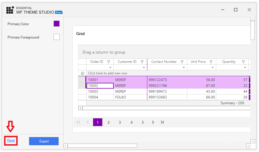
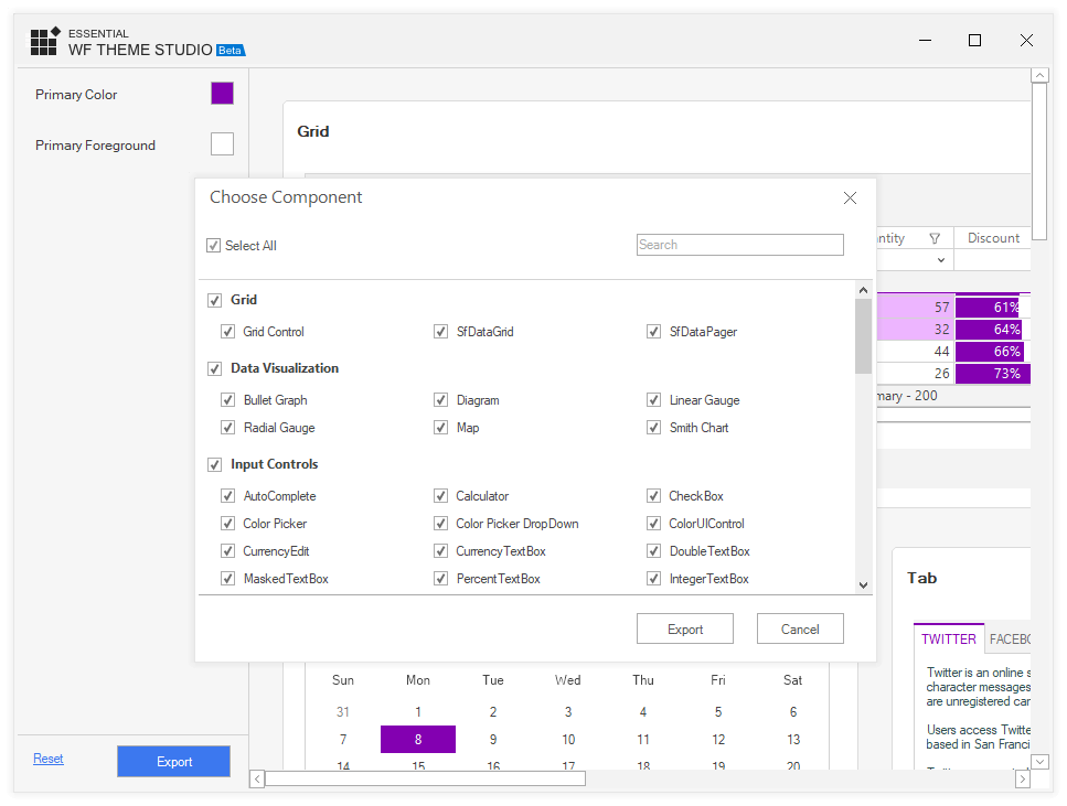
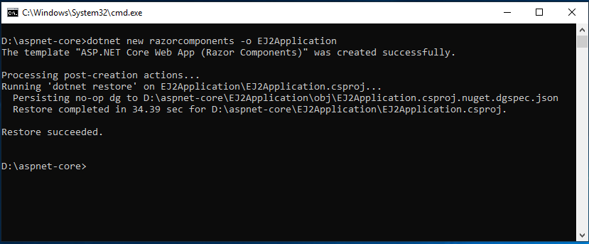
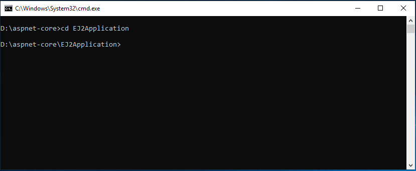
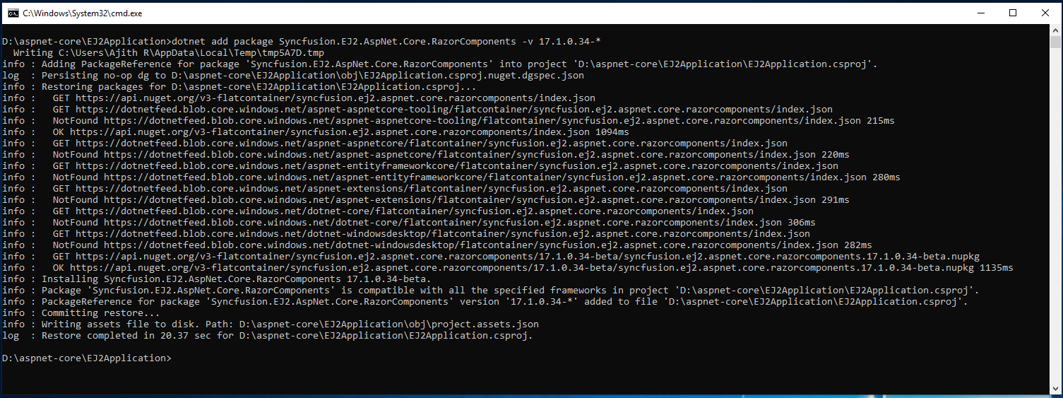
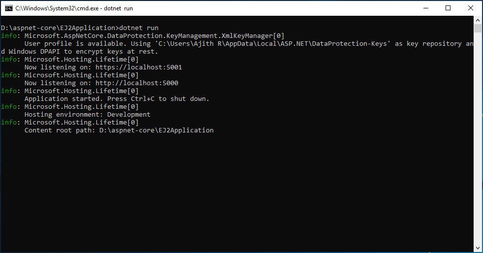
Now, I am going to follow below steps:

  1. Rendering React components
  2. Implement search operation
  3. Styling the application

Rendering React components

We need to render the following elements:

  1. Header
  2. Search text box
  3. List of cards

First, we need input for the search text box and a bootstrap Grid layout for aligning the cards in order. Create a local data source for listing the details of the Succinctly series books and name the file as datasource.js. Export this file to make it available in App.js. Add Syncfusion React TextBox component to render the search textbox. We can now import the TextBox from the ej2-react-inputs package. The App.js will contain the following code after including the required elements:

import {TextBoxComponent} from '@syncfusion/ej2-react-inputs';
class App extends Component {
render() {
return (
<div className="App">
<div className='control-pane'>
<div>
{/* Header HTML element */}
<header className="header">
<h1 className="header__title">Succinctly Series</h1>
</header>
</div>
<div className="main">
<div className="control-section card-control-section tile_layout">
<div className="row filter">
<div className="col-xs-4 col-sm-4 col-lg-4 col-md-4 "></div>
<div className="col-xs-4 col-sm-4 col-lg-4 col-md-4 ">
{/* Searching HTML element */}
<TextBoxComponent id="search_Card" placeholder="Enter text to search" floatLabelType="Auto" />
</div>
<div className="col-xs-4 col-sm-4 col-lg-4 col-md-4  tile_search">
</div></div>
{/* Cards Template holder */}
<div className='row e-card-layout' style={{ textAlign: 'center' }}>
<div className="row">
<div className="row error" style={{ minHeight: '150px' }}>
<div className="e-error-content" style={{ margin: 'auto', fontWeight: 500 }}>No results found. Please try a different search.</div></div>
<div className="col-xs-6 col-sm-6 col-lg-6 col-md-6"><div id='card_sample_1' className='card_sample'></div></div>
<div className="col-xs-6 col-sm-6 col-lg-6 col-md-6"><div id='card_sample_2' className='card_sample'></div></div>
<div className="col-xs-6 col-sm-6 col-lg-6 col-md-6"><div id='card_sample_3' className='card_sample'></div></div>
<div className="col-xs-6 col-sm-6 col-lg-6 col-md-6"><div id='card_sample_4' className='card_sample'></div></div>
<div className="col-xs-6 col-sm-6 col-lg-6 col-md-6"><div id='card_sample_5' className='card_sample'></div></div>
<div className="col-xs-6 col-sm-6 col-lg-6 col-md-6"><div id='card_sample_6' className='card_sample'></div></div>
<div className="col-xs-6 col-sm-6 col-lg-6 col-md-6"><div id='card_sample_7' className='card_sample'></div></div>
<div className="col-xs-6 col-sm-6 col-lg-6 col-md-6"><div id='card_sample_8' className='card_sample'></div></div>
<div className="col-xs-6 col-sm-6 col-lg-6 col-md-6"><div id='card_sample_9' className='card_sample'></div></div>
<div className="col-xs-6 col-sm-6 col-lg-6 col-md-6"><div id='card_sample_10' className='card_sample'></div></div>
<div className="col-xs-6 col-sm-6 col-lg-6 col-md-6"><div id='card_sample_11' className='card_sample'></div></div>
<div className="col-xs-6 col-sm-6 col-lg-6 col-md-6"><div id='card_sample_12' className='card_sample'></div></div>
</div></div></div></div></div>
</div>
);
}
}

Now I am going to render the cards by handling the componentDidMount hook method. Define the Card component, and run the data source against it. This renders each card populated in a bootstrapped grid layout.

import * as ReactDOM from 'react-dom';
import {cardBook} from './datasource';
let cardEle;
/* Funtion for Rendering Cards */
function cardRendering(cardBook) {
let errorContent = document.querySelector('.tile_layout .row.error');
if (cardBook.length > 0) {
errorContent.style.display = 'none';
cardBook.forEach((data, index) => {
cardEle = document.getElementById('card_sample_' + (++index));
if (cardEle) {
ReactDOM.render(<CardRender data={data}/>, cardEle);
}
});
}
else {
errorContent.style.display = 'flex';
}
}
 
class App extends Component {
componentDidMount() {
cardRendering(cardBook);
}
//render(){..}
}
class CardRender extends React.Component {
constructor() {
super(...arguments);
this.headerTitleSubCheck = this.props.data.header_title.length > 0 || this.props.data.header_subtitle.length > 0;
this.headerCheck = this.props.data.header_title.length > 0 || this.props.data.header_subtitle.length > 0 || this.props.data.header_img.length > 0;
this.bgimageUrl =  this.props.data.cardImage.url ;
}
render() {
return (<div className={this.props.data.isHorizontal ? 'e-card e-card-horizontal' : 'e-card'}>
{this.props.data.cardImage && <div className={"e-card-image "+this.bgimageUrl} > {this.props.data.cardImage.title && <div className='e-card-title'>{this.props.data.cardImage.title}</div>} </div>}
{this.props.data.cardTitle && <div className='e-card-title'>{this.props.data.cardTitle}</div>}
{this.headerCheck && <div className='e-card-header'>
{this.props.data.header_img && <div className={this.props.data.header_img.isRounded ? 'e-card-header-image e-card-corner' : 'e-card-header-image e-card-corner'}></div>}
{this.headerTitleSubCheck && <div className='e-card-header-caption'>
{this.props.data.header_title && <div className='e-card-header-title'>{this.props.data.header_title}</div>}
{this.props.data.header_subtitle && <div className='e-card-sub-title'>{this.props.data.header_subtitle}</div>}
</div>}
</div>}
{this.props.data.cardContent && <div className='e-card-content'>{this.props.data.cardContent}</div>}
{this.props.data.card_action_btn &&
<div className={this.props.data.card_action_btn.isVertical ? 'e-card-actions e-card-vertical' : 'e-card-actions'}>
{this.props.data.card_action_btn.action_btns.map(function (actBtn) {
return actBtn.tag === "a" ? <a key={actBtn.text} href={actBtn.href} target={actBtn.target} className='e-btn e-outline e-primary'> {actBtn.text}</a> : <button key={actBtn.text} className='e-card-btn'>{actBtn.text}</button>;
})}
</div>}
</div>);
}
}

Implement search operation

I have rendered the search text box in the above operation itself, and now I am going to add the functionality to the user interfaces. Handle the input event of the search textbox to create a predicate and parse it with the data source. Destroy all the cards available in the document after the search operation. Then, create new cards for the items available after searching the data source.

import { Query, DataManager, Predicate } from '@syncfusion/ej2-data';
let data = [];
let emptyData = true;
/* Function for Destroying Cards */
function destroyAllCard() {
let cards = document.querySelectorAll('.card-control-section .e-card');
[].slice.call(cards).forEach((el) => {
ReactDOM.unmountComponentAtNode(el.parentElement);
});
}
/* Function for Filtering Cards */
function searchFilter(key) {
let predicate = new Predicate('cardContent', 'Contains', key, true);
predicate = predicate.or('cardImage.title', 'Contains', key, true).or('header_title', 'Contains', key, true).or('header_subtitle', 'Contains', key, true);
data = new DataManager(cardBook).executeLocal(new Query().where(predicate));
destroyAllCard();
cardRendering(data);
}
class App extends Component {
componentDidMount() {
cardRendering(cardBook);
}
filterHandler(e) {
if (e.event.code === 'Tab' || e.event.code === 'Escape' || e.event.code === 'ShiftLeft' || (e.event.code === 'Backspace' && emptyData)) {
return;
}
let inputVal = e.value;
emptyData =inputVal.length === 0 ;
searchFilter(inputVal);
}
render(){
..
/* Filter handler in search text box */
<TextBoxComponent id="search_Card" input={(event) => this.filterHandler(event)} placeholder="Enter text to search" floatLabelType="Auto" />
..}
}

Note: You can find the information about this step on GitHub: Configuring Syncfusion React UI components

Styling the application

The React application requires styling to make it responsive on mobile devices. To do so, I am going to import bootstrap for the grid layout of cards and load material CSS for Syncfusion React UI components in App.js.  Also define the styles for card images which are loaded from the SRC folder and handle it using a background image URL.

npm install bootstrap

App.js

import “https://cdn.syncfusion.com/ej2/material.css”;

import “bootstrap/dist/css/bootstrap.min.css”;

Note: You can find the information about this step on GitHub: Application styling

Making it a Progressive Web App

The basic steps to make an application a progressive web app are:

  1. Configuring Web App Mainfest
  2. Handling Service Worker

Configuring Web App Manifest

Since I have created this application using create-react-app CLI, the default application manifest will be available in the public folder. This web app manifest is a JSON data containing some basic details about the application. We have more key value pairs in this manifest and will be modifying a few.

short_name / name – You can provide either short_name / name. If you provide both, short_name will be displayed, where the small space is available and name will be used for the app install prompt.

background_color – You can provide this property, which is used on the splash screen when the application is launched on slow networks. Downloading resources will take some time during the application’s initial load.

theme_color – Use this property to set the color of the toolbar in the browser.

icons – These are used for app icons when added from the browser to the home and splash screens.

display – You can set this to ‘standalone’ to make the app look like a native mobile app. The other display options are in the table below.

Options Description
fullscreen The application will be loaded without browser UI and will be responsive to entire display area
browser Standard browser look and feel
standalone Like native mobile application

start_url – This lets the browser display the application start page when it is launched and prevents displaying the URL from which the user pulled the app.

Manifest.json

{

"short_name": "Succinctly Series",

"name": "Succinctly Series",

"icons": [{

"src": "succinctly_series.png",

"sizes": "246x246",

"type": "image/png"

}],

"start_url": "./index.html",

"display": "standalone",

"theme_color": "#000000",

"background_color": "#000000"

}

Handling Service Worker – Offline Caching

Service workers handle the offline experience, and background syncing of data in a web application. This in-turn will provide a better experience, when offline or on a slow network. We have a default service worker JavaScript file named serviceworker.js in the SRC folder, since the application was created using create-react-app.

This script will handle the default caching required for files, so that, we can launch the application even when we are offline. When the application is launched for the first time, the service worker will be registered and cache required files; this will serve till the cache gets cleared. You can learn what the service worker does with the comments provided in the serviceworker.js. Register the service worker in index.js using the code below.

serviceWorker.register();

Note: You can find the information about this step on GitHub: Making a Progressive Web App

Launching application

With this, we have successfully implemented our application and now we need to launch it. To launch the application in development version, use the command below.

npm start

Succinctly series react PWA
Succinctly series React PWA

To launch the application for production, run the command below.

npm run build

This will generate the build folder in the application for production purpose. Then, we need to launch this application so we can make use of the serve NPM package which is used for serving static applications and single page applications. For which, use the following commands to serve the application:

npm i serve -g

serve -s build

This will launch the application at http://localhost:5000, and you can check the changes with the application manifest and service worker here.

In the Chrome developer tools we have the application tab, in which you can see the manifest and service worker in the left-side of the tree. Once you click on the manifest, in the right-side pane you can check the key value pair configured for the application.

Succinctly series PWA manifest

When you click on the service worker, you will see that, we have options to check the offline status of the application with a checkbox. Before doing that, ensure that the service worker is registered. Refresh the full page and check whether the service worker launches the application properly.

Succinctly series PWA Service Workers

Summary

In this blog, we have gone through the basic steps for creating a Progressive Web App. We walked through using React applications, created an app with create-react-app CLI and Syncfusion React UI components. We can do a lot more with progressive web apps, I am leaving this for you to experiment with.

You can find the application in this Github repository. If you have any questions or need more help, please let us know in the comments section below. You can also contact us through our support forum or Direct-Trac. We are always happy to assist you!

The post Create Progressive Web App with Syncfusion React UI Components appeared first on Syncfusion Blogs.

The Era of Feedback Portal for Syncfusion Products Begins!

$
0
0

We are glad to introduce our new Syncfusion feedback portal for receiving and processing your feedback across all our products, with an increased focus on upgrading them. This portal will give you a better experience posting your feedback and tracking it.

We’ve received a lot of feedback and it has helped us to improve our products in different ways. Hoping that the Syncfusion support system was very convenient for you, too, we came up with the new initiative of a feedback portal to make submitting and tracking your feedback even easier. As part of our improvements and to make our system more transparent, we are making your feedback public to other users and you can view the feedback raised by other users too. We believe this will help us understand common interests and opinions quickly. Which in turn, helps us improve our product in ways meaningful to you.

How to use the new portal?

This new portal is very simple and easy to use. You can see the feedback for all our products in one place. If you are an existing Syncfusion customer, you can share your ideas as feature requests here and you can log bug reports for any issues.

If you want to show interest in a feedback report created by someone else, then you can vote on it to raise it in our priority list.

You can also add comments to other people’s feedback if you have any questions or concerns.

This all can be done only after signing in into your Syncfusion account. You can use your existing Syncfusion account or you can create an account here.
Syncfusion feedback portal - Platforms list
Then, click New feedback. The portal will take you through a process very similar to submitting a support ticket.
Syncfusion feedback portal - Create new feedback

Private feedback

Sometimes, you may need to give additional details for us to reproduce the issue on the Syncfusion end when you log a bug report. You might think of privacy here, so, for this reason, you can log it as private feedback while creating it. As a result, only the concerned customer and Syncfusion can view it.
Syncfusion feedback portal - Post private feedback

How to track your feedback

You can find the details and status of your feedback in the feedback page after its creation. We will update the status of the feedback when we start to work on it or if it is finished. You can easily understand our updates, as all our statuses are very straightforward. Whenever the status is updated, you will receive an email with details.
Syncfusion feedback portal - Track your feedback

Your suggestions are welcome!

All our effort in this new portal is to make it easier for you to reach out and share your feedback. We want to get ideas and suggestions from you, as you play a vital role in our progress. We’re looking forward to your outlook on our feedback portal with great excitement!

The post The Era of Feedback Portal for Syncfusion Products Begins! appeared first on Syncfusion Blogs.

Viewing all 473 articles
Browse latest View live